|
Using the ActiveX Controls 1 |
The topics in this chapter provide introductions to ActiveX controls provided with Visual Basic (also see "Using the ActiveX Controls 2). For many of these, you will also find scenarios along with code featuring the controls in sample applications.
Using the ImageList Control
Using the ListView Control
Using the ProgressBar Control
An ImageList control contains a collection of images that can be used by other Windows Common Controls specifically, the ListView, TreeView, TabStrip, and Toolbar controls For example, the ImageList control can store all the images that appear on a Toolbar control's buttons.
The ImageList control can also be used with controls that assign a Picture object to a Picture property, such as the PictureBox, Image, and CommandButton controls.
Using the ImageList control as a single repository saves you development time by allowing you to write code that refers to a single, consistent catalog of images. Instead of writing code that loads bitmaps or icons (using the LoadPicture function), you can populate the ImageList once, assign Key values if you wish, and write code that uses the Key or Index properties to refer to im 454f51e ages.
The control uses bitmap (.bmp) or icon (.ico) files in a collection of ListImage objects You can add and remove images at design time or run time. The ListImage object has the standard collection object properties: Key, Index, and Count. It also has standard methods, such as Add, Remove, and Clear.
For More Information "Programming with Objects offers introductory information about working with objects and collections.
Finally, the control features the Overlay, Draw, and ExtractIcon methods, which allow you to create composite images, draw images on objects with an hDC property (such as the Form and Printer objects), and create an icon from a bitmap stored in the control.
Storing the images that represent open folders, closed folders, and documents. These images can then be dynamically assigned to the TreeView control's Node object to represent its different states as it expands or collapses, or whether or not it is a document or a folder.
Storing images that represent common computer operations, such as saving, opening, and printing files. These images can then be assigned to Button objects on a Toolbar control used by your application.
Storing images for drag-and-drop operations, such as MousePointer icons, and DragIcons.
The ImageList control contains the ListImages collection of ListImage objects, each of which can be referred to by its Index or Key property value. You can add or remove images to the control at design time or run time.
To add an image to at design time, use the ImageList control's Property Pages dialog box.
To add ListImage objects at design time
Right-click the ImageList control and click Properties.
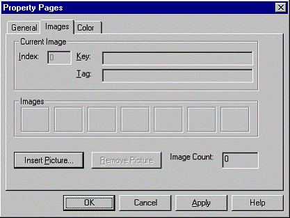
Click the Images tab to display the ImageList control's Property Pages, as shown in Figure 2.1.
Figure 2.1 ImageList control Property Pages dialog box
Click Insert Picture to display the Select Picture dialog box.
Use the dialog box to find either bitmap or icon files, and click Open.
Note You can select multiple bitmap or icon files.
Assign a unique Key property setting by clicking in the Key box and typing a string.
Optional. Assign a Tag property setting by clicking in the Tag box and typing a string. The Tag property doesn't have to be unique.
Repeat steps 3 through 6 until you have populated the control with the desired images.
To add an image at run time, use the Add method for the ListImages collection in conjunction with the LoadPicture function. The following example occurs in a form's Load event; an ImageList control named "imlImages" is loaded with a single bitmap:
Private Sub Form_Load()
' Assuming the path is correct, the open.bmp
' picture will be added to the ListImages
' collection. The Key property will also be
' assigned the value "open"
imlImages.ListImages. _
Add ,"open", LoadPicture("c:\bitmaps\open.bmp")
End Sub
Assigning a unique Key property value to the ListImage object allows you to create code that is easier to read. When assigning the image to a property, you can use its Key value instead of its Index value. Thus, assigning an image to a property might result in code like the following:
' Assign an image to a TreeView control Node object.
' The unique key of the image is "open".
TreeView1.Nodes.Add , , ,"Folder1","open"
The control can also contain any size .bmp or .ico image, and the images can differ in file size, although their display size will be the same. Generally, the display size of the first image inserted into the control determines the display size of images that are inserted afterwards. For example, if you first insert an icon that is 32 X 32 pixels, all images that you insert after it will also be displayed at that size in other controls.
Note An exception is when you use an image from the ImageList control with the Image control. Setting the Image control's Stretch property to True will cause the image to resize to fit the control.
At design time, you can specify the height and width, in pixels, of images in the control by choosing a size from the General tab of the ImageList control's Property Pages dialog box. You can choose a predetermined size, or click Custom and set the image size by typing the size you desire in the Height and Width boxes. This can only be done when the ImageList contains no images. Attempting to change the size after the control contains images will result in an error.
You can use the ImageList control to create a composite image (a picture object) from two images by using the Overlay method in conjunction with the MaskColor property. For example, if you have an "international no" image (a circle with a diagonal bar inside it), you can lay that image over any other image, as shown:

The syntax for the Overlay method requires two arguments. The first argument specifies the underlying image; the second argument specifies the image that overlays the first. Both arguments can be either the Index or the Key property of a ListImage object.
Thus the code to achieve the effect above is as follows:
' The composite image appears in a PictureBox
' control named "picOver". The Index value of
' the cigarette image is 2; the index value of the
' "no" symbol is 1.
ImageList1.MaskColor = vbGreen
Set picOver.Picture = ImageList1.Overlay(2, 1)
You could also use the Key property of the images, resulting in this code:
' Assuming the first image's Key is "smokes", and the
' second is "no".
Set picOver.Picture = ImageList1.Overlay("smokes","no")
The code example above also illustrates how the MaskColor property works. In brief, the MaskColor property specifies the color which will become transparent when an image is overlaid over another. The "no" image has a green background color. Thus, when the code specifies that the MaskColor will be vbGreen (an intrinsic constant), the green in the image becomes transparent in the composite image.
You can use the ImageList control as a repository of images for use by other Windows Common Controls and by controls with a Picture property.
The ImageList control can be used to supply images for the following controls using certain of their properties, as listed in the following table.
|
Windows Common Control |
Control Object |
Properties Settable with ImageList Images |
|
|
||
|
ListView control |
ListItem |
SmallIcon and Icon properties |
|
TreeView control |
Node |
Image and SelectedImage properties |
|
Toolbar control |
Button |
Image property |
|
TabStrip control |
Tab |
Image property |
For More Information For examples of using the ImageList with the TreeView, ListView, Toolbar, and TabStrip controls, see the scenario topics for those controls. (For example, see "TreeView Control Scenario: Bind the TreeView to the Biblio.mdb Database.")
To use the ImageList with these controls, you must first associate the ImageList with the other control, and then assign either the Key or Index property to one of the properties listed in the table above. This can be done at design time or run time. All of the Windows Common controls, except the ListView control (discussed in this topic), have an ImageList property that can be set with the name of the ImageList control you are using.
Important You should populate the ImageList control with images before you associate it with another control. Once you have associated an ImageList with a control, and assigned any image to a property of the control, the ImageList control will not allow you to add any more images.
To associate the ImageList control with the TreeView, TabStrip, or Toolbar control at design time
Right-click on the control using images from the ImageList control and click Properties to display the Property Pages dialog box
On the General tab, select the name of the ImageList control from the ImageList box.
To associate the ImageList control at run time, you might use the following code:
' Associate an ImageList named "imlImages" with a
' TreeView control named "tvwDB."
Set tvwDB.ImageList = imlImages
Once you have associated an ImageList control with another control, you can set properties for various objects using either the Key or Index property of an image in the ImageList control. For example, the following code sets the Image property of a TreeView control's Node object to an ImageList image with the Key property "leaf."
Private Sub Form_Load()
' The TreeView is named "tvwData."
' Add a node and set its Image property.
' The Key value of the image is "leaf."
tvwData.Nodes.Add , ,"1 node","Top","leaf"
End Sub
The ListView control can use two ImageList controls simultaneously. Instead of having a single ImageList property, the ListView control has an Icons and a SmallIcons property, each of which can be associated with an ImageList control. This can be done at design time or at run time.
To associate two ImageList controls with the ListView control at design time
Right-click on the ListView control and click Properties to display the Property Pages.
Click the ImageLists tab.
In the Normal box, select the name of an ImageList control
In the Small box, select the name of another ImageList control.
You can also assign the ImageList controls at run time with code like that shown in the following example:
' Assuming the ListView control is named "lvwDB", the
' first ImageList is named "imlSmallImages," and the
' second is named "imlImages."
Set lvwDB.SmallIcons = imlSmallImages
Set lvwDB.Icons = imlImages
The ImageList control used depends on the display mode determined in the View property of the ListView control. When the ListView control is in Icon view, it uses the images supplied by the ImageList named in the Icons property. In any of the other views (List, Report, or SmallIcon), the ListView uses the images from the ImageList named in the SmallIcons property.
For More Information For details about the ListView control see "Using the ListView Control" later in this chapter.
After you have associated the ImageList control with one of the Windows Common Controls, you can specify a particular image using the image's Index or Key property.
For example, if you are using the ImageList with a TreeView control, the following code will assign the third ListImage object (which has an Index value of 3) to a new Node object's Image property:
' The TreeView control is named "tvwDB."
' The fifth argument of the Add method
' specifies an image by either the ListImage
' object's Index or Key property.
tvwDB.Nodes.Add , , ,"node x", 3
On the other hand, you could use the Key property to achieve the same end:
' Assuming the Key property is "open."
tvwDB.Nodes.Add , , ,"node x", "open"
Because the ListImage object's Key property must be a unique string, at run time, you can then use the Key property instead of the Index property to reference the image. This results in code that is easier to read.
Tip Because the Key must be a unique string, using a descriptive name for each ListImage object will make your code easier to read and debug.
You can also use the ImageList as an image repository for objects which have a Picture property. These include the following:
CommandButton control
OptionButton control
Image control
PictureBox control
CheckBox control
Form object
Panel object (StatusBar control)
The ListImage object's Picture property returns a Picture object, which can be assigned to another control's Picture property. For example, the following code will display the third ListImage object in a PictureBox control named "picBox":
Set picBox.Picture = ImageList1.ListImages(3).Picture
Toolbars typically contain a row of buttons where each button performs a frequently used operation when pressed. Toolbar buttons often save screen space by using images to represent the operation. In this scenario, three common functions opening, saving, and printing a file are represented by images assigned to Button objects of a Toolbar control. The images and buttons commonly used to represent these functions are shown here:
![]()
These objects are used in the following example:
ImageList control named "imlTool"
Toolbar control named "tbrStandard"
To add images to a Toolbar control
Add images to the ImageList and assign unique Key property values to each object.
Associate the ImageList with the Toolbar control.
Assign images to Button objects using the Buttons tab.
To add ListImage objects at design time
Right-click the ImageList control and click Properties to display the Property Pages dialog box.
Click the Images tab.
Click Insert Picture to display the Select Picture dialog box.
Use the dialog box to find the bitmap files in the following table. The bitmaps can be found in the \Tools\Bitmaps\Tlbr_w95 directory of your Visual Basic CD-ROM.
After finding a file, click the file, and click Open, or double-click the file to open insert it into the ImageList control.
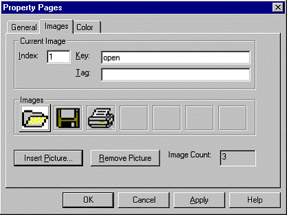
In the Images tab, click the Key box and type the Key property value, as found in the following table. The Images tab should resemble Figure 2.2.
|
File |
Key |
|
|
|
|
open.bmp |
open |
|
save.bmp |
save |
|
print.bmp |
|
Figure 2.2 Images tab with three ListImage objects
Before you can assign the images to Button objects, you must first associate the ImageList with the Toolbar control.
To associate an ImageList with a Toolbar control
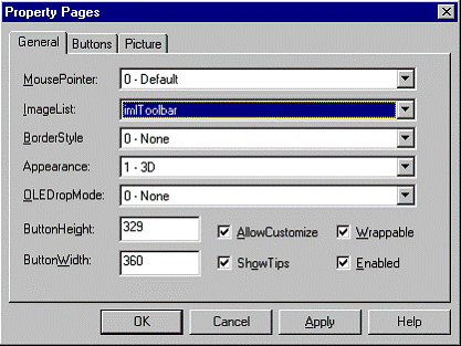
Right-click on the Toolbar control and click Properties to display the control's Property Pages, as shown in Figure 2.3.
On the General tab, select the name of the ImageList control from the ImageList box
Figure 2.3 Associate an ImageList with a Toolbar control
To assign an image to a Button object
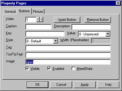
Click the Buttons tab (on the Toolbar control's Property Pages dialog box) to display the Buttons tab, shown in Figure 2.4.
Click Insert Button to insert a new Button object.
Click the Image box and type the Key value of a ListImage object.
Click Apply
Repeat steps 2 to 4 to add more buttons, and assign images to the new Button objects.
Figure 2.4 Add Button objects and assign Images using the Buttons tab
The ListView control displays data as ListItem objects. Each ListItem object can have an optional icon associated with the label of the object. The control excels at representing subsets of data (such as members of a database) or discrete objects (such as document templates).
To display the results of a query on a database.
To display all the records in a database table.
In tandem with a Treeview control, to give users an expanded view of a TreeView control node.
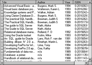
The ListView control can display data in four different view modes (as shown in Figures 2.5 to 2.8). How you program the control may depend on which of the different views you allow the end user to see (or select).
Each of these views has a particular advantage over the others. Some of these are listed in the following table:
|
View |
Advantage |
|
|
|
|
Icon |
Can be manipulated with the mouse, allowing the user to drag and drop the object and rearrange the objects. |
|
SmallIcon |
Allows more ListItem objects to be viewed. Like Icon view, objects can be rearranged by the user. |
|
List |
Presents a sorted view of ListItems object. |
|
Report |
Presents a sorted view, with SubItems allowing extra information to be displayed. |
Figure 2.5 ListView in Icon view
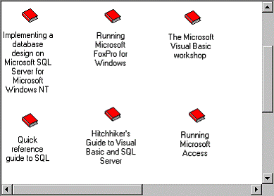
Figure 2.6 ListView in SmallIcon view
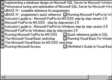
Figure 2.7 ListView in List view
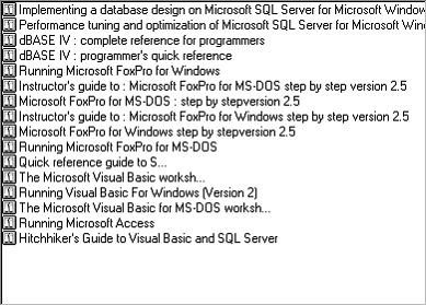
Figure 2.8 ListView in Report view
To change the display mode, use the View property. The following code sets the View property to the Report view (3), using the intrinsic constant lvwReport:
' The name of the control is "ListView1"
ListView1.View = lvwReport
Using the View property, you can allow the end user to dynamically change the view. In the Form's Load event, the ComboBox is populated with View choices:
Private Sub Form_Load()
' Populate the ComboBox control. The
' ComboBox control is named "cmbChooseView."
With cmbChooseView
. AddItem "Icon" '0
. AddItem "Small Icon" ' 1
. AddItem "List" ' 2
. AddItem "Report" '
3
End With
End Sub
In the ComboBox control's Click event, the View of the control can then be reset, as shown:
Private Sub cmbChooseView_Click()
' The name of the ListView control is "lvwDB."
lvwDB.View = cmbChooseView.ListIndex
End Sub
A ListItem object consists of a label (the Text property) and an optional image which is supplied by an ImageList control. However, the ListView control, unlike other controls, can use two ImageList controls, which you set using the Icons and SmallIcons properties. Whether or not you use one or both ImageList controls depends on the intended display mode, as determined by the View property.
In the List, SmallIcon, and Report views, you can use a small icon to represent the ListItem object. One ImageList control (specified by the SmallIcons property) supplies the images for use in any of these three views. At design time or run time, set the SmallIcons property to the ImageList control that will supply these images. At design time, use the ListView control's Property Pages dialog box to set the ImageList for the SmallIcons. At run time, use the following code:
ListView1.SmallIcons = imlSmallIcons
In contrast, when the control is in Icon view, the control uses a different set of images supplied by a second ImageList control. Set the Icons property to this second ImageList control at design time using the Property Pages dialog box, or use the following code at run time:
ListView1.Icons = imlIcons
Note The size of the icons you use is determined by the ImageList control. The available sizes are 16 x 16, 32 x 32, 48 x 48, and Custom.
If you are planning to use more than one view, and you wish to display images, you must set the SmallIcon and Icon properties for each ListItem object. The following code first declares an object variable of type ListItem, then sets the object variable to a single ListItem object added to the collection using the Add method. The SmallIcon and Icon images are then set with the object variable reference:
Dim itmX as ListItem
Set itmX = ListView1.ListItems.Add()
' Assuming an image named "smallBook" exists in the
' ImageList set to the SmallIcons property.
itmX.SmallIcon = "smallBook"
' Assuming an image named "BigBook" exists in the
' ImageList that is set to the Icons property.
itmX.Icon = "BigBook"
After setting an image with the SmallIcon and Icon properties, the correct image will be displayed automatically when switching views using the View property.
A unique feature of the Report view is ColumnHeader objects. The ListView control contains a collection of ColumnHeader objects in the ColumnHeaders collection. Figure 2.9 shows a ColumnHeader:
Figure 2.9 A ColumnHeader

The ColumnHeader object has a Text property that displays text when the control is in Report view. You can also set the Width property of each ColumnHeader, as well as the Alignment property (which sets the alignment of the text displayed in the ColumnHeader object). The following example code creates four ColumnHeader objects and sets their Text and Width properties:
Dim colX As ColumnHeader ' Declare variable.
Dim intX as Integer ' Counter variable.
For intX = 1 to 4
Set colX = ListView1.ColumnHeaders.Add()
colX.Text = "Field " & intX
colX.Width = ListView1.Width / 4
Next intX
Set Column Text with the SubItems Property
Notice that in any of the views except Report view, the ListItem object displays only one label the Text property. But in Report view, every ListItem object can have several other text items. For example, in Figure 2.11, the "Hitchhiker's Guide to Visual Basic " also has an author ("Vaughn, William R."), year (1996), and ISBN number associated with it. Each of these text items are properties of the ListItem object, specifically, its SubItems property. Further, because there can be any number of these text items, the SubItems property is in fact an array of strings. Thus, to set the author, year and ISBN number of a ListItem object, the code might look like this:
' The control is named lvwAuthors.
lvwAuthor.ListItems(23).Text = _
"Hitchhiker's Guide to Visual Basic and SQL Server"
lvwAuthor.ListItems(23).SubItems(1)= _
"Vaughn, William R."
lvwAuthor.ListItems(23).SubItems(2)= "1996"
lvwAuthor.ListItems(23).SubItems(3)= " 1-55615-906-4"
Both the presence and number of SubItems depends on the presence and number of ColumnHeader objects. That is, you cannot set any SubItems if there are no ColumnHeader objects present. Further, the number of ColumnHeader objects determines the number of SubItems you can set for the ListItem object. And the number of SubItems is always one less than the number of ColumnHeader objects. This is because the first ColumnHeader object is always associated with the Text property of the ListItem object, as shown in figure 2.10:
Figure 2.10 First ColumnHeader and SubItems

Thus, if the number of ColumnHeader objects in the above example is 4, then the maximum possible number of SubItems you can set is 3.
A ProgressBar control allows you to graphically represent the progress of a transaction. The control consists of a frame that is filled as the transaction occurs. The Value property determines how much of the control has been filled. The Min and Max properties set the limits of the control.
Use the ProgressBar whenever an operation will take more than a few seconds to complete. You must also know how long the process will take by using a known end point and setting it as the Max property of the control.
Tip Giving the user visual feedback on how much time remains on a lengthy operation gives the perception of improved performance.
To inform the user of progress as a file transfer occurs over a network.
To reflect the state of a process that takes more than a few seconds.
To inform the user of progress as a complex algorithm is being calculated.
To show progress in an operation, the Value property is continually incremented until a maximum defined by the Max property is reached. Thus the number of chunks displayed by the controls is always a ratio of the Value property to the Min and Max properties. For example, if the Min property is set to 1, and the Max property is set to 100, a Value property of 50 will cause the control to display 50 percent of the chunks, as shown:
![]()
To program the ProgressBar, you must have a limit to which the Value property will climb. For example, if you are performing downloading a file, and your application can determine how large the files is in kilobytes, you can set the Max property to that number. As the file is downloaded, your application must also have some way of determining how many kilobytes have been downloaded; set the Value property to that number.
In cases where a Max property can't be determined in advance, you may want to use the Animation control to continuously show an animation until a Stop method is invoked in a terminate event.
A progress bar usually doesn't appear until an operation has begun, and disappears again after the operation ends. Set the Visible property to True to show the control at the start of an operation, and reset the property to False to hide the control when the operation finishes.
Applications that create processes over networks often have a "TimeOut" interval. This is a predetermined period of time after which the user will be presented with the choice of canceling a process, or continuing to wait. One way of graphically representing the TimeOut interval is with the ProgressBar control.
The following example uses the following objects:
Form Object named "frmTimer"
ProgressBar control named "prgBar1"
Timer control named "tmrTimer"
CommandButton control named "cmdBegin"
To create a progress bar that reflects a TimeOut interval
In the Form's Load event, set a Timer control's Interval property to 1000.
Set the ProgressBar control's Max property to the TimeOut Interval.
Begin the Timer with the Enabled property
In the Timer control's Timer event, declare a Static variable to count the number of intervals.
Set the ProgressBar's value to the variable.
Test to see if the ProgressBar's value is the Max property.
In the Form object's Load event, configure the Timer control's Interval property. Because it's more useful to time a process in seconds, set the Interval to 1000 (milliseconds, or 1 second). Thus, at one second intervals, the ProgressBar control's Value property is updated.
tmrTimer.Interval = 1000
The Load event is also where you set the Max property of the ProgressBar. The value of the Max property should be the number of seconds you want the Timer to continue before being disabled. However, to accurately reflect the number of seconds that must elapse, the ProgressBar's Min property should be set to 1.
The Load event can also be used to hide the ProgressBar by setting its Visible property to False. The following code shows the entire Load event with the previous code included.
Private Sub Form_Load()
prgBar1.Visible = False
tmrTimer.Interval = 1000
prgBar1.Max = 10 ' Timer will go for 10 seconds.
End Sub
To start the timer, you must use the Enabled property. When you begin to time any process, you should also show the ProgressBar, as shown:
Private Sub cmdBegin_Click()
prgBar1.Visible = True
tmrTimer.Enabled = True
End Sub
In the Timer event, declare a static variable. This allows you to efficiently increment the variable every time the Timer event occurs. But as we don't wish to count from 0, we must also set the variable to 1, using the IsEmpty function, as shown:
Static intTime
If IsEmpty(intTime) Then intTime = 1
Each time the Timer event occurs, the ProgressBar's Value property must be set to the value of the static variable:
prgBar1.Value = intTime
After the ProgressBar's Value property has been updated, the variable must be tested to see if the TimeOut limit has occurred. If it has been reached, the variable must be reset to 1, the ProgressBar control hidden and its Value property reset to 1, and the Timer control disabled. If the limit hasn't been reached, then the variable is incremented by one. These steps are all implemented with an If statement, in the Timer event, as shown:
Private Sub tmrTimer_Timer()
Static intTime ' Declare the static variable.
' The first time, the variable will be empty.
' Set it to 1 if it is an empty variable.
If IsEmpty(intTime) Then intTime = 1
prgBar1.Value = intTime ' Update the ProgressBar.
If intTime = prgBar1.Max Then
Timer1.Enabled = False
prgBar1.Visible = False
intTime = 1
prgBar1.Value = prgBar1.Min
Else
intTime = intTime + 1
End If
End Sub
Here is the complete code for the example described in this topic:
Private Sub Form_Load()
prgBar1.Visible = False
tmrTimer.Interval = 1000
prgBar1.Max = 10 ' Timer will go for 10 seconds.
End Sub
Private Sub cmdBegin_Click()
prgBar1.Visible = True
tmrTimer.Enabled = True
End Sub
Private Sub tmrTimer_Timer()
Static intTime ' Declare the static variable.
' The first time, the variable will be empty.
' Set it to 1 if it is an empty variable.
If IsEmpty(intTime) Then intTime = 1
prgBar1.Value = intTime ' Update the ProgressBar.
If intTime = prgBar1.Max Then
Timer1.Enabled = False
prgBar1.Visible = False
intTime = 1
prgBar1.Value = prgBar1.Min
Else
intTime = intTime + 1
End If
End Sub
|