![]()
Chartists study market action, trying to identify recurrent price patterns. Their goal is to profit from trading when patterns recur. Most chartists work with bar graphs showing high, low, and closing prices and volume. Some also watch opening prices and open interest. Point-and-figure chartists track only price changes and ignore time, volume, and open interest.
Classical charting requires only a pencil and paper. It appeals to visually oriented people. Those who plot data by hand often develop a physical feel for prices. Computers speed charting at a cost of losing some of that feel.
The biggest problem in charting is wishful thinking. Traders often convince themselves that a pattern is bullish or bearish depending on whether they want to buy or to sell.
Early in this century Herman Rorschach, a Swiss psychiatrist, designed a test for exploring a person's mind. He dropped ink on 10 sheets of paper and folded each in half, creating a symmetrical inkblot. Most people who peer at these sheets describe what they see: parts of the anatomy, animals, buildings, and so on. In reality, there are only inkblots! Each person sees what's on his mind. Most traders use charts as a giant Rorschach test. They project their hopes, fears, and fantasies onto the charts.
Brief History
The first chartists in the
Dow never wrote a book, only the Wall Street Journal editorials.
The decade of the 1930s was the Golden Age of charting. Many innovators found
themselves with time on their hands after the crash of 1929. Schabaker, Rhea, Elliott,
In 1948, Edwards (who was a son-in-law of Schabaker) and Magee published Technical Analysis of Stock Trends. They popularized such concepts as triangles, rectangles, head-and-shoulders, and other chart formations, as well as support and resistance and trendlines. Other chartists have applied these concepts to commodities.
Markets have changed a great deal since the days of Edwards and Magee. In the 1940s, daily volume of an active stock on the New York Stock Exchange was only several hundred shares, while in the 1990s it often exceeds a million. The balance of power in the stock market has shifted in favor of bulls. Early chartists wrote that stock market tops were sharp and fast, while bottoms took a long time to develop. That was true in their deflationary era, but the opposite has been true since the 1950s. Now bottoms tend to form quickly while tops tend to take longer.
The Meaning of a Bar Chart
Chart patterns reflect the tides of greed and fear among traders. This book focuses on daily charts, but you can apply many of its principles to other data. The rules for reading weekly, daily, hourly, or intraday charts are very similar.
Each price is a momentary consensus of value of all market participants
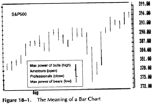
Opening prices are set by amateurs, whose orders accumulate
overnight and hit the market in the morning.
Closing prices are largely set by market professionals, who trade throughout
the day. Note how often opening and closing prices are at opposite ends
of a bar.
The high of each bar marks the maximum power of bulls during that bar. The low of each bar marks the maximum power of bears during that bar. Slippage tends to be less when you enter or exit positions during short bars.
expressed in action. Each price bar provides several pieces of information about the balance of power between bulls and bears (Figure 18-1).
The opening price of a daily or a weekly bar usually reflects the amateurs' opinion of value. They read morning papers, find out what happened the day before, and call their brokers with orders before going to work. Amateurs are especially active early in the day and early in the week.
Traders who researched the relationship between opening and closing prices for several decades found that opening prices most often occur near the high or the low of the daily bars. Buying or selling by amateurs early in the day creates an emotional extreme from which prices recoil later in the day.
In bull markets, prices often make their low for the week on Monday or Tuesday on profit taking by amateurs, then rally to a new high on Thursday or Friday. In bear markets, the high for the week is often set on Monday or Tuesday, with a new low toward the end of the week, on Thursday or Friday.
The closing prices of daily and weekly bars tend to reflect the actions of professional traders. They watch the markets throughout the day, respond to changes, and become especially active near the close. Many of them take profits at that time to avoid carrying trades overnight.
Professionals as a group usually trade against the amateurs. They tend to buy lower openings, sell short higher openings, and unwind their positions as the day goes on. Traders need to pay attention to the relationship between opening and closing prices. If prices closed higher than they opened, then market professionals were probably more bullish than amateurs. If prices closed lower than they opened, then market professionals were probably more bearish than amateurs. It pays to trade with the professionals and against the amateurs.
The high of each bar represents the maximum power of bulls during that bar. Bulls make money when prices go up. Their buying pushes prices higher, and every uptick adds to their profits. Finally, bulls reach a point where they cannot lift prices - not even by one more tick. The high of a daily bar represents the maximum power of bulls during the day, and the high of a weekly bar marks the maximum power of bulls during the week; the high of a 5-minute bar reflects the maximum power of bulls during that 5-minute period. The highest point of a bar represents the maximum power of bulls during that bar.
The low of each bar represents the maximum power of bears during that bar. Bears make money when prices go down. They keep selling short, their selling pushes prices lower, and every downtick adds to their profits. At some point they run out of either capital or enthusiasm, and prices stop falling. The low of each bar shows the maximum power of bears during that bar. The low of a daily bar marks the maximum power of bears during that day, and the low of a weekly bar identifies the maximum power of bears during that week.
The closing tick of each bar reveals the outcome of a battle between bulls and bears during that bar. If prices close near the high of the daily bar, it shows that bulls won the day's battle. If prices close near the low of the day, it shows that bears won the day. Closing prices on daily charts of the futures markets are especially important. The amount of money in your account depends on them because your account equity is "marked to market" each night.
The distance between the high and the low of any bar reveals the intensity of conflict between bulls and bears. An average bar marks a relatively cool market. A bar that is only half as long as average reveals a sleepy, disinterested market. A bar that is two times taller than average shows a boiling market where bulls and bears battle all over the field.
Slippage (see Section 3) is usually lower in quiet markets. It pays to enter your trades during short or normal bars. Tall bars are good for taking profits. Trying to put on a position when the market is running is like jumping on a moving train. It is better to wait for the next one.
Japanese Candlesticks
Japanese
rice traders began using candlestick charts some two centuries before the first chartists appeared in
The tip of the upper wick represents the high of the day, and the bottom of the lower wick represents the low of the day. The Japanese consider highs and lows relatively unimportant, according to Steve Nison, author of Japanese Candlestick Charting Techniques. They focus on the relationship between opening and closing prices and on patterns that include several candles.
The main advantage of a candlestick chart is its focus on the struggle between amateurs who control openings and professionals who control closings. Unfortunately, most candlestick chartists fail to use many tools of Western analysts. They ignore volume and have no trendlines or technical indicators. These gaps are being filled by modern American analysts such as Greg Morris, whose Candlepower software combines Western technical indicators with classical candlestick patterns.
Market Profile
This charting technique for tracking accumulation and distribution during each trading session was developed by J. Peter Steidlmayer. Market Profile requires access to real-time data-a constant flow of quotes throughout the day. It assigns one letter of the alphabet to each half-hour of trading. Each price level reached during that half-hour is marked with its own letter. As prices change, more and more letters fill the screen, creating a bell-shaped curve. When prices erupt in a trend, Market Profile reflects that by becoming elongated. Market Profile is sometimes combined with Liquidity Data Bank. It tracks intraday volume of trading by several groups-floor traders, hedgers, and off-the-floor traders.
Efficient Markets, Random Walk, and Nature's Law
Efficient Market theory is an academic notion that nobody can outperform the market because any price at any given moment incorporates all available information. Warren Buffet, one of the most successful investors of our century, commented: "I think it's fascinating how the ruling orthodoxy can cause a lot of people to think the earth is flat. Investing in a market where people believe in efficiency is like playing bridge with someone who's been told it doesn't do any good to look at the cards."
The logical flaw of Efficient Market theory is that it equates knowledge with action. People may have knowledge, but the emotional pull of the crowd often leads them to trade irrationally. A good analyst can detect repetitive patterns of crowd behavior on his charts and exploit them.
Random Walk theorists claim that market prices change at random. Of course, there is a fair amount of randomness or "noise" in the markets, just as there is randomness in any other crowd milling around. An intelligent observer can identify repetitive behavior patterns of a crowd and make sensible bets on their continuation or reversal.
People have memories, they remember past prices, and their memories influence their buying and selling decisions. Memories help create support under the market and resistance above it. Random Walkers deny that memories of the past influence our behavior in the present.
As Milton Friedman has pointed out, prices carry information about the availability of supply and the intensity of demand. Market participants use that information to make their buying and selling decisions. For example, consumers buy more merchandise when it is on sale and less when prices are high. Financial traders are just as capable of logical behavior as homemakers in a supermarket. When prices are low, bargain hunters step in. A shortage can lead to a buying panic, but high prices choke off demand.
Nature's Law is the rallying cry of a clutch of mystics who oppose Random Walkers in the financial markets. Mystics claim that there is a perfect order in the markets, which they say move like clockwork in response to immutable natural laws. R. N. Elliott even titled his last book Nature's Law.
The "perfect order" crowd gravitates to astrology and looks for links between prices and the movements of the planets. Most mystics try to hide their astrological bent, but it is easy to draw them out of a shell. Next time someone talks to you about natural order in the markets, ask him about astrology. He will probably jump at the chance to come out of the closet and talk about the stars.
Those who believe in perfect order in the markets accept that tops and bottoms can be predicted far into the future. Amateurs love forecasts, and mysticism provides a great marketing gimmick. It helps sell courses, trading systems, and newsletters.
Mystics, Random Walk academics, and Efficient Market theorists have one trait in common. They are equally divorced from the reality of the markets. Extremists argue with one another but they think alike.
A ball hits the floor and bounces. It drops after it hits the ceiling. Support and resistance are like a floor and a ceiling, with prices sandwiched between them. Understanding support and resistance is essential for understanding price trends and chart patterns. Rating their strength helps you decide whether the trend is likely to continue or to reverse.
Support is a price level where buying is strong enough to interrupt or reverse a downtrend. When a downtrend hits support, it bounces like a diver who hits the bottom and pushes away from it. Support is represented on a chart by a horizontal or near-horizontal line connecting several bottoms (Figure 19-1).
Resistance is a price level where selling is strong enough to interrupt or reverse an uptrend. When an uptrend hits resistance, it stops or tumbles down like a man who hits his head on a branch while climbing a tree. Resistance is represented on a chart by a horizontal or near-horizontal line connecting several tops.
It is better to draw support and resistance lines across the edges of congestion areas instead of extreme prices. The edges show where masses of traders have changed their minds, while the extreme points reflect only panic among the weakest traders.
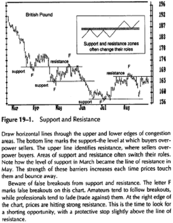
Minor support or resistance causes trends to pause, while
major support or resistance causes them to reverse. Traders
buy at support and sell at resistance, making
their effectiveness a self-fulfilling prophecy.
Memories, Pain, and Regret
Support and resistance exist because people have memories. Our memories prompt us to buy and sell at certain levels. Buying and selling by crowds of traders creates support and resistance.
If traders remember that prices have recently stopped falling and turned up from a certain level, they are likely to buy when prices approach that level again. If traders remember that an uptrend has recently reversed after rising to a certain peak, they tend to sell and go short when prices approach that level again.
For example, all major rallies in the stock market from 1966 until 1982 ended whenever the Dow Jones Industrial Average rallied to 950 or 1050. The resistance was so strong that traders named it "A Graveyard in the Sky." Once the bulls rammed the market through that level, it became a major support area.
Support and resistance exist because masses of traders feel pain and regret. Traders who hold losing positions feel intense pain. Losers are determined to get out as soon as the market gives them another chance. Traders who missed an opportunity feel regret and also wait for the market to give them a second chance. Feelings of pain and regret are mild in trading ranges where swings are small and losers do not get hurt too badly. Breakouts from trading ranges create intense pain and regret.
When the market stays flat for a while, traders get used to buying at the lower edge of the range and shorting at the upper edge. In uptrends, bears who sold short feel pain and bulls feel regret that they did not buy more. Both feel determined to buy if the market gives them a second chance. The pain of bears and regret of bulls make them ready to buy, creating support during reactions in an uptrend.
Resistance is an area where bulls feel pain, bears feel regret, and both are ready to sell. When prices break down from a trading range, bulls who bought feel pain, feel trapped, and wait for a rally to let them get out even. Bears regret that they have not shorted more and wait for a rally to give them a second chance to sell short. Bulls' pain and bears' regret create resistance - a ceiling above the market in downtrends. The strength of support and resistance depends on the strength of feelings among masses of traders.
Strength of Support and Resistance
A congestion area that has been hit by several trends is like a cratered battlefield. Its defenders have plenty of cover, and an attacking force is likely to slow down. The longer prices stay in a congestion zone, the stronger the emotional commitment of bulls and bears to that area. When prices approach that zone from above, it serves as support. When prices rally into it from below, it acts as resistance. A congestion area can reverse its role and serve as either support or resistance.
The strength of every support or resistance zone depends on three factors: its length, its height, and the volume of trading that has taken place in it. You can visualize these factors as the length, the width, and the depth of a congestion zone.
The longer a support or resistance area -its length of time or the number of hits it took-the stronger it is. Support and resistance, like good wine, become better with age. A 2-week trading range provides only minimal support or resistance, a 2-month range gives people time to become used to it and creates intermediate support or resistance, while a 2-year range becomes accepted as a standard of value and offers major support or resistance.
As support and resistance levels grow old, they gradually become weaker. Losers keep washing out of the markets, replaced by newcomers who do not have the same emotional commitment to old price levels. People who lost money only recently remember full well what happened to them. They are probably still in the market, feeling pain and regret, trying to get even. People who made bad decisions several years ago are probably out of the markets and their memories matter less.
The strength of support and resistance increases each time that area is hit. When traders see that prices have reversed at a certain level, they tend to bet on a reversal the next time prices reach that level.
The taller the support and resistance zone, the stronger it is. A tall congestion zone is like a tall fence around a property. A congestion zone whose height equals 1 percent of current market value (four points in the case of the S&P 500 at 400) provides only minor support or resistance. A congestion zone that is 3 percent tall provides intermediate support or resistance, and a congestion zone that is 7 percent tall or higher can grind down a major trend.
The greater the volume of trading in a support and resistance zone, the stronger it is. High volume in a congestion area shows active involvement by traders - a sign of strong emotional commitment. Low volume shows that traders have little interest in transacting at that level - a sign of weak support or resistance.
Trading Rules
1. Whenever the trend you are riding approaches support or resistance, tighten your protective stop. A protective stop is an order to sell below the market when you are long or to cover shorts above the market when you are short. This stop protects you from getting badly hurt by an adverse market move. A trend reveals its health by how it acts when it hits support or resistance. If it is strong enough to penetrate that zone, it accelerates, and your tight stop is not touched. If a trend bounces away from support or resistance, it reveals its weakness. In that case, your tight stop salvages a good chunk of profits.
Support and resistance are more important on long-term charts than on short-term charts. Weekly charts are more important than dailies. A good trader keeps an eye on several timeframes and defers to he longer one. If the weekly trend is sailing through a clear zone, the fact that the daily trend is hitting resistance is less important. When a weekly trend approaches support or resistance, you should be more inclined to act.
Support and resistance levels are useful for
placing stop-loss and protect-profit orders. The bottom of a
congestion area is the bottom line of support. If you buy and place your stop
below that level, you give
the uptrend plenty of room. More cautious traders buy
after an upside breakout and place a stop in the middle of a
congestion area. A true upside breakout should not be followed by a
pullback into the range, just as a rocket is not supposed to sink back
to its launching pad. Reverse this procedure in downtrends.
Many traders avoid placing stops at round numbers. This superstition began with off-the-cuff advice by Edwards and Magee to avoid placing stops at round numbers because "everybody" was placing them there. Now, if traders buy copper at 92, they place a stop at 89.75 rather than 90. When they sell a stock short at 76, they place a protective stop at 80.25 rather than 80. These days there are fewer stops at round numbers than at fractional numbers. It is better to place your stops at logical levels, round or not.
Trend and False Breakouts
Markets spend more time in trading ranges than they do in trends. Most breakouts from trading ranges are false breakouts. They suck in trend-followers just before prices return into the trading range. A false breakout is the bane of amateurs, but professional traders love them.
Professionals expect prices to fluctuate without going very far most of the time. They wait until an upside breakout stops reaching new highs or a downside breakout stops making new lows. Then they pounce -they fade the breakout (trade against it) and place a protective stop at the latest extreme point. It is a very tight stop, and their risk is low, while there is a big profit potential from a pullback into the congestion zone. The risk/reward ratio is so good that professionals can afford to be wrong half the time and still come out ahead of the game.
The best time to buy an upside breakout on a daily chart is when your analysis of the weekly chart suggests that a new uptrend is developing. True breakouts are confirmed by heavy volume, while false breakouts tend to have light volume. True breakouts are confirmed when technical indicators reach new extreme highs or lows in the direction of the trend, while false breakouts are often marked by divergences between prices and indicators.
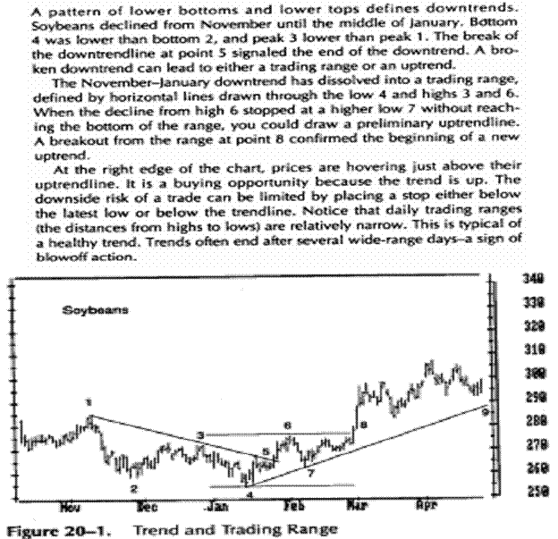
Traders try to profit from changes in prices: Buy low and sell high, or sell short high and cover low. Even a quick look at a chart reveals that markets spend most of their time in trading ranges. They spend less time in trends.
A trend exists when prices keep rising or falling over time. In an uptrend, each rally reaches a higher high than the preceding rally and each decline stops at a higher level than the preceding decline. In a downtrend, each decline falls to a lower low than the preceding decline and each rally stops at a lower level than the preceding rally. In a trading range, most rallies stop at about the same high and declines peter out at about the same low.
A trader needs to identify trends and trading ranges. It is easier to trade during trends (Figure 20-1). It is harder to make money when prices are flat unless you write options, which requires a special skill.
Trading in trends and in trading ranges calls for different tactics. When you go long in an uptrend or sell short in a downtrend, you have to give that trend the benefit of the doubt and not be shaken out easily. It pays to buckle your seat belt and hang on for as long as the trend continues. When you trade in a trading range, you have to be nimble and close out your position at the slightest sign of a reversal.
Another difference in trading tactics between trends and trading ranges is the handling of strength and weakness. You have to follow strength during trends-buy in uptrends and sell short in downtrends. When prices are in a trading range, you have to do the opposite -buy weakness and sell strength.
Mass Psychology
An uptrend emerges when bulls are stronger than bears and their buying forces prices up. If bears manage to push prices down, bulls return in force, break the decline, and force prices to a new high. Downtrends occur when bears are stronger and their selling pushes markets down. When a flurry of buying lifts prices, bears sell short into that rally, stop it, and send prices to new lows.
When bulls and bears are equally strong or weak, prices stay in a trading range. When bulls manage to push prices up, bears sell short into that rally and prices fall. Bargain hunters step in and break the decline; bears cover shorts, their buying fuels a minor rally, and the cycle repeats.
A trading range is like a fight between two equally strong gangs. They push one another back and forth on a street corner but neither can control the turf. A trend is like a fight where a stronger gang chases the weaker gang down the street. Every once in a while the weaker gang stops and puts up a fight but then is forced to turn and run again.
Prices in trading ranges go nowhere, just as crowds spend most of their time in aimless milling. Markets spend more time in trading ranges than in trends because aimlessness is more common among people than purposeful action. When a crowd becomes agitated, it surges and creates a trend. Crowds do not stay excited for long -they go back to meandering. Professionals tend to give the benefit of the doubt to trading ranges.
The Hard Right Edge
Identifying trends and trading ranges is one of the hardest tasks in technical analysis. It is easy to find them in the middle of a chart, but the closer you get to the right edge, the harder it gets.
Trends and trading ranges clearly stand out on old charts. Experts show those charts at seminars and make it seem easy to catch trends. Trouble is, your broker does not allow you to trade in the middle of the chart. He says you must make your trading decisions at the hard right edge of the chart!
The past is fixed and easy to analyze. The future is fluid and uncertain. By the time you identify a trend, a good chunk of it is gone. Nobody rings a bell when a trend dissolves into a trading range. By the time you recognize that change, you will lose some money trying to trade as if the market was still trending.
Many chart patterns and indicator signals contradict one another at the right edge of the chart. You have to base your decisions on probabilities in an atmosphere of uncertainty.
Most people cannot accept uncertainty. They have a strong emotional need to be right. They hang onto losing positions, waiting for the market to turn and make them whole. Trying to be right in the market is very expensive. Professional traders get out of losing trades fast. When the market deviates from your analysis, you have to cut losses without fuss or emotions.
Methods and Techniques J
There is no single magic method for identifying trends and trading ranges. There are several methods, and it pays to combine them. When they confirm one another, their message is reinforced. When they contradict one another, it is better to pass up a trade.
Analyze the pattern of highs and lows. When rallies keep reaching higher levels and declines keep stopping at higher levels, they identify an uptrend. The pattern of lower lows and lower highs identifies a downtrend, and the pattern of irregular highs and lows points to a trading range (Figure 20-1).
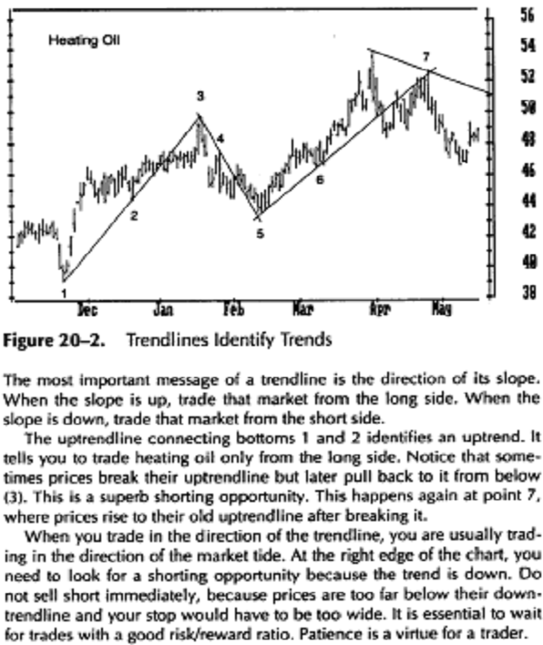
Draw an uptrendline connecting significant recent lows and a down trendline connecting significant recent highs (see Section 21). The slope of the latest trendline identifies the current trend (Figures 20-1,
A significant high or low on a daily chart is the highest high or the lowest low for at least a week. As you study charts, you become better at identifying those points. Technical analysis is partly a science and partly an art.
Plot a 13-day or longer exponential moving average (see Section 25). The direction of its slope identifies the trend. If a moving average has not reached a new high or low in a month, then the market is in a trading range.
Several market indicators, such as MACD (see Section 26)
and the Directional system (Section 27), help
identify trends. The Directional system is
especially good at catching early stages of new trends.
Trade or Wait
When you identify an uptrend and decide to buy, you have to decide whether to buy immediately or wait for a dip. If you buy fast, you get in gear with the trend, but your stops are likely to be farther away and you risk more.
If you wait for a dip, you will risk less but will have four groups of competitors: longs who want to add to their positions, shorts who want to get out even, traders who never bought, and traders who sold too early but are eager to buy. The waiting area for a pullback is very crowded! Markets are not known for their charity, and a deep pullback may well signal the beginning of a reversal. This reasoning also applies to downtrends. Waiting for pull-backs while a trend is gathering steam is an amateur's game.
If the market is in a trading range and you are waiting for a breakout, you have to decide whether to buy in anticipation of a breakout, during a breakout, or on a pullback after a valid breakout. If you trade multiple positions, you can buy a third in anticipation, a third on a breakout, and a third on a pullback.
Whatever method you use, there is one money management rule that will keep you out of the riskiest trades. The distance from the entry point to the level of a protective stop should never be more than 2 percent of your account equity (see Chapter 10). No matter how attractive a trade is, pass it up if it requires a wider stop.
Money management tactics are different in trends and trading ranges. It pays to put on a smaller position in a trend but use a wider stop. Then you will be less likely to get shaken out by reactions while you keep risk under control. You may put on a bigger position in a trading range but use a tighter stop.
Finding good entry points is extremely important in trading ranges. You have to be very precise because the profit potential is so limited. A trend is more forgiving of a sloppy entry, as long as you trade in the direction of the trend. Old traders chuckle: "Do not confuse brains with a bull market." When you cannot tell whether the market is in a trend or in a trading range, remember that professionals give the benefit of the doubt to trading ranges. If you are not sure, stand aside.
Professionals love trading ranges because they can slide in and out of positions with little risk of being impaled on a trend. Since they pay low or no commissions and suffer little slippage, it is profitable for them to trade in gently fluctuating markets. Those of us who trade away from the floor are better off trying to catch trends. You can trade less frequently during trends, and your account suffers less from commissions and slippage.
Most traders ignore the fact that markets usually are both in a trend and in a trading range at the same time! They pick one timeframe such as daily or hourly and look for trades on daily charts. With their attention fixed on daily or hourly charts, trends from other timeframes, such as weekly or 10-minute trends, keep sneaking up on them and wreaking havoc with their plans.
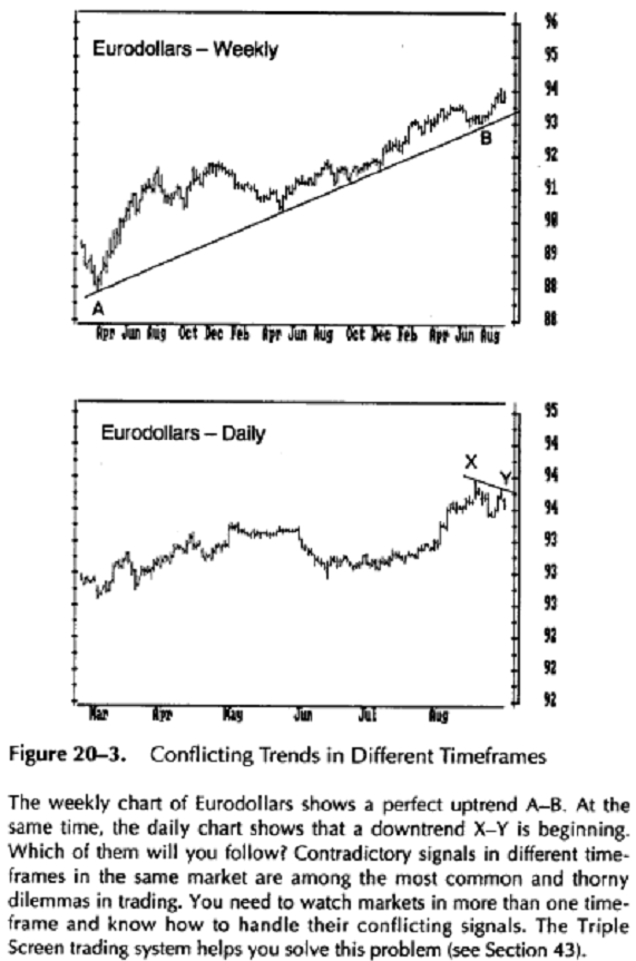
Markets exist in several timeframes simultaneously (see Section 36). They exist on a 10-minute chart, an hourly chart, a daily chart, a weekly chart, and any other chart. The market may look like a buy on a daily chart but a sell on a weekly chart, and vice versa (Figure 20-3). The signals in different timeframes of the same market often contradict one another. Which of them will you follow?
When you are in doubt about a trend, step back and examine the charts in a timeframe that is larger than the one you are trying to trade. This search for a greater perspective is one of the key principles of the Triple Screen trading system (see Section 43).
A losing trader often thinks he would be better off if he had a real-time quote machine on his desk. One of the universal fantasies of losers is that they would be winners if they could get their data faster and focused on a shorter timeframe. But they lose money even faster with a quote system! When that happens, some losers say they would be better off trading right on the exchange floor, without any delay for data transmission. But more than half of floor traders wash out in their first year; being in the middle of the action does not do losers any good.
The conflicting signals in different timeframes of the same market are one of the great puzzles in market analysis. What looks like a trend on a daily chart may show up as a blip on a flat weekly chart. What looks like a flat trading range on a daily chart shows rich uptrends and downtrends on an hourly chart, and so on. When professionals are in doubt, they look at the big picture, but amateurs focus on the short-term charts.
Charts reveal the actions of bulls and bears. Bottoms of declines show where bears stopped and bulls regained control of the market. Peaks of rallies show where bulls ran out of steam and bears gained control. A line connecting two nearby bottoms shows the lowest common denominator of bullish power. A line that connects two nearby tops shows the lowest common denominator of the power of bears. Those lines are called trendlines. Traders use them to identify trends.
When prices rally, draw an uptrendline across the bottoms. When prices decline, draw a downtrendline across the tops. Projecting those lines into the future helps anticipate buying and selling points.
The most important feature of a trendline is its angle - it identifies the dominant market force. When a trendline points up, it shows that bulls are in control. Then it pays to buy with a protective stop below the trendline. When a trendline points down, it shows that bears are in control. Then it pays to sell short and protect your position with a stop above the trendline.
Trendlines are among the oldest tools of traders. Modern computerized tools for identifying trends include moving averages, the Directional system, and MACD (Chapter 4).
How to Draw a Trendline
Most chartists draw a trendline through extreme high and low points, but it is better to draw it through the edges of congestion areas (Figure 21-1). Those edges show where the majority of traders have reversed direction. Technical analysis is poll-taking - and polltakers want to track opinions of masses, not of a few extremists. Drawing trendlines through the edges of congestion areas is somewhat subjective. You have to watch out for the temptation to slant your ruler.
Panic dumping by bulls at the bottoms and panic covering by bears at the tops create extremes, which appear as long "tails" on the charts. You want to base your trendlines on the edges of congestion areas and not on tails because tails show little about the crowd other than its tendency to panic.
The extreme points are very important-but not for drawing trendlines. Markets usually recoil from those tails, offering opportunities to short-term traders (Figure 21-1). As Steidlmayer pointed out, a bar that looks like a finger sticking out of a tight chart pattern provides a valuable reference point for short-term traders.
Markets constantly fluctuate, seeking an area that generates the highest volume of trading. A tail shows that a certain price has been rejected by the market. It usually leads to a swing in the opposite direction. As soon as you recognize a tail, trade against it. Place your protective stop halfway through the tail. If the market starts "chewing its tail," it is time to get out.
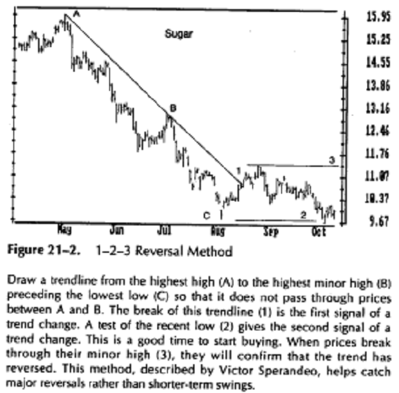
Victor Sperandeo described another method for drawing trendlines in his book, Trader Vic. His technique helps identify reversals of well-established trends (Figure 21-2).
Sperandeo draws an uptrendline from the lowest low of the move to the highest minor low prior to the highest high. That line may not pass through prices between those two points. When that trendline is broken, it gives the first signal of a trend change. The second signal is given when prices retest the recent high and back away from it. The third signal occurs when prices break through the previous minor low. It confirms that the uptrend has reversed. A mirror image of this method applies to downtrends.
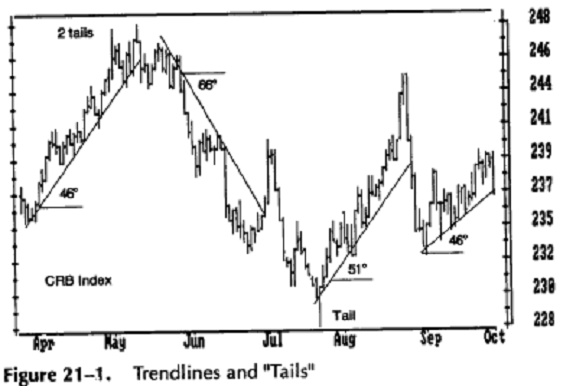
Draw trendlines through the edges of congestion areas and leave out the extreme prices. Tails are long bars at the ends of trends-they spring outside of congestion areas. Markets recoil from tails, offering good trading opportunities in the opposite direction.
Notice how the angles of uptrends tend to recur, month after month. Knowing this can help you draw preliminary trendlines. At the right edge of the chart, prices are touching their uptrendline-buy as soon as you see a bar that fails to reach a new low.
Rating Trendlines
The single most important feature of a trendline is its slope. When a trend-line slants up, bulls are in control and it pays to look for buying opportuni-ties. When a trendline slants down, bears are in control and it pays to look for shorting opportunities. You can rate the importance of any trendline by examining five factors: the timeframe of the trendline, its length, the number of times prices touch it, its angle, and volume. The longer the timeframe, the more important the trendline. A trendline on a weekly chart identifies a more important trend than a daily trendline. A trendline on a daily chart identifies a more important trend than an hourly trendline, and so on.
The longer the trendline, the more valid it is. A short trendline reflects mass behavior over a short period. A longer trendline reflects mass behavior over a longer time. The longer a trend continues, the greater its inertia. A major bull market may follow its trendline for several years.
The more contacts between prices and trendline, the more valid that line.
When the trend is up, a return to the trendline shows a rebellion among bears. When the trend is down, a rally to the trendline shows a rebellion by the bulls. When prices pull back to a trendline and then bounce away from it, you know that the dominant market group has beaten the rebels.
A preliminary trendline is drawn across only two points. Three points of contact make that line more valid. Four or five points of contact show that the dominant market crowd is firmly in control.
The angle between a trendline and the horizontal axis reflects the emotional intensity of the dominant market crowd. A steep trendline shows that the dominant crowd is moving rapidly. A relatively flat trendline shows that the dominant crowd is moving slowly. A shallow trendline is likely to last longer, like a turtle racing against a hare.
It pays to measure the angle of every trendline and write it down on your chart (Figure 21-1). This can be done using a computer, a protractor, or a Chinese Charting Tool. Comparing angles of trendlines shows whether the dominant market crowd is becoming more bullish or bearish. It is uncanny how often trendlines trace the same angle time and again in a given market. It may be because the key players seldom change.
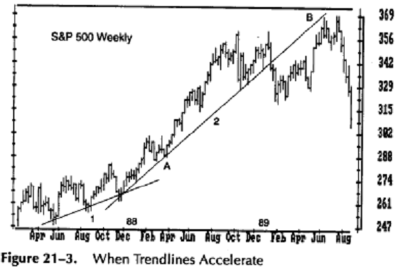
Sometimes prices accelerate away from their trendline. Then you can draw a new, steeper trendline. It shows that a trend is speeding up, becoming unsustainable (Figure 21-3). When you draw a new, steeper trendline, tighten your stop, place it immediately below the latest trendline, and adjust that stop at every new bar. The breaking of a steep trendline is usually followed by a sharp reversal.
When the trend is up, volume normally expands when prices rally and shrinks when they decline. This shows that rallies attract traders while declines leave them cold. The opposite occurs in downtrends -volume expands on declines and shrinks on rallies. A pullback on heavy volume threatens a trendline because it shows that the rebellious crowd is growing.
If volume expands when prices move in the direction of a trendline, it confirms that trendline; if volume shrinks when prices pull back to a trendline, it also confirms the trendline. If volume expands when prices return to a trend-line, it warns of a potential break; if volume shrinks when prices pull away from a trendline, it warns that the trendline is in danger.
Trendline Breaks
The breaking of a well-established trendline shows that the dominant market crowd has lost its power. You have to be careful not to anticipate trading signals-most traders lose money when they jump the gun.
![]()
|
|
The stock market rose slowly but steadily from its 1987 bottom. You could buy each time prices touched their shallow uptrendline (1). The uptrend accelerated in 1988, and at point A, a new uptrendline (2) had to be drawn. When the new, steeper trendline was broken, it indicated that the bull move was over. The market offered, as it sometimes does, an excellent shorting opportunity at point B, when it pulled back to its old uptrendline before crashing.
A trendline is not a glass floor under the market -one crack and it is gone. It is more like a fence that bulls or bears can lean on. They can even violate it a bit without toppling it, the way animals shake a fence. A trendline break is valid only if prices close on the other side of a trendline. Some traders insist that a trendline has to be penetrated by two or three percentage points of price ($8-$12 in the case of $400/oz. gold).
After a very steep uptrend is broken, prices often rally again, retest their old high, and touch their old uptrendline from below (Figures 20-2, 21-3). When that happens, you have a near-perfect shorting opportunity: a combination of a double top, a pullback to an old trendline, and perhaps a bearish divergence from technical indicators. The reverse also applies to downtrends.
Trading Rules
Trade in the direction of the slope of a
trendline. If it points up, look
for buying opportunities and avoid shorting. When the
slope is down,
trade from the short side and avoid buying.
A trendline provides support or resistance.
When prices rise, place buy
orders at the uptrendline and protective orders below.
Reverse the pro
cedure in downtrends.
Steep trendlines precede sharp breaks. If a
trendline is steeper than
45°, place your stop right at the trendline and adjust it
daily.
Prices often retest their latest extreme after
breaking a steep trendline.
A pullback rally to an old high on falling volume and
with indicator
divergences provides an excellent shorting opportunity. A
decline to
an old low after a downtrendline is broken provides a
low-risk buying
opportunity.
Draw a channel line parallel to a trendline
and use it as a target for
profit taking.
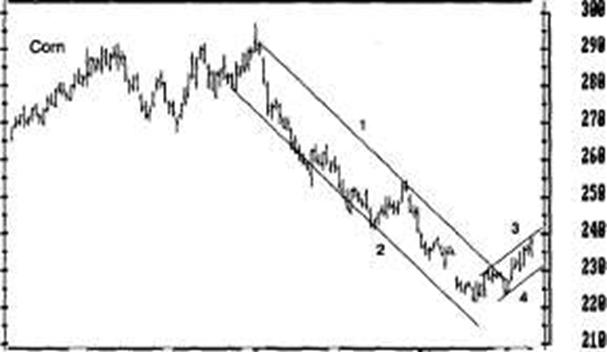
Trendline Channels
A channel consists of two parallel lines that contain prices (Figure 21-4). If you draw an uptrendline across the bottoms of reactions, you can draw a channel line parallel to it across the tops of rallies. When you draw a downtrendline across the tops of rallies, you can also draw a channel line parallel to it across the bottoms of declines.
Channel lines, like trendlines, should be drawn across the edges of congestion areas, leaving out the extreme highs and lows. The presence of a channel line reinforces the validity of the trendline itself. The validity of channel lines depends on how many times they were touched by prices.
A channel line marks the area of bulls' maximum power in an uptrend and bears' maximum power in a downtrend. The wider the channel, the stronger the trend. It pays to trade in the direction of the channel's slope, going long in the lower quarter or half of a rising channel and selling short in the upper quarter or half of a falling channel. Profits should be taken at the opposite channel wall (see also Section 45).
Hay Jun Jul Bug mp OcF
Figure 21-4. Trendline Channels and Preliminary Trendlines
The downtrendline 1, drawn across rally peaks, identifies a bear market in corn. A channel line 2 is drawn across the lows, parallel to the trend-line. The channel line helps track the maximum power of bears in a downtrend. The best shorting opportunities are in the upper half of a falling channel, while the best buying opportunities are in the lower half of a rising channel.
When prices break out above their downtrendline, channels can help you draw a preliminary uptrendline. First, draw a new channel line 3 to connect the last two rally tops. Then draw line 4 parallel to it, touching the latest bottom. This is the new preliminary uptrendline.
At the right edge of the chart, corn is trending higher. It is expensive-near its upper channel line. If you want to go long, place an order to buy in the vicinity of the new uptrendline 4.
![]() A Preliminary Trendline
A Preliminary Trendline
Normally, a trendline touches at least two points on a chart. There is a little-known technique for drawing a preliminary trendline through only one point (Figure 21-4).
When prices break their downtrend and rally above it, you can assume that the downtrend has ended and a new uptrend may begin. Connect the two latest peaks - this is the channel line of the new uptrend. Draw a line parallel to it through the latest low. This preliminary uptrendline, drawn parallel to a channel line, tells you where to expect the next bottom. It often points to excellent buying opportunities. This procedure tends to work better at bottoms than at the tops.
More on Trendlines
When prices break their uptrend, measure the vertical distance from the trendline to the latest top and project it down from the breaking point. If the crowd can become optimistic enough to swing prices so many dollars above the trendline, then it is likely to become equally pessimistic and swing prices the same distance down from the trendline. Reverse this procedure in downtrends. This method gives you the minimum target for a new move, which is often exceeded.
Trendlines can also be applied to volume and to indicators. The
slope of a trendline of volume shows whether more or
fewer people are becoming involved in the market. A rising trendline of volume
confirms the current price trend. A falling trendline of volume
shows that the market crowd is refusing to 
follow the current price trend. Among technical
indicators, the Relative Strength Index (see Section 31) is especially well
suited for trend-line analysis. It often breaks its trendlines
in advance of prices, providing an early warning of a trend change.
Figure 22-1. Gaps
Cover this chart with a sheet of paper and slide it slowly from left to right.
A. A breakaway
gap. Sell short and place a stop a few ticks above the
gap's upper rim.
B. An
exhaustion gap-prices pull back into it the next day. The down
trend is over. Cover shorts
immediately.
C. Another
exhaustion gap, marked by a lack of new highs after the gap.
Several days of churning offer good shorting opportunities with a stop
above the high.
D. A
continuation gap in a downtrend. Go short, with a stop a few ticks
above the gap's upper rim. Prices hit
that stop a few days later-no
method is fail-safe.
E. An
exhaustion gap, closed two days after it opened. Cover shorts
immediately.
F. A common gap
in the midst of a congestion area, closed the next day.
No action recommended.
G. A breakaway gap. Go long and place a protective stop a few ticks below the gap's lower rim.
H. A continuation gap. Add to longs and place a protective stop a few ticks below the gap's lower rim. The gap at the right edge of this chart could be either a continuation or an exhaustion gap. Relatively quiet volume suggests continuation. If you buy, place a protective stop a few ticks below the lower rim of this gap.
A gap is a chart pattern that consists of two adjacent bars, where the low of one bar is higher than the high of the other bar (Figure 22-1). It shows that no trades took place at a certain price, only at higher and lower levels. Webster's Dictionary defines: "Gap: 1. a hole or opening, as in a wall or fence, made by breaking or parting; breach. 2. an interruption of continuity in space or time; hiatus; lacuna."
Gaps occur when prices jump in response to a sudden imbalance of buy or sell orders. A scary piece of news often triggers gaps. Gaps on daily charts show reactions to events that took place while the market was closed. Had the news come out during trading hours, a gap might have occurred only on intraday charts and perhaps have led to a wider daily range.
For example, a strike at a major copper mine is bullish for copper. If the news comes out in the evening, the shorts become frightened and want to cover. They flood the pit with buy orders before the opening bell. Floor traders respond by opening copper above the previous day's high. The smart money, incidentally, has probably bought copper before the strike was announced. Smart money tends to put on trades when markets are quiet, but amateurs tend to jump on the news.
Gaps show that the trading crowd is spooked, that losers are getting hurt and dumping their positions. When you know that bulls or bears are hurting, you can figure out what they are likely to do next and trade accordingly.
Some gaps are valid; others are phony. Valid gaps occur when the market skips a price level. Phony gaps occur when a financial instrument trades
in another market while the market you analyze is closed. For example, daily charts of
All gaps can be divided into four major groups: common, breakaway, continuation, and exhaustion. You need to identify them because each tells a different story and calls for different trading tactics.
Common Gaps
Common gaps are rapidly closed-prices return into the gap within a few days. Common gaps usually occur in quiet trendless markets. They are seen in futures contracts for late delivery, in thinly traded stocks, and at sold-out, low-volume market bottoms.
Common gaps show no follow-through - no new highs after an upside gap or new lows after a downside gap. Volume may slightly increase on the day of a common gap, but the following days show a return to average volume. The lack of new highs or lows and indifferent volume show that neither bulls nor bears have strong feelings about the market. Common gaps are the least useful of all gaps for trading.
Common gaps occur more often than other gaps. It takes very little to create them in a dull market. A Comex floor trader at one of our seminars spoke of how he could push gold up or down $2 an ounce on a quiet day. He was known as a big trader and if he suddenly began bidding for 20 contracts at a time, other floor traders stepped back, figuring he knew something. Gold would gap up, and the trick for him was to sell before that gap was closed.
An ex-dividend gap is a common gap that occurs in the stock market on the day a dividend becomes payable. For example, if the dividend is 50 cents, then each share is worth 50 cents less after that dividend is paid. This is similar to a drop in the price of a cow after it delivers a calf. Once the calf is born, the price of the cow falls by the amount of the calf's price because it is no longer included with the cow. Ex-dividend gaps were common in the old days. Today, the average daily range of a dividend-paying stock is greater than the amount of its dividend, and the ex-dividend drop seldom results in a gap.
Breakaway Gaps
A breakaway gap occurs when prices leap out of a congestion zone on heavy volume and begin a new trend. A breakaway gap can remain open for weeks or months, and sometimes years. The longer the range that preceded the gap, the longer the subsequent trend.
An upside breakaway gap is usually followed by new highs for several days in a row, and a downside breakaway gap is followed by a series of new lows. There is a sharp increase in volume on the day of the breakaway gap and for several days after that. Volume on the day of the gap may be twice as high as the average volume for the previous few days.
A breakaway gap marks a major change in mass mentality - it reveals a great pressure behind the new trend. The sooner you jump aboard the new trend, the better.
Most gaps are common gaps that are quickly closed. Professional traders like to fade them - trade against gaps. You have to be careful because if you do it mechanically, sooner or later a breakaway gap will clobber you. It takes deep pockets to hold a losing position for months, waiting for a gap to close.
Continuation Caps
A continuation gap occurs in the midst of a powerful trend, which continues to reach new highs or new lows without filling the gap. It is similar to a breakaway gap but occurs in the middle of a trend rather than in the beginning. Continuation gaps show a new surge of power among the dominant market crowd. The inflationary bull markets in commodities in the 1970s had many of them.
A continuation gap can help you estimate how far a trend is likely to carry. Measure the vertical distance from the beginning of a trend to the gap, and then project it from the gap in the direction of the trend. When the market approaches that target, it is time to begin taking profits.
Volume confirms continuation gaps when it jumps at least 50 percent above the average for the previous few days. If prices do not reach new highs or new lows for several days after a gap, you are probably dealing with a treacherous exhaustion gap.
Exhaustion Gaps
An exhaustion gap is not followed by new highs during uptrends or new lows during downtrends-prices churn and then return into the gap and close it. Exhaustion gaps appear at the ends of trends. Prices rise or fall for several weeks or months, and then gap in the direction of the trend. At first, an exhaustion gap looks like a continuation gap - a leap in the direction of the trend on heavy volume. If prices fail to reach new highs or new lows for several days after the gap, it is probably an exhaustion gap.
An exhaustion gap is confirmed only when prices reverse and close it. This gap is like the last spurt of a tired athlete. He springs away from the pack but cannot sustain the pace; as soon as others close in on him, you know that he will lose the race.
Trading Rules
1. Common gaps do not offer good trading opportunities, but if you must trade, fade them. If prices gap up, sell short as soon as the market stops reaching new highs and place a protective stop above the high of the past few days; cover shorts and take profits at the lower rim of the gap. If prices gap down, go long as soon as the market stops reaching new lows and place a protective stop below the low of the past few days; place an order to sell and take profits at the upper rim of the gap.
If a market gaps out of a long trading range
on a burst of volume and
continues to make new highs or lows, you are probably
dealing with a
breakaway gap. If prices have gapped to the upside, buy
and place a
protective stop at the lower rim of the gap. A valid
breakaway gap
almost never gets closed. Reverse the procedure in
downtrends.
Waiting for a pullback when a new trend has just begun
may leave you
on the sidelines.
Trading a continuation gap is similar to
trading a breakaway gap -buy
early and place a protective stop at the lower rim of the
gap. Reverse
the procedure in downtrends. Tighten your stops when a
trend
approaches its target as projected by the continuation
gap.
A valid breakaway or continuation gap must be
confirmed by a series
of several new highs or lows. Otherwise, you may be dealing with an
exhaustion gap. If the market refuses to reach new highs
or lows in the
direction of the gap, exit your trade and re-evaluate the
market from
the
sidelines.
Exhaustion gaps offer attractive trading
opportunities because they are
often followed by violent reversals. When you identify an
upside
exhaustion gap, sell short and place a protective stop
above the latest
high. Once prices begin to slide, weak bulls will start
bailing out. Stay
short as long as prices continue to reach new lows and
cover the day
after prices fail to make a new low. Reverse the
procedure in down
trends. Because of high volatility, exhaustion gaps are
easier to trade
using options, especially buying puts at the tops.
An island reversal is a combination of a continuation gap and a breakaway gap in the opposite direction. An island reversal looks like an island, separated from the rest of price action by a gulf in which no trading took place. It begins as a continuation gap, followed by a compact trading range with high trading volume. Then prices gap in the opposite direction and leave behind an island of prices. This pattern occurs very seldom, but it marks major reversal areas. Trade against the trend that preceded an island.
It pays to watch for gaps in related markets. If gold shows a breakaway gap but silver and platinum do not, then you may get a chance to position for a "catch-up move" in a market that has not yet become frenzied.
Gaps can serve as support and resistance levels. If greater volume occurred after an upside gap, it indicates very strong support. If greater volume occurred before the gap, then support is less strong.
Technical indicators help identify types of gaps. The Force Index (see Section 42) is based on price and volume. If Force Index shows only a minor change on the day of a gap, it is probably a common gap. When Force Index reaches a record high or a low level for several weeks, it confirms breakaway and continuation gaps.
Intraday charts show many opening gaps, when prices open outside the previous day's range. When there is an imbalance of public buy and sell orders before the opening, floor traders open markets higher or lower. If outsiders want to buy, floor traders sell to them at such a high price that the slightest dip will make them money. If customers want to sell, floor traders will take merchandise off their hands-at a price that is low enough to profit from the slightest bounce. Professionals play it cool -they know that crowds seldom stay excited for long and prices tend to pull back into yesterday's range. They sell above that range or buy below, waiting to unwind their positions and take profits when the opening gap is closed.
If you trade the S&P 500 futures, remember that their opening gaps are almost always closed. If the S&P 500 futures open higher, they almost always sink during the day and touch their previous day's high. If they open lower, they almost always rally during the day and touch their previous day's low. Savvy day-traders tend to sell short higher openings and buy lower openings. This is not a mechanical method -you have to buy or sell only after indicators tell you that the force behind the opening gap has been spent and the market is ready to close the gap.
The patterns you see on your chart or computer screen are the trails left by bulls and bears. A chartist is a hunter who follows subtle signs, visible only to those who know what to look for. Chart patterns can help you decide when a trend is likely to continue or to reverse.
There are two main groups of patterns: continuation and reversal.
Continuation patterns include flags and pennants. They suggest trading in the direction of the current trend.
Reversal patterns include head and shoulders, inverse head and shoulders, and double tops and bottoms. They indicate it is time to take profits on existing positions. Some patterns can serve as either continuation or reversal formations. Triangles and rectangles are notorious for doing that double duty.
When several chart patterns point in the same direction, their signals are reinforced. For example, if an uptrendline gets broken when a head-and-shoulders top is being completed, they both confirm that the uptrend is ending. When different patterns give conflicting messages, their signals cancel one another, and it is better not to trade.
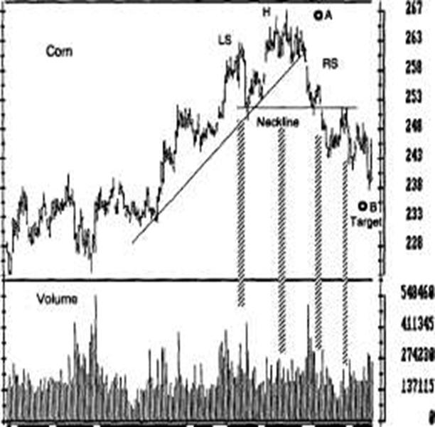
Head-and-Shoulders Tops
A healthy uptrend moves up in steps. Most rallies reach higher peaks than the preceding rally and declines stop at a higher level than the previous decline. When an uptrend fails to reach a higher high or a decline falls below the previous low, it shows that bulls are losing their grip.
Head-and-shoulders tops mark the ends of uptrends (Figure 23-1). The "head" is a price peak surrounded by two lower peaks, or "shoulders." A neckline connects the lows of declines from the left shoulder and the head. The neckline does not have to be horizontal - it may be flat, rising, or falling. A downsloping neckline is especially bearish -it shows that bears are becoming stronger.
When prices fail to rally above the head, they confirm that a head-and-shoulders top is developing. The right shoulder may be higher or lower than the left and may be shorter or longer. The decline from the right shoulder breaks the neckline. When that happens, the uptrend is dead.
After breaking the neckline, prices sometimes pull back to it on low volume. This feeble rally offers an excellent shorting opportunity, with a logical stop just above the neckline.
Head-and-shoulders tops often have typical volume patterns. Volume is often lower on the head than on the left shoulder. It is even lower on the right shoulder. Volume tends to increase when prices break the neckline. When prices pull back to it, volume is very thin.
A head-and-shoulders pattern provides an approximate target for the new downtrend. You can obtain it by measuring the distance from the top of the head to the neckline and projecting this down from the neckline.
|
|
Oct How Dec Jan rel far Figure 23-1. Head and Shoulders
Apr fay Jun
An uptrend remains healthy as long as each new rally reaches a new high. Rising volume confirmsT^TnesTVoiumelalls when prices reach the "Tiead (H) and flashes a warning to tighten stops on long positions. The decline from the head breaks the uptrendline and signals that the uptrend is over.
The head, in this case, is an "island reversal" (see "Gaps," Section 22)-a very bearish pattern. Volume shoots up ominously during the decline from the head. The right shoulder (RS) is much smaller than the left-another sign of weakness. Low volume on the right shoulder also points to a good shorting opportunity.
![]() The decline from the right shoulder breaks the
neckline. This completes the
head-and-shoulders pattern. There is an excellent shorting opportunity when
prices pull back to the neckline from below on low volume. The distance from the top of the head
to the neckline (A) provides a target
for the decline (B). At the right edge of the chart, hold shorts because prices continue to fall on rising
volume and have not reached their
target; place a protective stop at the top of the past 5 days' range.
The decline from the right shoulder breaks the
neckline. This completes the
head-and-shoulders pattern. There is an excellent shorting opportunity when
prices pull back to the neckline from below on low volume. The distance from the top of the head
to the neckline (A) provides a target
for the decline (B). At the right edge of the chart, hold shorts because prices continue to fall on rising
volume and have not reached their
target; place a protective stop at the top of the past 5 days' range.
Trading Rules
Once you identify a head-and-shoulders top, you need to make two trading decisions: what to do about your long position and how to go about shorting. You have three choices for managing your longs: sell them outright, tighten your stops, or sell some and hold the rest.
Many traders take the fourth choice - they simply freeze and do nothing. Trading is a complex, nontrivial game that demands making decisions in an atmosphere of uncertainty.
Your decision depends on how certain you feel about the pattern. It also depends on the size of your account. A large account allows you to buy and sell gradually. Having to trade a single contract in a small account demands precise timing-it is a good school for a beginning trader.
You must analyze your charts in more than one timeframe (see Section 36). If weekly charts are toppy, a head-and-shoulders pattern on the dailies should prompt you to run for the exit. If weeklies are strong, then it is often better to simply tighten the stops. Technical indicators can also help you decide how urgent it is to sell.
Markets often are more volatile at tops, with wide swings between short-term highs and lows. Selling short and placing a stop above the latest high may expose you to more risk than the maximum amount allowed per contract in your account (see Chapter 10). You may have to pass up the trade or buy puts to keep your monetary risk within allowed limits.
Sell when you recognize the head or the right
shoulder of a head-and-
shoulders pattern, based on low volume, a break of an
uptrend, and a
divergence between indicators and prices.
The decline from the head establishes a
neckline. If you still hold a
long position, place a stop below the neckline.
The rally to the right shoulder is usually
marked by low volume and
glaring weakness in technical indicators; it offers the
last good oppor
tunity to cash out of the uptrend. Technical indicators
often reach
higher levels on the right shoulder than on the head but
they never
exceed the levels reached during the left shoulder. When
you sell short
into the right shoulder, place your stop at the top of
the head. Make
that order "stop-and-reverse" - if stopped out of the short position,
reverse and go long (see "The Hound of the
Baskervilles" signal).
4. Once the neckline is broken, a pullback on low volume offers an excellent shorting opportunity, with a protective stop slightly above the neckline.
The Hound of the Baskervilles
This signal occurs when a reliable chart or indicator pattern does not lead to the action you expect and prices move in the opposite direction. A head-and-shoulders pattern indicates that the uptrend is over. If prices continue to rise, they give the Hound of the Baskervilles signal.
This signal is named after the story by Sir Arthur Conan Doyle in which Sherlock Holmes was called to solve a murder at a country estate. He found the essential clue when he realized that the family dog did not bark while the murder was being committed. That meant the dog knew the criminal and the murder was an inside job. The signal was given by the lack of expected action - by the lack of barking!
When the market refuses to bark in response to a perfectly good signal, it gives you the Hound of the Baskervilles signal. This shows that something is fundamentally changing below the surface. Then it is time to get in gear with the new powerful trend.
A head-and-shoulders pattern gives a strong sell signal. If the market refuses to collapse but rallies from the right shoulder, it gives you its Hound of the Baskervilles signal. When pieces rise above the head, it is time to cover shorts, reverse, and go long. An aborted head-and-shoulders top often leads to a very strong rally. Buy the upside breakout, and place a protective stop slightly below the top of the head.
Inverse Head and Shoulders
Some traders call this pattern a head-and-shoulders bottom-a mirror image of a head-and-shoulders top. It looks like a silhouette of a person upside down: the head at the lowest point, surrounded by two shoulders. This pattern develops when a downtrend loses its force and gets ready to reverse (Figure 23-2).
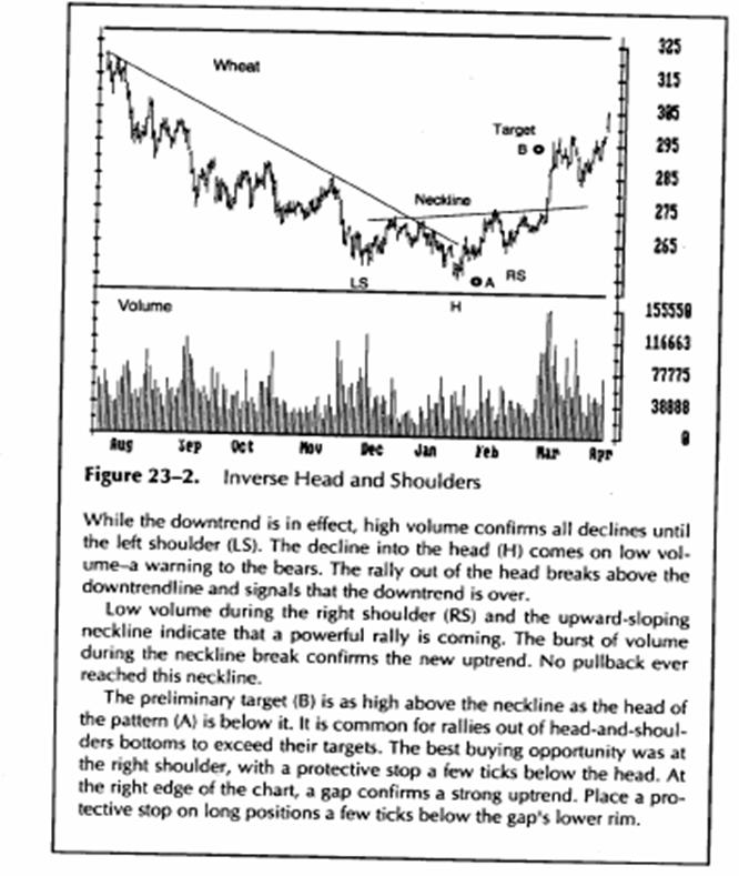
In a valid downtrend, each new low falls lower than the
previous low, and each rally stops at a lower level. A strong
rally from the head allows you to
draw a neckline. When a decline from the neckline fails to reach the level of the head, it creates the right shoulder. When prices rally from the right shoulder above the neckline on increased volume, they complete the head-and-shoulders bottom and a new uptrend begins.
Sometimes a head-and-shoulders bottom is followed by a pullback to the neckline on low volume, offering an excellent buying opportunity. Measure the distance from the bottom of the head to the neckline and project it upward from the point where the neckline was broken. This gives you a minimum measurement for a rally, which is frequently exceeded.
The tactics for trading inverse head and shoulders is similar to head-and-shoulders tops. You risk less money trading at bottoms because prices are less volatile, and you can use closer stops.
Rectangles
A rectangle is a chart pattern that contains price movements between two parallel lines. They are usually horizontal but can sometimes slant up or down (see "Lines and Flags," later in this section). Rectangles and triangles can serve as continuation or reversal patterns.
You need four points to draw a rectangle: The upper line connects two rally tops, and the lower line connects two bottoms (Figure 23-3). These lines should be drawn through the edges of congestion areas rather than across the extreme highs and lows (see Section 19).
The upper line of a rectangle identifies resistance, while the lower line identifies support. The upper line shows where bulls run out of steam; the lower line shows where bears become exhausted. A rectangle shows that bulls and bears are evenly matched. The key question is whether bulls or bears will eventually win the battle within this pattern.
If volume swells when prices approach the upper border of a rectangle, an upside breakout is more likely. If volume increases when prices approach the lower border, a downside breakout is more likely. A valid breakout from a rectangle is usually confirmed by an increase in volume - one-third to one-half higher than the average of the previous five days. If volume is thin, it is likely to be a false breakout.
Rectangles tend to be wider in uptrends and narrower in downtrends. The longer a rectangle, the more significant a breakout. Breakouts from rectangles on weekly charts are especially important because they mark important victories for bulls or bears.
There are several techniques for projecting how far a breakout is likely to go. Measure the height of a rectangle and project it from the broken wall in the direction of the breakout. This is the minimum target. The maximum target is obtained by taking the length of the rectangle and projecting it vertically from the broken wall in the direction of a breakout. Tony Plummer writes that a rectangle is a part of a spiral-like development of a trend. He recommends measuring the height of a rectangle, multiplying it by three Fibonacci ratios (1.618, 2.618, and 4.236), and projecting those measurements in the direction of the breakout to obtain a price target.
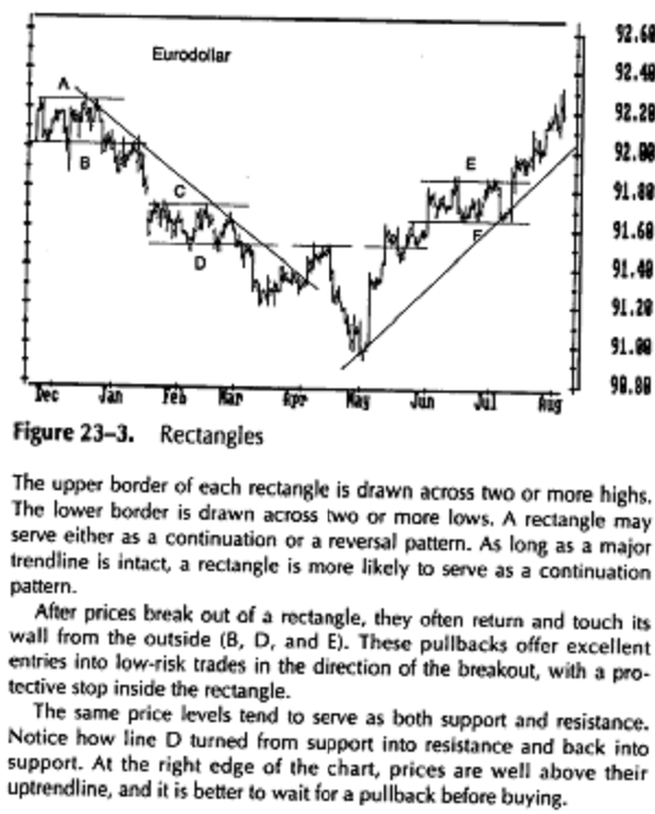
Trading Rules
Floor traders can profit from trading short-term swings between a rectangle's walls, but the big money is made by trading in the direction of a breakout.
When trading within a rectangle, buy at the lower boundary and sell
short at the upper boundary.
Oscillators can help you decide when
prices are ready to reverse within a
rectangle. Stochastic, the Relative
Strength Index, and Williams %R (see
Chapter 4) mark price rever
sals within rectangles when they hit
their reference lines and change
direction.
If you buy at the lower border of a rectangle, place your protective stop slightly below that rectangle. If you sell short near the upper wall of a rectangle, place a protective stop slightly above that border. You have to be very nimble and take profits at the first sign of a reversal. It is dangerous to hold on for a few extra ticks within a rectangle.
To find out whether an upside or a downside
breakout is more likely,
analyze the market in a longer timeframe than the one you
are trading.
If you want to catch a breakout on a daily chart,
identify the weekly
trend because a breakout is more likely to go in its
direction (see
Section 43).
Once you buy an upside breakout or sell short
a downside breakout,
place your protective stop slightly inside the rectangle.
There may be a
pullback to the rectangle wall on light volume, but
prices should not
return into a rectangle after a valid breakout.
Lines and Flags
A line is a kind of a rectangle - a lengthy congestion area. In Dow theory, a line is a correction against the primary trend. It is a congestion zone whose height is approximately 3 percent of current stock market value. When the stock market "draws a line" instead of reacting more deeply against its major trend, it shows a particularly strong primary trend.
A flag is a rectangle whose boundaries are parallel but slant up or down.
Breakouts tend to go against the slope of the flag. If a flag slants upward, a downside breakout is more likely. If the flag slants down, an upside breakout is more likely.
If you see a downsloping flag in an uptrend, place a buy order above the latest peak of the flag to catch an upside breakout. A rising flag in an uptrend marks distribution, and a downside breakout is more likely. Place an order to sell short below the latest low of that flag. Reverse the procedure in downtrends.
Triangles
A triangle is a congestion area whose upper and lower boundaries converge on the right (Figure 23-4). It can serve either as a reversal or, more often, as a continuation pattern. Some technicians call triangles coils. The market winds up and the energy of traders becomes compressed, ready to spring from a triangle.
A small triangle whose height is 10 to 15 percent of the preceding trend is more likely to serve as a continuation pattern. Many uptrends and downtrends are punctuated by these triangles, as sentences are punctuated by commas. Large triangles whose height equals a third or more of the preceding trend are more likely to serve as reversal patterns. Finally, some triangles simply fizzle out into listless trading ranges.
Triangles can be divided into three major groups, depending on their angles. The upper and lower lines of symmetrical triangles converge at the same angles. If the upper line is inclined 30 degrees to the horizontal, then the lower line is also inclined 30 degrees. Symmetrical triangles reflect a fair balance of power between bulls and bears and are more likely to serve as continuation patterns.
An ascending triangle has a relatively flat upper boundary and a rising lower boundary. Its flat upper boundary shows that bulls are maintaining their strength and can lift prices to the same level, while bears are losing their ability to drive prices lower. An ascending triangle is more likely to result in an upside breakout.
A descending triangle has a relatively flat lower boundary, while its upper boundary slants down. Its flat lower boundary shows that bears are maintaining their strength and continue to drive prices down, while bulls are losing their capacity to lift prices. A descending triangle is more likely to lead to a downside breakout.
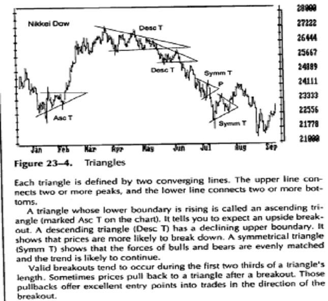
Volume tends to shrink as triangles get older. If volume jumps on a rally toward the upper boundary, an upside breakout is more likely. If volume becomes heavier when prices fall toward the lower boundary, a downside breakout is more likely. Valid breakouts are accompanied by a burst of volume - at least 50 percent above the average for the past 5 days.Valid breakouts occur during the first two thirds of a triangle. It is better not to trade breakouts from the last third of a triangle. If prices stagnate all the way into the apex, they are likely to remain flat. A triangle is like a fight between two tired boxers who keep leaning on each other. An early breakout shows that one of the fighters is stronger. If prices stay within a triangle all the way into the apex, that shows that both boxers are exhausted and no trend is likely to emerge.
Charts of related markets often show triangles at the same time. If gold, silver, and platinum all trace triangles and gold breaks out to the upside, then platinum and silver are likely to follow. This approach works well with currencies, especially with closely related ones, such as the German Mark and Swiss Franc. It also works with stocks in the same group-compare General Motors to Ford but not to IBM.
Triangles provide a minimum target for a move following a breakout. Measure the height of a triangle at its base and project vertically from the point where the triangle was broken. If you are dealing with a small triangle in the midst of a dynamic trend, that minimum measurement is likely to be exceeded. You can also use the Fibonacci projections mentioned earlier.
Trading Rules
It's better not to trade minor swings within a triangle unless that triangle is very large. As a triangle grows older, the swings become narrower. Profit potential shrinks, while slippage and commissions continue to take just as bad a bite from your account as before.
If you trade inside a triangle, use oscillators such as Stochastic (see Section 30) and Elder-ray (see Section 41). They can help you catch minor swings.
In trying to decide whether a triangle on a daily chart is likely to lead to an upside or a downside breakout, look at the weekly chart (see Section 43). If the weekly trend is up, then a triangle on the daily charts is more likely to break out to the upside, and vice versa.
When you want to buy an upside breakout, place a buy order slightly above the upper boundary of a triangle. Keep lowering your order as the triangle becomes narrower. If you want to short a downside breakout, place a sell order slightly below the lower boundary. Keep raising it as the triangle becomes narrower. Once you are in a trade, place a protective stop slightly inside the triangle. Prices may pull back to the wall, but they should not return deep inside a triangle following a valid breakout.
When a breakout from a triangle is followed by a pullback, pay attention to volume. A pullback on heavy volume threatens to abort the breakout, but a pullback on light volume offers a good opportunity to add to your position.
When prices approach the last third of a triangle, cancel your buy or sell orders. Breakouts from the last third of a triangle are very unreliable.
Atypical Triangles
A pennant is a small triangle whose lines are slanted in the same direction. Pennants that slant against the trend serve as continuation patterns. There is an old saying "The pennant flies at half-mast" - a rally is likely to travel as far after the pennant as it did before. A pennant that slants in the direction of the trend indicates exhaustion - a trend is nearing a reversal.
A widening triangle occurs when prices set a series of higher highs and lower lows. This pattern shows that the market is becoming hysterically volatile, with bulls and bears pouring in. The fight between bulls and bears becomes too hot for the uptrend to continue -a widening triangle kills an uptrend.
A diamond starts out as a widening triangle and ends as a symmetrical triangle. You have to squint very hard to recognize it. Diamonds are prime examples of Rorschach-type patterns for chartists. If you look long enough, you will find them, but their trading usefulness is minimal. I used to look for diamonds ... and most of them were fake zirconium.
Double Tops and Bottoms
Double tops occur when prices rally to the area of the previous high. Double bottoms occur when prices fall near the previous low. The second top or bottorn can be slightly above or below the first. This often confuses beginning analysts.
Savvy traders use technical indicators to identify double tops and bottoms. They are often marked by bullish and bearish divergences. Buying at double bottoms and selling short at double tops offer some of the best trading opportunities.
|