To be a successful trader, you must understand markets better than your competitors do. You can analyze them more thoroughly using a computer. Many traders who compete with you in the markets already have these machines.
Manual charting can help you develop an intuitive, physical feel for prices. You can buy some graph paper and plot several stocks or commodities each day. Once you post your charts, write down at what level you will be a buyer or a seller and where you will place your stops.
After you do that for a while, you will probably want to analyze more markets using technical indicators. Then it is time to look for a computer and technical analysis software.
Driving or Walking
A trader without a computer is like a man traveling on a bicycle. His legs grow strong and he sees a lot of scenery, but his progress is slow. When you travel on business and want to get to the point fast, you get a car.
A computer can help you track and analyze more markets in depth. It can take over routine tasks and free up your mind for thinking. A computer allows you to use more indicators and spot more opportunities in the markets. Trading is an information game. A computer helps you process more information.
Computerized technical analysis is more objective than classical charting. You can argue about whether a head-and-shoulders pattern is present -but there is never an argument about an indicator's direction. When an indicator points up, it is clearly up, and when it is down, it is clearly down.
Switching from manual charting to computerized analysis is like giving up an abacus for a calculator. It may slow you down for a while, as you learn to push the keys, but the eventual increa 10110l1112k se in speed is worth the effort.
Three Steps to Computerized Analysis
There are three steps to becoming a computerized trader. First you must choose software, then a computer, and finally data for analysis. Different programs require different computers, which is why it pays to choose software first. Software tells a computer how to process data and how to display the results. Each program has a unique list of features and its own look and feel.
Draw a list of tasks you want your computer to perform for you and show it to computerized traders. Contact a traders' group such as Club 3000 to see what its members like. Many traders call Financial Trading Seminars, Inc. for our opinion on the best packages. Magazines for traders, such as Futures and Technical Analysis of Stocks and Commodities carry many ads for technical analysis software. Read those ads and software reviews, and send away for demo diskettes.
Once you narrow down your choices to two or three programs, call the companies whose software you like and ask for names of users in your area. Insist on names of real users - your best source of practical and unbiased advice. Many traders feel isolated and enjoy contact with other traders. They like to show their equipment and tell you about the quality of technical support.
Most programs for technical analysis fall into one of three groups: toolboxes, black boxes, and gray boxes. Toolboxes are for serious traders, black boxes are for people who believe in Santa Claus, and gray boxes are in between. When considering a new package, ask yourself which group it belongs to.
Toolboxes
If you want to work with wood or metal, you can go to a hardware store and buy a toolbox with a set of tools. You must learn how to use those tools to work smarter and more efficiently. A technical analysis toolbox provides a set of electronic tools for processing market data.
A toolbox draws daily and weekly charts, splits the screen into several windows, and plots prices and indicators. A good toolbox includes many popular indicators, such as moving averages, channels, MACD, MACD-Histogram, Stochastic, the Relative Strength Index, and a dozen others. It allows you to fine-tune all indicators. For example, it lets you switch from a 5-day to a 9-day Stochastic at the push of a button.
A quality package allows you to write your own indicators into the system. You may have a favorite formula that you want to follow, along with ready-made indicators. Avoid programs that limit you to canned indicators.
A good toolbox allows you to compare any two markets and analyze their spreads. If you trade options, your toolbox must include an options valuation model. Advanced packages allow you to test the profitability of trading systems.
There are good toolboxes at all price levels. At the high end, CompuTrac'sT list of indicators runs to two pages, it allows you to test profitability, and it is highly automated. Most of the charts in this book were drawn using CompuTrac. Financial Trading Seminars, Inc. maintains a list of recommended resources for computerized traders -software packages at all price levels, data services, computer configurations, and so on. This list is updated every few months and offered to traders as a public service. You can receive this timely information by contacting our company at the address that appears in the back of this book.
Black Boxes
Black box software tells you what to buy and sell and when to buy or sell it without telling you why. You put data into a black box, lights blink, gears click, and out comes a piece of paper telling you what to do. Thousands of traders pay good money for this.
Most black boxes are sold by hustlers to gullible or insecure traders. Black boxes always come with impressive track records showing profitable past performance. Every black box self-destructs because markets keep changing. Even systems with built-in optimization do not work because we do not know what kind of optimization will be needed in the future. There is no substitute for mature judgment in trading. The only way to make money from a black box is to sell one.
Each black box is guaranteed to fail, even if sold by an honest developer. Complex human activities such as trading cannot be automated. Machines can help but not replace humans.
Trading with a black box means using a slice of someone else's intelligence, as it existed at some point in the past. Markets change, and experts change their minds, but a black box keeps churning out its buy and sell signals. Trading with a black box is like having sex using a penile implant - you may deceive your partner for a while, but you will never deceive yourself.
Gray Boxes
Like a black box, a gray box generates trading signals based on a proprietary formula. Unlike a black box, it gives you a general understanding of its formula and allows you to fine-tune its operations to some degree. The closer a gray box is to a toolbox, the better it is.
Well-known gray boxes include such programs as
Computers
Different software programs run on different machines. This is why it is better to choose your software before you buy a computer. Get the most modern machine, so that it will remain useful for years. Traders keep demanding more memory and speed - I never heard anyone complain about having too much of either. Buy a fast modem for collecting data from a database. Get a laser printer if you need to print high-quality charts.
Most programs allow you to automate studies and print them out. You push a button and leave the computer alone. When you return, there is a ream of charts with indicators piled in front of the printer. The tedious work is done, and you can go to work making trading decisions.
It pays to hire a person who already uses the package to set up your system. I often do that when I start using a new piece of software - it saves a lot of time and energy. Once you know which buttons to push, you can run most programs without knowing much about computers.
Market Data
Each trader needs to start with a historical database and update it daily. In the old days, both had to be created manually. Now historical data for any given market costs less than a dollar per month, and updates are cheap. It takes less than a minute to update a dozen markets by modem, using your regular phone line. There are many reliable databases offering a variety of stock, currency, futures, and options data.
Some traders collect their data around the clock. They use satellite dishes, FM receivers, and dedicated phone lines. Real-time data is necessary for day-trading, but not for position trading.
Position traders enter and exit positions within days or weeks. Day-traders enter and exit trades within a few hours if not minutes. You need to become a competent position trader before you can day-trade. You can compare position trading and day-trading to playing a video game at level one or level nine. You run the same mazes and dodge the same monsters, but the pace of the game is so fast that at level nine your reactions must be almost automatic. If you stop to think, you are dead. Learn to analyze the markets and trade at level one- learn to be a position trader before attempting to day-trade.
When you buy historical data, it pays to cover two bull markets and two bear markets. Starting to analyze a new market, I usually review a monthly chartbook covering 20 years of trading to see whether the market is historically high or low. I buy three to five years' worth of weekly data and one year of daily data.
When you begin using a computer, focus on six or fewer markets and add more later. For example, you may follow Treasury Bonds, Standard & Poor's 500, gold, and Japanese Yen or the German Mark. Change this list if you want to follow agricultural or industrial markets. Choose a few technical indicators, and run them daily on each market. After you learn them well, add new ones. I use a battery of 10 or 12 indicators at any given time, plus one new indicator. I watch it for several months and compare its signals to others. If it proves useful, I add it to the standard package.
Three Major Groups of Indicators
Indicators can help you identify trends and their turning points. They can provide a deeper insight into the balance of power between bulls and bears. Indicators are more objective than chart patterns.
The trouble with indicators is that they often contradict one another. Some of them work best in trending markets, others in flat markets. Some are good at catching turning points, while others are better at following trends.
Most beginners look for a single indicator-a silver bullet to kill the confusion in the markets. Others lump together many indicators and try to average their signals. Either way, a careless beginner with a computer is like a teenager with a sports car-an accident waiting to happen. A serious trader needs to know which indicators work best under different conditions. Before you use any indicator, you must understand what it measures and how it works. Only then can you have confidence in its signals.
Professionals divide indicators into three groups: trend-following indicators, oscillators, and miscellaneous. Trend-following indicators work best when markets are moving but give bad and dangerous signals when the markets are flat. Oscillators catch turning points in flat markets but give premature and dangerous signals when the markets begin to trend. Miscellaneous indicators provide special insights into mass psychology. The secret of successful trading is to combine several indicators from different groups so that their negative features cancel each other out while their positive features remain undisturbed. This is the aim of the Triple Screen trading system (see Section 43).
Trend-following indicators include moving averages, MACD (moving average convergence-divergence), MACD-Histogram, the Directional System, On-Balance Volume, Accumulation/Distribution, and others. Trend-following indicators are coincident or lagging indicators - they turn after trends reverse.
Oscillators help identify turning points. They include Stochastic, Rate of Change, Smoothed Rate of Change, Momentum, the Relative Strength Index, Elder-ray, the Force Index, Williams %R, the Commodity Channel Index, and others. Oscillators are leading or coincident indicators and often turn ahead of prices.
Miscellaneous indicators provide insights into the intensity of bullish or bearish market opinion. They include the New High-New Low Index, the Put-Call Ratio, Bullish Consensus, Commitments of Traders, the Advance/Decline Index, the Traders' Index, and so on. They can be leading or coincident indicators.
Wall Street old-timers claim that moving averages were
brought to the financial markets by antiaircraft gunners. They
used moving averages to site guns on enemy planes during World War 11 and
applied this method to prices. The two early experts on moving averages were
Richard Donchian and J. M. Hurst -neither apparently a gunner. Donchian
was a Merrill Lynch employee who developed trading methods based on moving
average crossovers.

A
moving average (MA) shows the average value of data in its time window. A
5-day MA shows the average price for the past 5 days, a 20-day MA shows the
average price for the past 20 days, and so on. When you connect each day's MA
values, you create a moving average line.
The value of MA depends on two factors: values that are being averaged and the width of the MA time window. Suppose you want to calculate a 3-day simple moving average of a stock. If it closes at 19,21, and 20 on three consecutive days, then a 3-day simple MA of closing prices is 20 (19 + 21 + 20, divided by 3). Suppose that on the fourth day the stock closes at 22. It makes its 3-day MA rise to 21 - the average of the last three days (21 + 20 + 22), divided by 3.
There are three main types of moving averages: simple, exponential, and weighted. Most traders use simple MAs because they are easy to calculate, and Donchian and Hurst used them in precomputer days. Simple MAs, however, have a fatal flaw -they change twice in response to each price.
Twice as Much Bark
A simple MA changes twice in response to each piece of data. First, it changes when a new piece of data is added to the moving average. That is good-we want our MA to reflect changes in prices. The bad thing is that MA changes again when an old price is dropped off at the end of the moving average window. When a high price is dropped, a simple MA ticks down. When a low price is dropped, a simple MA rises. Those changes have nothing to do with the current reality of the market.
Imagine that a stock hovers between 80 and 90, and its 10-day simple MA stands at 85 but includes one day when the stock reached 105. When that high number is dropped at the end of the 10-day window, the MA dives, as if in a downtrend. That meaningless dive has nothing to do with the current reality of the market.
When an old piece of data gets dropped off, a simple moving average jumps. A simple MA is like a guard dog that barks twice - once when someone approaches the house, and once again when someone walks away from it. You do not know when to believe that dog. Traders use simple MAs out of inertia. A modern computerized trader is better off using exponential moving averages.
Market Psychology
Each price is a snapshot of the current mass consensus of value (see Section 12). A single price does not tell you whether the crowd is bullish or bearish-just as a single photo does not tell you whether a person is an optimist or a pessimist. If, on the other hand, someone brings ten photos of a person to a lab and gets a composite picture, it will reveal that person's typical features. If you update a composite photo each day, you can monitor trends in that person's mood.
A moving average is a composite photograph of the market-it combines prices for several days. The market consists of huge crowds, and a moving average identifies the direction of mass movement.
The most important message of a moving average is the direction of its slope. When it rises, it shows that the crowd is becoming more optimistic- bullish. When it falls, it shows that the crowd is becoming more pessimistic-bearish. When the crowd is more bullish than before, prices rise above a moving average. When the crowd is more bearish than before, prices fall below a moving average.
Exponential Moving Averages
An exponential moving average (EMA) is a better trend-following tool than a simple MA. It gives greater weight to the latest data and responds to changes faster than a simple MA. At the same time, an EMA does not jump in response to old data. This guard dog has better ears, and it barks only when someone approaches the house.
EMA = Ptod . K + EMAyest . (1 - K)
where K=
JV+1
N = the number of days in the EMA (chosen by the trader).
Ptod = today's Price-
EMAyest = the EMA of yesterday.
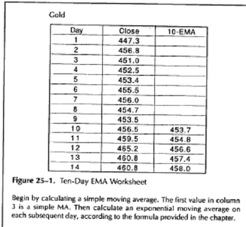
Technical analysis software allows you to select the EMA length and calculate it at a push of a key. To do it by hand, follow these steps:
Choose the EMA length (see below). Let us
say, we want a 10-day
EMA.
Calculate the coefficient K for that
length (see above). For example, if
you want a 10-day EMA, K equals 2 divided by 10 + 1, or 0.18.
Calculate a simple MA for the first 10
days-add closing prices and
divide the sum by 10.
On the 11th day, multiply the closing price
by K, multiply the previous
day's MA by (1 - K), and add the two. The result is the 10-day
EMA.
Keep repeating step 4 on each subsequent day
to obtain the latest
EMA (see worksheet, Figure 25-1).
An EMA has two major advantages over a simple MA. First, it assigns greater weight to the last trading day. The latest mood of the crowd is more important. In a 10-day EMA, the last closing price is responsible for 18 percent of EMA value, while in a simple MA all days are equal. Second, EMA does not drop old data the way a simple MA does. Old data slowly fades away, like a mood of the past lingering in a composite photo.
Choosing the Length of a Moving Average
A relatively short EMA is
more sensitive to price changes -it allows you to catch new trends sooner. It also changes its direction more often and
produces more whipsaws. A whipsaw is a rapid reversal of a trading
signal. A relatively long EMA leads to
fewer whipsaws but misses turning points by a wider margin.
When computers first became available, traders crunched numbers to find the "best" moving averages for different markets. They found which MAs worked in the past -but it did not help them trade because markets kept changing. Our brokers do not let us trade the past.
It pays to
tie EMA length to a cycle if you can find it. A moving average should be
half the length of the dominant market cycle (see Section 36). If you find a
22-day cycle, use an 11-day moving average. If the cycle is 34 days long,
then use a 17-day moving average. Trouble is, cycles keep changing their
length and disappearing. Some traders use software such as
Finally, traders can fall back on a simple rule of thumb: The longer the trend you are trying to catch, the longer the moving average you need. You need a bigger fishing rod to catch a bigger fish. A 200-day moving average works for long-term stock investors who want to ride major trends. Most traders can use an EMA between 10 and 20 days. A moving average should not be shorter than 8 days to avoid defeating its purpose as a trend-following tool. I have been using a 13-day exponential moving average for most of my trading in the past several years.
Trading Rules
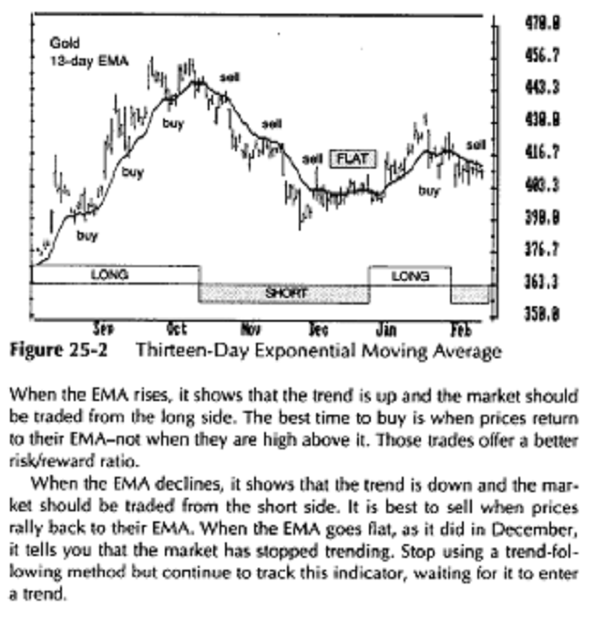
A successful trader does not forecast the future - he monitors the market and manages his trading position (see Section 17). Moving averages help us to trade in the direction of the trend. The single most important message of a moving average is the direction of its slope. It shows the direction of the market's inertia. When an EMA rises, it is best to trade the market from the long side, and when it falls, it pays to trade from the short side (Figure 25-2).
When an EMA rises, trade that market from the
long side. Buy when
prices dip near or slightly below the moving average. Once you are
long, place a protective stop below the latest minor low and move the
stop to the break-even point as soon as prices close above their EMA.
When the EMA falls, trade that market from the
short side. Sell short
when prices rally toward or slightly above the EMA, and place a pro
tective stop above the latest minor high. Lower that stop to the break
even point as soon as prices close below their EMA.
When the EMA goes flat and only wiggles a
little, it identifies an aim
less, trendless market. Do not trade using a trend-following method.
Mechanical Systems
The old mechanical trading methods using moving averages usually had four steps: (1) Buy when the MA rises and prices close above it; (2) sell when prices close below the MA; (3) sell short when the MA declines and prices close below it; (4) cover shorts when prices close above the MA. This mechanical method works in trending markets but leads to whipsaws when markets go flat.
Trying
to filter out whipsaws with mechanical rules is self-defeating - fil-
ters reduce profits as much as losses. An example of a filter is a rule that requires that prices close on the other side of MA not once, but twice, or that they penetrate MA by a certain margin. Mechanical filters reduce losses, but they also diminish the best feature of a moving average - its ability to lock onto a trend early.
The favorite approach of Donchian, one of the originators of trading with moving averages, was to use crossovers of 4-, 9-, and 18-day MAs. Trading signals were given when all three MAs turned in the same direction. His method, like other mechanical trading methods, only worked in strongly trending markets.
A trader must accept that an EMA, like any other trading tool, has good and bad sides. Moving averages help you identify and follow trends, but they lead to whipsaws in trading ranges. We will look for an answer to this dilemma in Chapter 9 on the Triple Screen trading system.
More on Moving Averages
Moving averages serve as support and resistance zones. A rising MA tends to serve as a floor below prices, and a falling MA serves as a ceiling above them. That's why it pays to buy near a rising MA, and sell short near a falling MA.
Moving averages can be applied to indicators as well as prices. Some traders use a 5-day moving average of volume. When volume falls below its 5-day MA, it shows reduced public interest in the minor trend, which is likely to reverse. When volume overshoots its MA, it shows strong public interest and confirms the price trend.
The proper way to plot a simple moving average is to lag it behind prices by half its length. For example, a 10-day simple MA properly belongs in the middle of a 10-day period, and it should be plotted underneath the 5th or 6th day. An exponential moving average is more heavily weighted toward the latest data, and a 10-day EMA should be plotted underneath the 7th or 8th day. Most software packages allow you to lag a moving average.
Moving averages can be based not only on closing prices but also on the mean between the high and the low. MAs of closing prices are used for daily analysis, but day-traders prefer to apply MAs to median prices.
An exponential moving average assigns greater weight to the latest day of trading, but a weighted moving average (WMA) allows you to assign any weight to any day, depending on what you deem important. WMAs are so complicated that traders are better off using EMAs.
Moving averages identify trends by filtering out daily
price ripples. A more advanced indicator was constructed by Gerald Appel, an
analyst and money manager in
How to Create MACD
The original MACD indicator consists of two lines: a solid line (called the MACD line) and a dashed line (called the Signal line). The MACD line is made up of two exponential moving averages (EMAs). It responds to changes in prices relatively quickly. The Signal line is made up of the MACD line smoothed with another EMA. It responds to changes in prices more slowly.
Buy and sell signals are given when the fast MACD line crosses above or below the slow Signal line. The MACD indicator is included in most programs for technical analysis. Few traders calculate it by hand -a computer does the job faster and more accurately.
To create MACD:
Calculate a 12-day EMA of closing prices.
Calculate a 26-day EMA of closing prices.
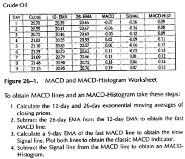
Subtract the 26-day EMA from the 12-day EMA,
and plot their differ
ence as a solid line. This is the fast MACD line.
Calculate a 9-day EMA of the fast line, and
plot the result as a dashed
line. This is the slow Signal line (see the worksheet, Figure 26-1).
Market Psychology
Each price reflects the consensus of value among the mass of market participants at the moment of the trade. A moving average represents an average consensus of value in a selected period - a composite photo of mass consensus. A long moving average tracks long-term consensus, and a short moving average tracks short-term consensus.
Crossovers
of the MACD and Signal lines identify shifts in the balance of power of
bulls and bears. The fast MACD line reflects mass consensus over a shorter
period. The slow Signal line reflects mass consensus over a longer period.
When the fast MACD line rises above the slow Signal line, it shows that bulls
dominate the market, and it is better to trade from the long side. When the
fast line falls below the slow line, it shows that bears dominate the market
and it pays to trade from the short side.
Trading Rules
Crossovers between the MACD and Signal lines identify changing market tides. Trading in the direction of a crossover means going with the flow of the market. This system generates fewer trades and whipsaws than a mechanical system based on a single moving average.
When the fast MACD line crosses above the slow Signal line, it gives a buy signal. Go long, and place a protective stop below the latest minor low.
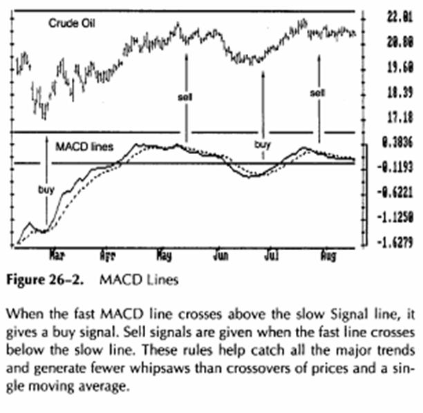
When
the fast line crosses below the slow line, it gives a sell signal. Go short,
and place a protective stop above the latest minor high (Figure 26-2).
More on MACD
Many traders try to optimize MACD by using other moving averages than the standard 12-, 26-, and 9-bar EMAs; 5-34-7 is another popular choice. Some traders try to link MACD to market cycles. The trouble is cycles are not present in the markets most of the time (see Section 36). If you use cycles, the first EMA should be one quarter the length of the dominant cycle and the second EMA half the cycle length. The third EMA is a smoothing device whose length does not have to be tied to a cycle. Beware of optimizing MACD too often. If you fiddle with MACD long enough, you can make it give you any signal you want using the same data.
A "quick-and-dirty" way to plot MACD is used by traders whose software does not include this indicator. Some packages allow you to draw only two EMAs. In that case, you can use crossovers between two EMAs, such as 11-day and 26-day EMAs as a proxy for MACD and Signal lines.
MACD-Histogram
MACD-Histogram offers a deeper insight into the balance of power between bulls and bears than the original MACD. It shows not only whether bulls or bears are in control but also whether they are growing stronger or weaker. It is one of the best tools available to a market technician.
MACD-Histogram = MACD line - Signal line
MACD-Histogram measures the difference between the MACD line and the Signal line (see worksheet, Figure 26-1). It plots that difference as a histogram - a series of vertical bars. That distance may appear puny, but a computer rescales it to fill the screen.
If the fast line is above the slow line, MACD-Histogram is positive and plotted above the zero line. If the fast line is below the slow line, MACD-Histogram is negative and plotted below the zero line. When the two lines touch, MACD-Histogram equals zero.
When the spread between the MACD and Signal lines increases, MACD-Histogram becomes taller or deeper, depending on its direction. When the two lines draw closer, MACD-Histogram becomes shorter.
The slope of MACD-Histogram is defined by the relationship between any two neighboring bars. If the last bar is higher (like the height of letters m-M), the slope of MACD-Histogram is up. If the last bar is lower (like the depth of letters P-p), then the slope of MACD-Histogram is down.
Market Psychology
MACD-Histogram shows the difference between long-term and short-term consensus of value. The fast MACD line reflects market consensus over a shorter period. The slow Signal line reflects market consensus over a longer period. MACD-Histogram tracks the difference between these two lines.
The slope of MACD-Histogram identifies the dominant market group. A rising MACD-Histogram shows that bulls are becoming stronger. A falling MACD-Histogram shows that bears are becoming stronger.
When the fast MACD line rallies faster than the slow Signal line, MACD-Histogram rises. It shows that bulls are becoming stronger than they have been - it is a good time to trade from the long side. When the fast MACD line drops faster than the slow line, MACD-Histogram falls. It shows that bears are becoming stronger-it is a good time to trade from the short side.
When the slope of MACD-Histogram moves in the same direction as prices, the trend is safe. When the slope of MACD-Histogram moves in a direction opposite to that of prices, the health of the trend is questioned. It is best to trade in the direction of the slope of MACD-Histogram because it shows whether bulls or bears dominate the market.
The slope of MACD-Histogram is more important than its position above or below the centerline. The best sell signals are given when MACD-Histogram is above its centerline but its slope turns down, showing that bulls have become exhausted. The best buy signals occur when MACD-Histogram is below its centerline but its slope turns up, showing that bears have become exhausted.
Trading Rules
MACD-Histogram gives two types of trading signals. One is common and occurs at every price bar. The other is rare and occurs only a few times a year in any market-but it is extremely strong.
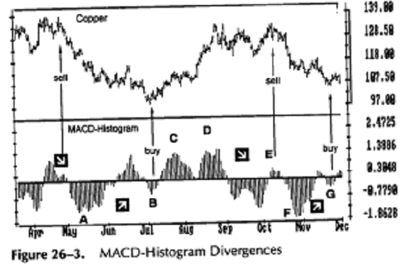
The common signal is given by the slope of MACD-Histogram (Figure 26-3). When the current bar is higher than the preceding bar, the slope is up. It shows that bulls are in control and it is time to buy. When the current bar is lower than the preceding bar, the slope is down. It shows that bears are in control and it is time to be short. When prices go one way but MACD-Histogram moves the other way, it shows that the dominant crowd is losing its enthusiasm and the trend is weaker than it appears.
Buy when MACD-Histogram stops falling and
ticks up. Place a pro
tective stop below the latest minor low.
Sell short when MACD-Histogram stops rising
and ticks down. Place
a protective stop above the latest minor high.
MACD-Histogram
ticks up and down on the daily charts so often that is not
practical to buy and sell every time it turns. The changes of slope of MACD-Histograms
are much more meaningful on the weekly charts, which is why it
is included in the Triple Screen trading system (see Section 43).
MACD-Histogram confirms trends when it reaches new highs or lows together with prices. The new lows in MACD-Histogram at points A and F confirm downtrends. New lows in the indicator tell traders that the downtrend is likely to retest or exceed bottoms A and F. New highs C and D in MACD-Histogram confirm uptrends. They show that the uptrend is likely to retest or exceed peaks C and D.
Divergences between MACD-Histogram and prices identify major turning points. These signals rarely occur, but when they do, they often let you catch major reversals and the beginnings of new trends. The bullish divergence A-B flags a major buying opportunity. Prices are at a new low, but the indicator is tracing a higher bottom. It shows that bears are exhausted and bulls are ready to gain the upper hand.
The bearish divergence D-E identifies a major selling opportunity. At the right edge of the chart, there is a bullish divergence, F-G. The best time to buy is when MACD-Histogram ticks up from its second bottom, G. Once you go long, place a protective stop below the price bottom G. Move the stop up as the trend progresses.
When to Expect a New Peak or Valley
MACD-Histogram works like headlights on a car-it gives traders a glimpse of the road ahead. New highs and lows in this indicator are usually followed by new high or low prices.
A record peak for the past three months in daily MACD-Histogram shows that bulls are very strong and prices are likely to rise even higher. A record new low for MACD-Histogram for the past three months shows that lower prices are likely ahead.
When MACD-Histogram reaches a new high during a rally, the uptrend is healthy and you can expect the next rally to retest or exceed its previous peak. If MACD-Histogram falls to a new low during a downtrend, it shows that bears are strong and prices are likely to retest or exceed their latest low.
The Strongest Signal in Technical Analysis
Divergences between MACD-Histogram and prices occur only a few times a year in any given market, but they give some of the most powerful messages in technical analysis. These divergences identify major turning points and give "extra-strength" buy or sell signals. They do not occur at every important top and bottom, but when you see one, you know that a major reversal is probably at hand.
When prices rally to a new high, but MACD-Histogram traces a lower top, it creates a bearish divergence (Figure 26-3). A lower top in MACD-Histogram shows that bulls are internally weak even though prices are higher. When bulls are running out of steam, bears are ready to grab control. Bearish divergences between MACD-Histogram and prices identify weakness at market tops. They give sell signals when most traders feel excited about a breakout to a new high!
3. Sell short when MACD-Histogram ticks down from its second, lower top, while prices are at a new high. Place a protective stop above the latest high.
As long as prices keep falling to new lows and MACD-Histogram keeps going lower, it confirms the downtrend. If prices fall to a new low but MACD-Histogram traces a more shallow low, it creates a bullish divergence. It shows that prices are falling out of inertia, bears are weaker than they seem, and bulls are ready to gain control. Bullish divergences between MACD-Histogram and prices identify strength at market bottoms. They give buy signals when most traders feel fearful about a breakdown to a new low!
4. Buy when MACD-Histogram ticks up from its second, more shallow bottom while prices are at a new low. Place a protective stop below the latest low.
If a bullish divergence between MACD-Histogram and price is aborted and prices fall to a new low, you will be stopped out. Continue to watch MACD-Histogram. If it traces a more shallow third bottom while prices decline to a new low, you are dealing with a "triple bullish divergence" - an especially strong buy signal. Buy again as soon as MACD-Histogram ticks up from its shallow third bottom. The reverse applies to shorting triple bearish divergences.
More on MACD-Histogram
MACD-Histogram works in any timeframe: weekly, daily, and intraday. The signals of weekly MACD-Histogram lead to greater price moves than the daily or intraday indicators. This principle applies to all indicators - signals in longer timeframes lead to greater price moves.
When you use MACD and MACD-Histogram on the weekly charts, you do not have to wait until Friday to get your signals. A major trend can change in the middle of the week - the market does not watch the calendar. Because of this, weekly studies have to be performed each day.
The Directional system is a trend-following method. It was developed by J. Welles Wilder, Jr., in the mid-1970s and modified by several analysts. The Directional system identifies trends and shows when a trend is moving fast enough to make it worth following. It helps traders take chunks of profit out of the middle of important trends.
How to Construct the Directional System
Directional
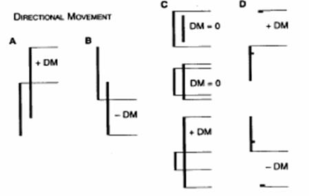
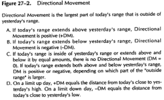
Movement is defined as the portion of today's range that is outside of the
previous day's range. The Directional system checks whether today's
range extends above or below the previous day's range and averages that data
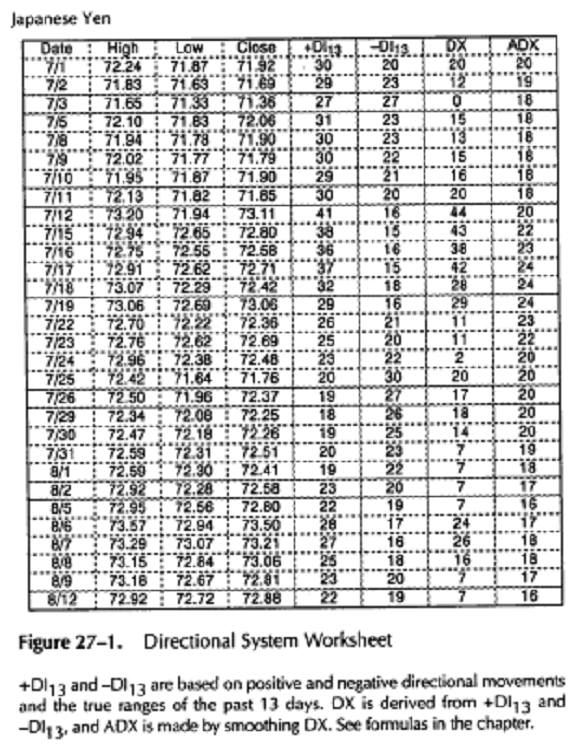
over a period of time. These complex calculations (see worksheet, Figure 27-1)
are best performed on a computer. The Directional system is included in
most software programs for technical analysis.
Identify "Directional Movement"
(DM) by comparing today's high-
to-low range with yesterday's high-to-low range. Directional
Movement is the largest part of today's range outside of yesterday's
range. There are four types of DM (Figure 27-2). DM is always a posi
tive number (+DM and -DM refer simply to movement above or
below yesterday's range).
Identify the "
always a positive number, the largest of three:
A. The distance from today's high to today's low
B. The distance from today's high to yesterday's close
C. The distance from today's low to yesterday's close
Calculate daily Directional
Indicators (+DI and -DI). They
allow
you to compare different markets by
expressing their directional
movement as a percentage of each
market's true range. Each DI is a
positive number: +DI equals zero on a
day that has no directional
movement up; -DI equals zero on a
day that has no directional move
ment down.
+DM -DM
+DI = -DI
TR TR
4. Calculate smoothed Directional Lines (+DI13 and -DI13). Smooth +DI and -DI are created with moving averages. Most software packages allow you to pick any period for smoothing, such as a 13-day moving average. You get two indicator lines: smoothed Positive and Negative Directional lines, +DI13 and -DI13. Both numbers are positive. They are usually plotted in different colors, or as a solid and a dashed line.
The relationship between Positive and Negative lines identifies trends. When +DI13 is on top, it shows that the trend is up, and when -DIjj is on top, it shows that the trend is down. The crossovers of +DI13 and give buy and sell signals.
Calculate
the Average Directional Indicator (ADX). This unique component
of Directional system shows when a trend is worth following. ADX measures the
spread between Directional Lines +DI^3 and -DI^3. It is calculated in
two steps:
For example, +DI13 = 34; -DI^ = 18. Then,

DX = . 100 = 30.77, rounded off = 31
B. Calculate the Average Directional Indicator ADX by smoothing DX with a moving average, such as a 13-day EMA.
When a trend proceeds in a healthy manner, the spread between two smoothed Directional lines increases and ADX rises. ADX declines when a trend reverses or when a market enters a trading range. It pays to use a trend-following method when ADX rises and not when ADX declines.
Crowd Behavior
The Directional system tracks changes in mass bullishness and bearishness by measuring the capacity of bulls and bears to move prices outside of the previous day's range. If today's high is above yesterday's high, it shows that the market crowd is becoming more bullish. If today's low is below yesterday's low, it shows that the market crowd is becoming more bearish.
The relative position of Directional lines identifies trends. When the Positive Directional line is above the Negative Directional line, it shows that bullish traders dominate the market. When the Negative Directional line rises above the Positive Directional line, it shows that bearish traders are stronger. It pays to trade in the direction of the upper Directional line.
The Average Directional Indicator ADX rises when the spread between Directional lines increases. This shows that market leaders are becoming stronger, losers are getting weaker, and the trend is likely to continue. When the ADX rises, it pays to trade in the direction of the upper Directional line, using a trend-following method.
ADX declines when the spread between +DI13 and -DI13 narrows down. This shows that the dominant market group is losing its strength, while the underdogs are gaining. Then the market is in turmoil, and it is better not to use trend-following methods.
Trading Rules
Trade only from the long side when +DI13 is above -DI13. Trade only from the short side when -DI13 is above +DI13. The best time to be long is when both +DI13 and ADX are above -DI13 and ADX rises. This shows that the uptrend is getting stronger. Go long and place a
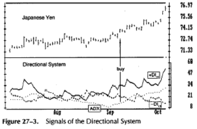
Directional lines identify trends. When +DI is on top, the trend is up, and it pays to trade the market from the long side. When -Dl is on top, it shows that the trend is down and it pays to trade the market from the short side. The best time to use a trend-following method is when ADX is rising and is above the lower Directional line. Those are two signs of dynamic trends.
The Directional system gives its best signals after ADX spends several weeks below both Directional lines. That happens in quiet, dull markets. Once ADX "wakes up" and rises by four steps (for example, from 10 to 14), it gives a strong signal to trade in the direction of the upper Directional line. It often flashes this signal at the beginning of major market moves. On this chart, ADX rallied from 9 to 13 in September, just prior to a dynamic rally in the Japanese Yen. Since the +DI was on top when the signal occurred, it signalled to go long.
![]() protective
stop below the latest minor low. The best time to be short is when -DIj3
and ADX are above +DI13 and ADX rises. This shows that bears
are becoming stronger. Go short and place a protective stop above the latest
minor high.
protective
stop below the latest minor low. The best time to be short is when -DIj3
and ADX are above +DI13 and ADX rises. This shows that bears
are becoming stronger. Go short and place a protective stop above the latest
minor high.
2. When ADX declines, it shows that the market is becoming less directional. There are usually many whipsaws, just as there are turbulences in the water during the change of tide. When ADX points down, it is better not to use a trend-following method.
When ADX falls below both Directional lines,
it identifies a flat,
sleepy market. Do not use a trend-following system but start getting
ready, because major trends emerge from such lulls.
The single best signal of the Directional
system comes after ADX falls
below both Directional lines. The longer it stays there, the stronger the
base for the next move. When ADX rallies from below both Directional
lines, it shows that the market is waking up from a lull. When ADX
rises by four steps (i.e., from 9 to 13) from its lowest point below both
Directional lines, it "rings a bell" on a new trend. It shows
that a new
bull market or bear market is being born (Figure 27-3). Buy if +DI13 is
on top and place a
stop below the latest minor low. Sell short if -DI13 is
on top and place a stop above the latest minor high.
For example, if ADX rises from 8 to 12 while both lines are above 12 and +DI13 is on top, it indicates that a new uptrend is beginning. If ADX rises from 9 to 13 while both lines are above 13 and -DI13 is on top, it shows that a new downtrend is starting.
The Directional System is unique in telling you when a major new trend is likely to begin. It rings a bell once or twice a year in any given market. It signals when a new baby bull or baby bear is being born. Monetary risk is usually low at that time, due to low volatility while the trend is still young.
When ADX rallies above both
Directional lines, it identifies an over
heated market. When ADX turns down
from above both Directional
lines, it shows that the major trend
has stumbled. It is a good time to
take profits. If you trade multiple
contracts, you definitely want to take
partial profits.
Market indicators give hard signals and soft signals. For example, a violation of a price low or a change in direction of a moving average are hard signals. A downturn of ADX is a soft signal. Once you see ADX turn down, you ought to be very, very careful about adding to positions. You should start taking profits, reducing positions, and looking to get out of your position rather than adding to it.
When greed or fear grips a mass of traders, the crowd surges. Oscillators measure the speed of that surge and track its momentum.
Technical indicators are divided into three main groups. Trend-following indicators help identify trends. Oscillators help find turning points. Miscellaneous indicators, such as the New High-New Low Index, track general changes in mass psychology.
Oscillators identify the emotional extremes of market crowds. They allow you to find unsustainable levels of optimism and pessimism. Professionals tend to fade those extremes. They bet against them, for a return to normalcy. When the market rises and the crowd gets up on its hind legs and roars from greed, professionals sell short. They buy when the market falls and the crowd howls in fear. Oscillators help them to time those trades.
Overbought and Oversold
Martin Pring compares trend-following indicators and oscillators to the footprints of a man walking his dog on a leash. The man leaves a fairly straight trail -like a trend-following indicator. The dog's trail swings right and left as far as the leash allows - like an oscillator. When the dog reaches the end of its leash, it is likely to turn and run the other way.
You can follow the trail of a man to find the trend of the pair. When the dog deviates from that trail by the length of its leash, it usually turns around. Usually, but not always. If a dog sees a cat or a rabbit, it may become excited enough to pull its owner off his trail. Traders need to use judgment when using oscillator signals.
An oscillator becomes overbought when it reaches a high level associated with tops in the past. Overbought means too high, ready to turn down. An oscillator becomes oversold when it reaches a low level associated with bottoms in the past. Oversold means too low, ready to turn up.
Overbought and oversold levels are marked by horizontal reference lines on the charts. The proper way to draw those lines is to place them so that an oscillator spends only about 5 percent of its time beyond each line. Place overbought and oversold lines so that they cut across only the highest peaks and the lowest valleys of an oscillator for the past six months. Readjust these lines once every three months.
When an oscillator rises or falls beyond its reference line, it helps a trader to pick a top or a bottom. Oscillators work spectacularly well in trading ranges, but they give premature and dangerous trading signals when a new trend erupts from a range. When a strong trend begins, oscillators start acting like a dog that pulls its owner off his path.
An oscillator can stay overbought for weeks at a time when a new, strong uptrend begins, giving premature sell signals. It can stay oversold for weeks in a steep downtrend, giving premature buy signals. Knowing when to use oscillators and when to rely on trend-following indicators is a hallmark of a mature analyst (see Section 43).
Types of Divergences
Oscillators, as well as other indicators, give their best trading signals when they diverge from prices. Bullish divergences occur when prices fall to a new low while an oscillator refuses to decline to a new low. They show that bears are losing power, prices are falling out of inertia, and bulls are ready to seize control. Bullish divergences often mark the ends of downtrends.
Bearish divergences occur in uptrends - they identify market tops. They emerge when prices rally to a new high while an oscillator refuses to rise to a new peak. A bearish divergence shows that bulls are running out of steam, prices are rising out of inertia, and bears are ready to take control.
There are three classes of bullish and bearish divergences (Figure 28-1). Class A divergences identify important turning points -the best trading opportunities. Class B divergences are less strong, and class C divergences are least important. Valid divergences are clearly visible - they seem to jump from the charts. If you need a ruler to tell whether there is a divergence, assume there is none.
Class A bearish divergences occur when prices reach a new high but an oscillator reaches a lower high than it did on a previous rally. Class A bearish divergences usually lead to sharp breaks. Class A bullish divergences occur when prices reach a new low but an oscillator traces a higher bottom than during its previous decline. They often precede sharp rallies.
Class B bearish divergences occur when prices make a double top but an oscillator traces a lower second top. Class B bullish divergences occur when prices make a double bottom but an oscillator traces a higher second bottom.
Class C bearish divergences occur when prices rise to a new high but an indicator stops at the same level it reached during the previous rally. It shows
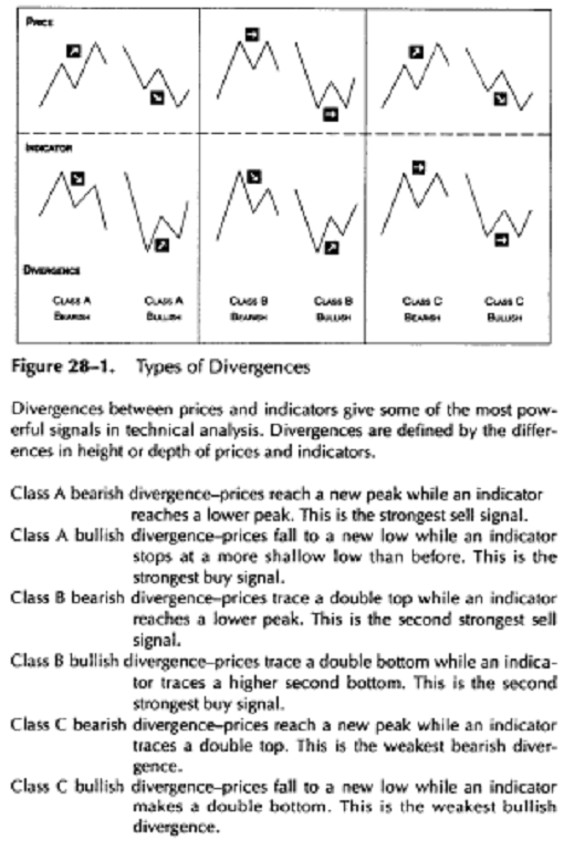
that bulls are becoming neither stronger nor weaker. Class C bullish divergences occur when prices fall to a new low but the indicator traces a double bottom.
Class A divergences almost always identify good trades. Class B and C divergences more often lead to whipsaws. It is best to ignore them, unless they are strongly confirmed by other indicators.
Triple Bullish or Bearish Divergences consist of three price bottoms and three oscillator bottoms or three price tops and three oscillator tops. They are even stronger than regular divergences. In order for a triple divergence to occur, a regular bullish or bearish divergence first has to abort. That's another good reason to practice tight money management! If you lose only a little on a whipsaw, you will not suffer-and you will have both the money and psychological strength to re-enter a trade.
Momentum and Rate of Change
Momentum and Rate of Change measure trend acceleration-its gain or loss of speed. These leading indicators show when a trend speeds up, slows down, or maintains its rate of progress. They usually reach a peak before the trend reaches its high and reach a bottom before prices hit their low.
As long as oscillators keep reaching new highs, it is safe to hold long positions. As long as they keep reaching new lows, it is safe to hold short positions. When an oscillator reaches a new high, it shows that an uptrend is gaining speed and is likely to continue. When an oscillator traces a lower peak, it shows that an uptrend has stopped accelerating, like a rocket that has run out of fuel. When it flies only because of inertia, you have to get ready for a reversal. The same reasoning applies to oscillator lows in downtrends.

Momentum
and Rate of Change compare today's closing price to a price a selected
period of time ago. Momentum subtracts a past price from today's price; Rate of
Change divides today's price by a past price.
For example, a 7-day Momentum of closing prices equals today's closing price minus the closing price 7 days ago. Momentum is positive if today's price is higher, negative if today's price is lower, and at zero if today's price equals the price of 7 days ago. The slope of the line connecting momentum values for each day shows whether momentum is rising or falling.
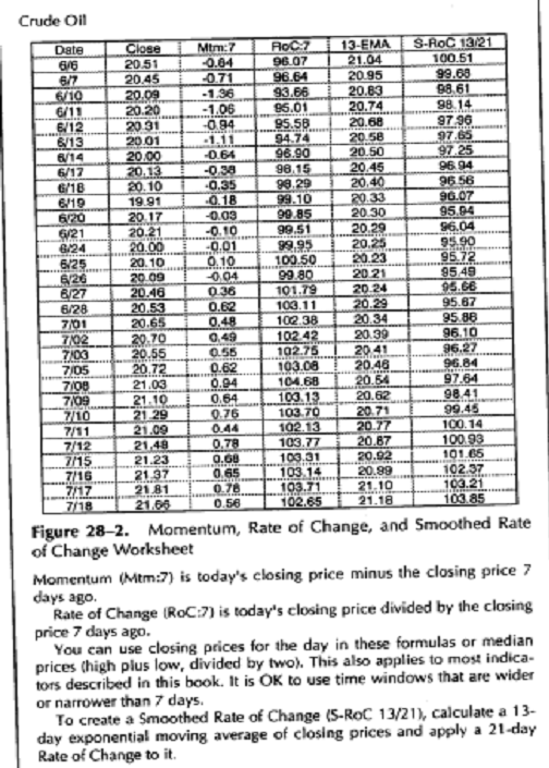
A 7-day Rate of Change (RoC) divides the latest price by the closing price 7 days ago. If they are equal, RoC equals 1. If today's price is higher, then RoC is greater than 1, and if today's price is lower, then RoC is less than 1. The slope of the line that connects values for each day shows whether Rate of Change is rising or falling (see worksheet, Figure 28-2).
A trader must choose the width of the time window for Momentum or RoC. As a rule of thumb, it pays to keep oscillator windows fairly narrow. Use wide windows for trend-following indicators whose goal it is to catch trends. Use narrow windows for oscillators to detect short-term changes in the markets.
Momentum and RoC share a flaw with simple moving averages - they jump twice in response to each piece of data. They react to each new price, and they jump again when that piece of data leaves the oscillator's window. Smoothed Rate of Change takes care of this problem.
Crowd Psychology
Each price reflects the consensus of value of all market participants at the moment of transaction. Momentum and RoC compare today's price (today's consensus of value) to a previous price (an earlier con
sensus of value). They measure changes in mass optimism or pessimism.
To
find out whether a child is growing fast enough, you can measure his height each
month and compare it with his height six months ago. Then you find out
whether your child is growing normally, growing so slowly that you should
take him to a doctor, or growing fast enough to think about applying for a
basketball scholarship. Momentum and RoC tell you whether a trend is
accelerating, slowing down, or moving at the same speed.
When Momentum or RoC rises to a new peak, it shows that the optimism of the market crowd is growing, and prices are likely to rally higher. When Momentum or RoC falls to a new low, it shows that the pessimism of the market crowd is increasing, and lower prices are likely ahead.
When prices rise but Momentum or RoC falls, it warns you that a top is near - it is time to think of taking profits on long positions or tightening stops. If prices reach a new high but Momentum or RoC reaches a lower top, that bearish divergence gives a strong sell signal. The reverse holds true in downtrends.
There are times when Momentum and RoC act not as leading but as coincident indicators. Think what happens to a rocket when it hits an overhead obstacle. Its speed and momentum stop rising and fall together as the rocket crashes. This happens in the markets when the crowd gets hit by a major piece of bad news and this "overhead obstacle" sends RoC and prices down together. Trading Rules
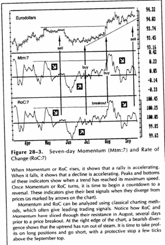
Leading indicators are like brake lights on a car ahead of you on a highway. When they light up, you do not know whether the other driver is tapping his breaks or slamming them. You have to be extra careful putting on trades using leading indicators (Figure 28-3).
When the trend is up, buy whenever RoC
declines below its centerline
and ticks up. It shows that the uptrend has slowed down - like a train
that slows down to pick up passengers. When the trend is down, sell
short whenever RoC rallies above its centerline and ticks down.
If you hold a long position and prices begin
to slide, see whether RoC
has reached a record peak before this pullback. A new peak in RoC
shows a high level of bullish energy, which is likely to lift the market
to its previous high or higher. Then it is relatively safe to hold long
positions. On the other hand, a series of declining peaks in RoC is a
sign of weakness -it is better to sell immediately. Reverse this
approach in downtrends.
A break in a trendline of Momentum or RoC
often precedes a break of
a price trendline by a day or two. When you see a leading indicator
break a trendline, prepare for a break in the price trend.
Smoothed Rate of Change
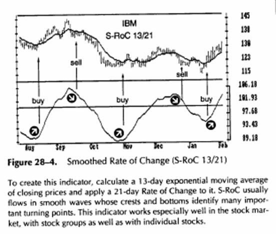
This oscillator, developed by Fred G. Schutzman, avoids the major flaw of RoC. It responds to each piece of data only once rather than twice. Smoothed Rate of Change (S-RoC) compares the values of an exponential moving average (EMA) instead of prices at two points in time. It gives fewer trading signals, and the quality of these signals is better. To create S-RoC you must first calculate an exponential moving average of closing prices (see Section 25). The next step is to apply Rate of Change to the EMA. S-RoC is not very sensitive to the length of its EMA or RoC parts. You can calculate a 13-day EMA of closing prices and then apply a 21-day Rate of Change to it (see worksheet, Figure 28-2).
Some traders calculate the Rate of Change of prices first and then smooth it with a moving average. Their method produces a much jumpier indicator, which is less useful than S-RoC.
Crowd Behavior
An exponential moving average reflects the average consensus of value of all market participants during the period of its window. It is like a composite photograph that reflects major features of the market crowd rather than its fleeting moods.
S-RoC compares each reading of an EMA to a past reading from your selected period of time. It compares the average mass consensus today to the average consensus in the past. S-RoC tracks major shifts in the bullishness and bearishness of the market crowd.
Trading Rules
Changes in the direction of S-RoC often identify important market turns. Upturns of S-RoC mark significant bottoms, and its downturns mark important tops (Figure 28-4). Divergences between S-RoC and prices give especially strong buy and sell signals.
Buy when S-RoC turns up from below its centerline.
Sell when S-RoC stops rising and turns down.
Sell short when S-RoC
turns down from above its centerline.
If prices reach a new high but S-RoC traces a
lower peak, it shows that
the market crowd is less enthusiastic even though prices are higher. A bearish
divergence between S-RoC and price gives a strong signal to sell short.
If
prices fall to a new low but S-RoC traces a higher bottom, it shows
that the market crowd is less fearful, even though prices are lower. It shows that
the downside pressure has lessened, even though the market has fallen deeper
than before. A bullish divergence gives a strong signal to cover shorts and
buy.

Williams
%R (Wm%R) is a simple but effective oscillator described by Larry
Williams in 1973. It measures the capacity of bulls and bears to close prices each
day near the edge of the recent range. Wm%R confirms trends and warns
of their upcoming reversals.
where r = the time window selected by a trader, such as 7 days.
Hr= the highest high of the selected period (i.e., a 7-day high). Lr = the lowest low of the selected period (i.e., a 7-day low). C = the latest close.
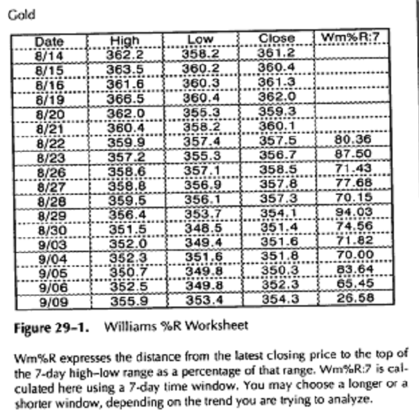
Wm%R measures the placement of each closing price in relation to the recent high-low range. It expresses the distance from the highest high to the lowest low in its time window as 100 percent. It expresses the distance from the latest closing price to the top of that window as a percentage of the range in its window (see worksheet, Figure 29-1). Williams %R is closely related to Stochastic (see Section 30).
Wm%R is designed to fluctuate between 0 and 100 percent. It equals 0 (plotted at the top of the chart) when bulls reach the peak of their power and close prices at the top of the range. It reaches 100 percent when bears are at the peak of their power and close prices at the bottom of the recent range.
A rule of thumb with all oscillators -when in doubt,-make them shorter. This is the opposite of trend-following indicators - when in doubt make them longer. Oscillators with narrow windows help catch short-term reversals. If you work with cycles, make Wm%R equal half the cycle length. A 7-day window fits Wm%R fine. Wm%R works well with weekly charts - use a 7-week window.
Horizontal reference lines for Wm%R are drawn at 10 percent and 90 percent levels. When Wm%R closes above its upper reference line, it shows that bulls are strong but the market is overbought. When Wm%R closes below its lower reference line, it shows that bears are strong but the market is oversold.
Crowd Psychology
Each price is a momentary consensus of value among all market participants. The high of the recent range shows how high bulls can lift prices - it reflects their maximum power. The low of the range reflects the maximum power of bears during that period. Closing price is the most important consensus of the day because the settlement of trading accounts depends on it.
Wm%R compares each closing price to the recent range. It shows whether bulls can close the market near the top of the recent, range or bears can close the "market at the bottom of the range. Wm%R measures the balance of power between bulls and bears at closing time - the crucial money-counting time in the market.
Bulls may push prices higher during the day, or bears may push them lower. Wm%R shows which group is capable of closing the market in its favor. If bulls cannot close the market near the top during a rally, they are weaker than they seem. This is a shorting opportunity. If bears cannot close the market near the lows during a decline, they are weaker than they appear. This is a buying opportunity
Trading Rules
Wm%R gives three types of trading signals. They are, in order of importance, bullish or bearish divergences, failure swings, and overbought-over-sold readings (Figure 29-2).
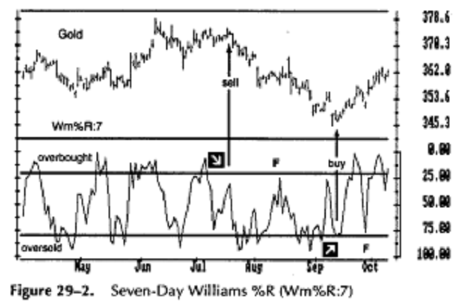
When Wm%R rises above its upper reference line, it shows that the market is overbought. When it falls below its lower reference line, it shows that the market is oversold. The best buy and sell signals are given by divergences (marked by arrows). A Class B bearish divergence in July gave a sell signal. A Class A bullish divergence in September gave a strong buy signal.
Failure swings (marked by the letter F) occur when Wm%R reverses without reaching its reference line. This happens during reactions against very strong trends-failure swings confirm those trends. A failure swing during a downtrend in August gave a strong sell signal. A failure swing during an uptrend in September gave a strong buy signal.
At the right edge of the chart, prices are surging. If Wm%R dips below its lower reference line, use that as a buying opportunity. Do not sell short unless a bearish divergence emerges.
![]() Divergences
Divergences
Divergences between prices and Wm%R rarely occur. They identify the best trading opportunities. When Wm%R rises above its upper reference line, falls, and then cannot rise above that line during the next rally, it creates a bearish divergence. It shows that bulls are losing their power and the market is likely to fall. A bullish divergence occurs when Wm%R falls below its lower reference line, rallies, and then cannot decline below that line when prices slide again. It shows that bears are losing power and a rally is in the offing.
When you identify a bullish divergence, go
long and place a protective
stop below the recent price low.
When you identify a bearish divergence, go
short and place a protec
tive stop above the recent price high.
Failure Swings
Crowds tend to swing from one extreme to the other. Wm%R seldom reverses in the middle of its range. Failure swings occur when Wm%R fails to rise above its upper reference line during a rally or fall below its lower reference line during a decline.
When Wm%R stops rising in the middle of a
rally and turns down
without reaching its upper reference line, it produces a failure swing.
This shows that bulls are especially weak and gives a sell signal.
When Wm%R stops falling in the middle of a
decline and turns up
without reaching its lower reference line, that is a failure swing. It
shows that bears are very weak and gives a buy signal.
Overbought and Oversold
When prices close near the upper edge of their range, Wm%R reaches its top and becomes overbought. When prices close near the bottom of their recent range, Wm%R falls and becomes oversold. Neither bulls nor bears are all-powerful. They seldom can close prices near the extreme of the recent range for too many days in a row.
When Wm%R rises above its upper reference
line, it marks a potential
market top and gives a sell signal.
When Wm%R falls below its lower reference
line, it marks a potential
market bottom and gives a buy signal.
These overbought and oversold signals tend to work well during flat trading ranges. They become premature and dangerous when the market enters a trend. Wm%R can stay near the top for a week or longer during a strong rally: Its overbought readings can identify strength rather than a shorting opportunity. Similarly, in a strong downtrend, Wm%R can stay oversold for weeks, indicating weakness rather than a buying opportunity.
Overbought and oversold readings of Wm%R should be used for trading only after you identify the major trend. Use long-term trend-following indicators for that purpose (see Section 43). If a weekly chart shows a bull market, take only buy signals from daily Wm%R, and do not go short when it gives a sell signal. If a weekly chart indicates a bear market, sell short whenever daily Wm%R gives you a sell signal, but do not go long when it becomes oversold.
Stochastic is an oscillator
popularized by
Stochastic is more complex than Williams %R. It includes several steps for filtering out market noise and weeding out bad signals. Stochastic consists of two lines: a fast line called %K and a slow line called %D.

1.
The first step in calculating Stochastic is to obtain "raw
Stochastic" or
The standard width of Stochastic's time window is 5 days, although some traders use much higher values. A narrow window helps catch more turning points, but a wider window helps identify major turning points.

2.
The second step is to obtain %D. It is done by smoothing %K-usually over a
three-day period. It can be done in several ways, such as:
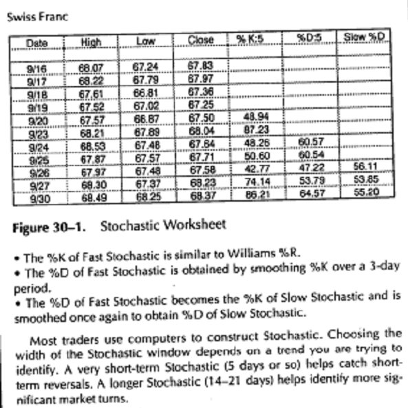
There
are two ways to plot Stochastic-Fast and Slow. Fast Stochastic consists of two lines-%K and
%D-plotted on the same chart. It is very sensitive
to market turns but leads to many whipsaws. Many traders prefer a less sensitive Slow Stochastic. The %D of
Fast Stochastic becomes the %K of Slow Stochastic and is smoothed by repeating
step 2 to obtain %D of Slow Stochastic.
Slow Stochastic does a better job of filtering out market noise and leads to fewer whipsaws. A 5-bar Slow Stochastic
(smoothed over a 3-day period) is a popular choice among traders (see
worksheet, Figure 30-1).
Stochastic is designed to fluctuate between 0 and 100. Reference lines are drawn at 20 percent and 80 percent levels to mark overbought and oversold areas. Slow Stochastic seldom reaches the same extremes as raw Williams
Crowd Psychology
Each price is the consensus of value of all market participants at the moment of transaction. Daily closing prices are important because the settlement of trading accounts depends on them. The high of any period marks the maximum power of bulls during that time. The low of that period shows the maximum power of bears during that time.
Stochastic measures the capacity of bulls or bears to close the market near the upper or lower edge of the recent range. When prices rally, markets tend to close near the high. If bulls can lift prices up during the day but cannot close them near the top, Stochastic turns down. It shows that bulls are weaker than they seem and gives a sell signal.
Daily closes tend to occur near the lows during downtrends. When a bar closes near its high, it shows that bears can only push prices down during the day but cannot hold them down. An upturn of Stochastic shows that bears are weaker than they appear and flashes a buy signal.
Trading Rules
Stochastic shows when bulls or bears become stronger or weaker. This information helps you decide whether bulls or bears are likely to win the current fight in the market. It pays to trade with the winners and against the losers.
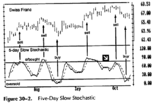
Stochastic gives three types of trading signals, listed here in the order of importance: divergences, the level of Stochastic lines, and their direction (Figure 30-2).
Divergences
The
most powerful buy and sell signals of Stochastic are given by divergences
between this indicator and prices.
Stochastic lines help identify top and bottom areas when they move above or below their reference lines. These signals work well during trading ranges but are premature when a new trend begins (see early September). Stochastic gives its best signals when it diverges from prices. There is a Class A bearish divergence in early October, prior to a sharp price break.
Once you go long or short using Stochastic, place a protective stop immediately below the latest minor low or above the latest minor high. There is a buy signal at the right edge of the chart-it is time to cover shorts and buy.
![]() A bullish
divergence occurs when prices fall to a new low but
A bullish
divergence occurs when prices fall to a new low but
Stochastic traces a higher bottom than during the previous decline. It
shows that bears are losing strength and prices are falling out of iner
tia. As soon as Stochastic turns up from its second bottom, it gives a
strong buy signal: Go long and place a protective stop below the latest
low in the market. The best buy signals occur when the first bottom is
below the lower reference line and the second is above it.
A bearish
divergence occurs when prices rally to a new high but
Stochastic traces a lower top than during its previous rally. It shows that bulls
are becoming weaker and prices are rising out of inertia. As soon as
Stochastic turns down from its second top, it gives a sell signal: Go short
and place a protective stop above the latest price peak. The best
sell signals occur when the first top is above the upper reference line
and the second is below.
Overbought and Oversold
When Stochastic rallies above its upper reference line, it shows that the market is overbought. Overbought means too high, ready to turn down. When Stochastic falls below its lower reference line, it shows that the market is oversold. Oversold means too low, ready to turn up.
These signals work fine during trading ranges but not when a market develops a trend. In uptrends, Stochastic quickly becomes overbought and keeps giving sell signals while the market rallies. In downtrends, Stochastic quickly becomes oversold and keeps giving premature buy signals. It pays to combine Stochastic with a long-term trend-following indicator (see Section 43). The Triple Screen trading system allows traders to take buy signals from daily Stochastic only when the weekly trend is up. When the weekly trend is down, it allows traders to take only sell signals from daily Stochastic.
When you identify an uptrend on a
weekly chart, wait for daily
Stochastic lines to decline below
their lower reference line. Then,
without waiting for their crossover
or an upturn, place a buy order
above the high of the latest price
bar. Once you are long, place a pro
tective stop below the low of the
trade day or the previous day,
whichever is lower.
The shape of Stochastic's bottom often indicates whether a rally is likely to be strong or weak. If the bottom is narrow and shallow, it shows that bears are weak and the rally is likely to be strong. If it is deep and wide, it shows that bears are strong and the rally is likely to be weak. It is better to take only strong buy signals.
When you identify a downtrend on
a weekly chart, wait for daily
Stochastic lines to rally above their
upper reference line. Then, with
out waiting for their crossover or a
downturn, place an order to sell
short below the low of the latest
price bar. By the time Stochastic lines
cross over, the market is often in a
free fall. Once you are short, place a
protective stop above the high of the trade day or the previous day, whichever is higher.
The shape of Stochastic's top often indicates whether a decline is likely to be steep or sluggish. A narrow top in Stochastic shows that bulls are weak and a severe decline is likely. A Stochastic top that is high and wide shows that bulls are strong-it is safer to pass up that sell signal.
5. Do not buy when Stochastic is overbought and do not sell short when it is oversold. This rule filters out most bad trades.
Line Direction
When both Stochastic lines are headed in the same direction, they confirm the short-term trend. When prices rise and both Stochastic lines rise, the uptrend is likely to continue. When prices slide and both Stochastic lines fall, the short-term downtrend is likely to continue.
More on Stochastic
Stochastic can be used in any timeframe, including weekly, daily, or intra-day. Weekly Stochastic usually changes its direction one week prior to weekly MACD-Histogram. If weekly Stochastic turns, it warns you that trend-following MACD-Histogram is likely to turn the next week. It is a signal to tighten stops on existing positions or start taking profits.
Choosing the width of the Stochastic window is important. Short-term oscillators are more sensitive. Long-term oscillators turn only at important tops and bottoms. If you use Stochastic as a stand-alone oscillator, a longer Stochastic is preferable. If you use Stochastic as part of a trading system, combined with trend-following indicators, then a shorter Stochastic is preferable.
An ingenious way to use Stochastic, popularized by Jacob Bernstein, is called a Stochastic pop. When Stochastic crosses above its upper reference line, it indicates strength. You can buy for a quick rally and sell as soon as Stochastic turns down. This signal can help you catch the last splash of the bullish wave.
Stochastic is one of the favorite tools of automatic trading systems developers. These modern-day alchemists try to use Stochastic in a pu.cly mechanical manner, buying and selling when the two Stochastic lines cross. They discard Stochastic when it fails to deliver magic results. Trading the crossovers of Stochastic lines is not profitable, no matter how much you optimize them, because Stochastic works differently, depending on whether the market is in a trend or in a trading range.

Relative
Strength Index (RSI) is an oscillator developed by J. Welles Wilder, Jr. It is
now included in most software packages. RSI measures the strength of any
trading vehicle by monitoring changes in its closing prices. It is a leading or
a coincident indicator-it is never a laggard.
The pattern of RSI peaks and valleys does not change in response to the width of its time window. Trading signals become more visible with shorter RSI, such as 7 or 9 days. Most traders use computers to calculate and plot RSI. Take these steps to calculate a 7-day RSI for any market:
Obtain closing prices for the past 7 days.
Find all days where the market closed higher
than the day before and
add up the amounts of increases. Divide the sum by 7 to obtain the
average UP closing change.
Find all days when the market closed lower
than the day before and
add up the amounts of declines. Divide the sum by 7 to obtain the
average DOWN closing change.
Divide the average UP closing change by the
average DOWN closing
change to obtain Relative Strength (RS). Insert RS in the formula
above to arrive at
RSI - Relative Strength Index.
Repeat the process daily (see worksheet, Figure 31-1).
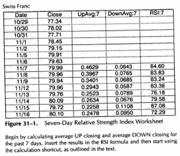
If
you calculate RSI by hand, you can use a shortcut. Once you have 7 days'
worth of data, replace steps 2 and 3 on all following days:
Multiply yesterday's average UP closing
change by 6, add today's UP
closing change, if any, and divide the total by 7. That is your new
average UP closing change.
Multiply yesterday's average DOWN closing
change by 6, add today's
DOWN close if any, and divide the total by 7. That is your new aver
age DOWN closing change. Then proceed to step 4 (opposite page).
If you calculate RSI by hand, you can use a shortcut. Once you have 7 days' worth of data, replace steps 2 and 3 on all following days:
Multiply yesterday's average UP closing
change by 6, add today's UP
closing change, if any, and divide the total by 7. That is your new
average UP closing change.
Multiply yesterday's average DOWN closing
change by 6, add today's
DOWN close if any, and divide the total by 7. That is your new aver
age DOWN closing change. Then proceed to step 4 (opposite page).
RSI fluctuates between 0 and 100. When RSI reaches a peak and turns down, it identifies a top. When RSI falls and then turns up, it identifies a bottom. These turns come at different levels in different markets or even in the same market, during bull and bear periods.
Overbought and oversold levels vary from market to market and from year to year. There are no magical levels marking all tops and bottoms. Oversold and overbought signals are like hot and cold readings on a thermometer. The same temperature has a different meaning in summer or in winter.
Horizontal reference lines must cut across the highest peaks and the lowest valleys of RSI. They are often drawn at 30 and 70. Some traders use 40 and 80 levels in bull markets or 20 and 60 in bear markets. Use the 5 percent rule: Draw each line at a level beyond which RSI has spent less than 5 percent of its time in the past 4 to 6 months. Adjust reference lines once every three months.
Mass Psychology
Each price represents the consensus of value of all market participants at the moment of transaction. Closing price reflects the most important consensus of the day because the settlement of traders' accounts depends on it. When the market closes higher, bulls make money and bears lose. When the market closes lower, bears make money and bulls lose.
Most traders in all markets pay more attention to closing prices than to any other prices. In the futures markets, money is transferred from losers' to winners' accounts at the end of each trading day. RSI shows whether bulls or bears are stronger at closing time -the crucial money-counting time in the market.
Trading Rules
RSI gives three types of trading signals. They are, in order of importance, divergences, charting patterns, and the level of RSI.
Bullish and Bearish Divergences
Divergences between RSI and prices give the strongest buy and sell signals. They tend to occur at major tops and bottoms. They show when the trend is weak and ready to reverse (Figure 31-2).
Bullish divergences give buy signals. They occur when prices fall to a new low but RSI makes a more shallow bottom than during its previous decline. Buy as soon as RSI turns up from its second bottom, and place a protective stop below the latest minor price low. Buy signals are especially strong if the first RSI bottom is below its lower reference line and the second bottom is above that line.
2. Bearish divergences give sell signals. They occur when prices rally to a new peak but RSI makes a lower top than during the previous rally. Sell short as soon as RSI turns down from its second top, and place a protective stop above the latest minor high. Sell signals are especially strong if the first RSI top is above its upper reference line and the second top is below it.
Charting Patterns
Classical charting methods work better with Relative Strength Index than with other indicators. Trendlines, support and resistance, and head-and-shoulders patterns work well with RSI. RSI often completes these patterns a few days in advance of prices, providing hints of likely trend changes. For example, RSI trendlines are usually broken one or two days before price trendlines.
When RSI breaks its downtrendline, place an
order to buy above the
price trendline in order to catch an upside breakout.
When RSI breaks its uptrendline, place an order
to sell short below the
price trendline to catch a downside breakout.
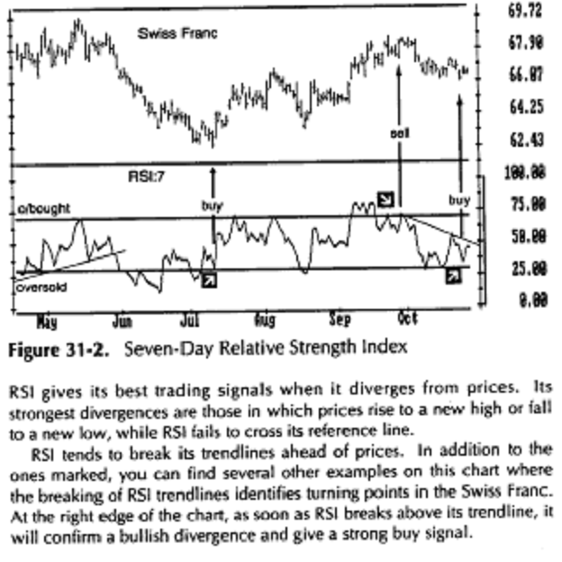
RSI Levels
When RSI rises above its upper reference line, it shows that bulls are strong but the market is overbought and entering its sell zone. When RSI declines below its lower reference line, it shows that bears are strong but the market is oversold and entering its buy zone.
It pays to buy using overbought signals of daily RSI only when the weekly trend is up. It pays to sell short using sell signals of daily RSI only when the weekly trend is down (see Section 43).
Buy when RSI declines below its lower reference line and then rallies above it.
Sell short when RSI rises above its upper reference line and then crosses below it.
More on RSI
Some traders try to find deeper meaning in RSI patterns. Some analysts have described formations called positive and negative reversals, which they said forecasted the extent of any price move using RSI patterns. So far, there have been no reports of conspicuous success using these patterns from any
|