How To Use
BYGraph
Developer Manual
End-users of your software are primarily concerned with its features, speed, and usability within their own applications. BYGraph attracts practical product managers and owners working with complex engineering, financial, scientific, manufacturing and business data. For end-users, BYGraph offers numerous ways to view data and tools to analyze and manipulate data. Although most graphing tools on the market merely allow viewing only, our tools are so advanced that it allows users to edit data and create theoretical data set for comparison and analysis.
For software developers, the rich features make BYGraph the perfect choice for application software development. In this industry, many developers are more interested in making designers and wizards so that developers can click a few clicks and add a generic chart to an application. If your dedication to the end-user and/or your product's competitiveness is true, and you're primarily interested in the quality and quantity of embedded functionality that renders without overlapping text and visual oddities, congratulations, you've come to the right place.
BYSoft, Inc. is unique in that it evolved from an internal project. We needed "good charting functionality," but none of the generic charting products available came close to the quality we expected. So we wrote our own. If you have similar high expectations, you will appreciate BYSoft, Inc. We've heard many times that our charts "blow the competition away." Because we realize that wizards and generic charts won't help your product's competitiveness, we have implemented features in our software that allow greater user control and manipulation.
Our
Transform your idea into software reality
Where to Get More Information
You may call the BYSoft Client Service at 713-776 1111, send an email to [email protected] or a fax to 281-499 5816 for more information. Information is also available on the BYSoft Web Site at https://www.bysoftinc.com.
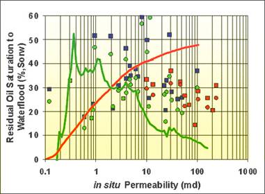
Thanks for choosing BYGraph ActiveX control. BYGraph is easy to learn and easy to use for both end users and software developers. This product manual is intended for both end users and software developers who have the software developmental environments that support AcitveX (OCX).
BYGraph is an ActiveX Control that implemented the COM interface so users can use it anywhere with COM supports, such as web browser, Microsoft office (word, excel, access, outlo 949f51j ok). Developers and engineers could use this component in most popular development environment, such as Visual Basic, Visual C++, ASP, and Microsoft Office. The control intelligently displays user's data into customizing format.
Both end users and developers could use BYGraph. It provides menu by right click on the graph area. End users could use this menu to access and manipulate the graph. It also provides COM interface to developers to manipulate the graph, such as graph data, curve, curve fitting, curve editing, curve generating, and file save and open.
It can be used to display both static and dynamic data. Static graph are the ones that did not change with time, such as curve of temperature relationship with depth. Dynamic graph is the one which change with real time such temperature measured at oil meter every second. This graph could display dynamic and static curves at the same time so users could view the relationship between desired values with real values.
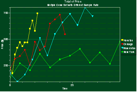
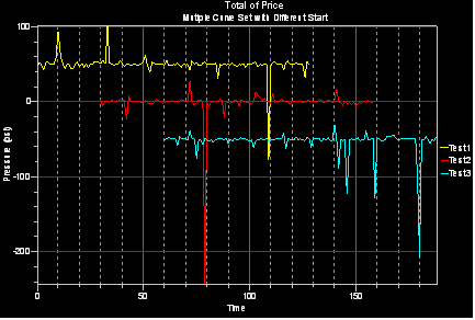
BYGraph could display both sampled data and random distributed data. Sample data are evenly distributed along x-axis at an equal interval; sampled data is defined by values at each sample point and sample interval as well as starting coordinate. Random data must be specified by giving both x and y values at each point of the curve. BYGraph could be used to display both sampled and random data in the same graph. BYGraph could even display sampled data curves, which don't have the same starting points and/or same sampling interval.
BYGraph supports multiple curves. Multiple curves could be displayed in six different modes. The most common one is normal mode that has the same vertical axis scale. But when the difference between curves' amplitudes is big, normalization mode should be used, since curves are stretched to the same graph area. Curves could be displayed in two vertical axes so some curves use left vertical axis and some right axis. All curves could be displayed in their own panel with their own scale.
BYGraph could be used to do histogram display and cross section display. Since there is no requirement for data sets to start at the same points, this graph can easily display fault, underground rock properties, etc.
Curves from different files could superpose on each other so user could compare data from different situations or different process or different time.
Each curve has its own property and user could manipulate them by using the context menu; developer can do that by using the COM interface.
Markers could be added to mark the special interested points, area or region. Markers are also used to identify interested area or selected window so users left. Markers could be editable so user could pick them up and move them to the desired places.
Data points and markers could be editable. So user could change the data or marked area, point or region.
Support sampled data and random distributed data, Static and dynamic data display together.
Supports multiple curves, multiple axes: horizontal or vertical layout.
Build-in histogram, statistics data support.
User can generate, modify, add noise, or drag and move curves in real time for the further analysis.
Add drawing objects to any graph such as points (marker), lines (fitting line, gradient line...), polygons, rectangles and ellipses.
Support area picking, deleting, editing, interpolation, smooth, analyze, curve fitting.
Support user defined or pre-defined fitting line and gradient line, which can be manipulated in two modes: rotate and parallel dragging on plot.
Vertical and horizontal layout.
Multiple display format support (bar, curve, cross section, static bar, trace and normalized)
Support linear and log scale.
Pick and copy curves and lines into clipboard and paste into another plot.
Dynamically move curves to desired position.
Editable curve shapes.
Access data file from either remote computer on the internet or local machine.
User configurable background: color, gradient color, picture, transparency
Interactive axis configuration, annotation, zoom, customized menu support.
Multiple Language support.
Data Type:
Functions:
Single or multiple curve and axis display.
Curve can be edit and created at real-time for the further analysis, such as: generate, modify, add noise, or drag and move curves.
Multiple curves as related traces.
Pick and copy curves and lines into clipboard and paste into another plot.
Multiple ways to display curve(s), such as: bar, stack area, trace, density .
Curve fitting, smooth, annotation, theoretical curve creation, real time math support.
Support pre-defined fits or user defines fit line and gradient line, both can be rotating or parallel dragging.
Support irregular and interval region
Support customized user menu.
Display:
Curve:
Edit:
Axis:
Cursor:
Markers:
Grid:
Hard Copy:
Print directly to printer
Save as a vector file (windows enhanced metal file *.emf).
Language:
Support multiple languages, such as: English, Chinese, Spanish .
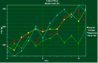
Example1: Multiple curves Under the Normal Display Mode
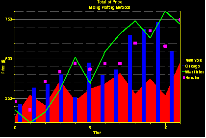
Example2: Mixing Plotting Methods
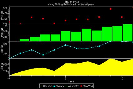
Example3: Mixing Plotting Methods with Individual panel
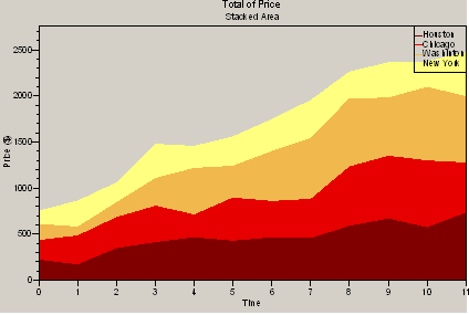
Example4: Area stacking graph to show accumulated results with legend at corner
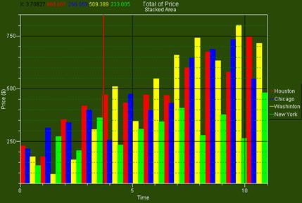
Example5: Histogram display chart with data
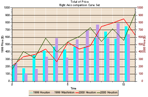
Example : Right Axis comparison on Curve Set
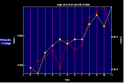
Example7: Large and Small quantity handle
Example8: Display sampled data and random distributed data with different axis
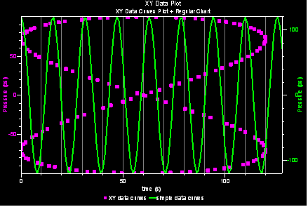
Example : Random data with range marker and fitting line
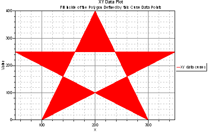
Example : Fill Inside of the Polygon Defined by This Curve Data Points
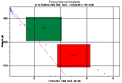
Example : Annotation capability to enhance visual view
Example12: Multiple Curve Set with Different Sample Rate
Example13: Multiple Curves Set with Different Start X data
Example : Trace Display + event picking
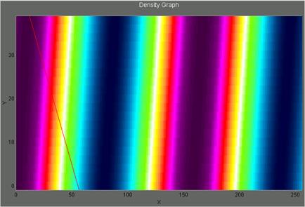
Example1 : Density display mode
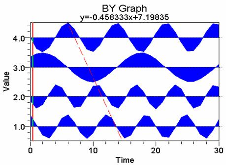
Example 16: Display vertically with customized background
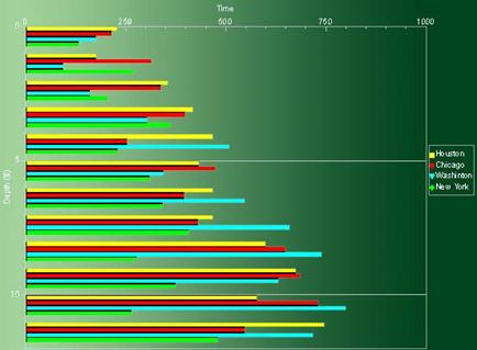
Example17: Display in log scale

Example 18: Generated from the user's functions by use the calculator syntax
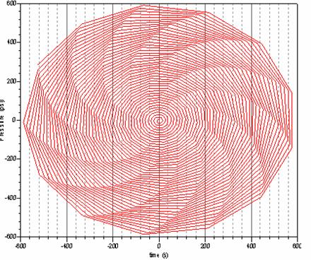
Example 19: User defined gradient line
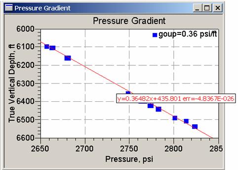
Example 20: Support irregular and interval region
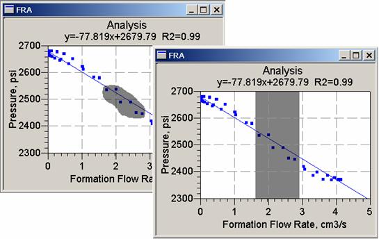
Example 21: Support user customized menu.
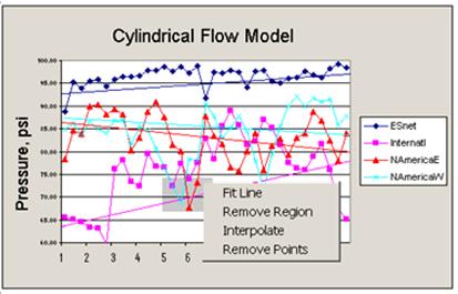
Example 22: support compute functions by use the calculator syntax
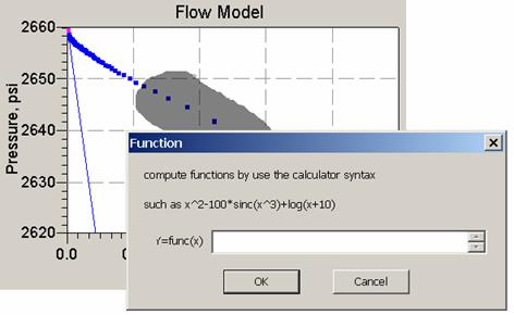
Example 22: support compute functions by use the calculator syntax
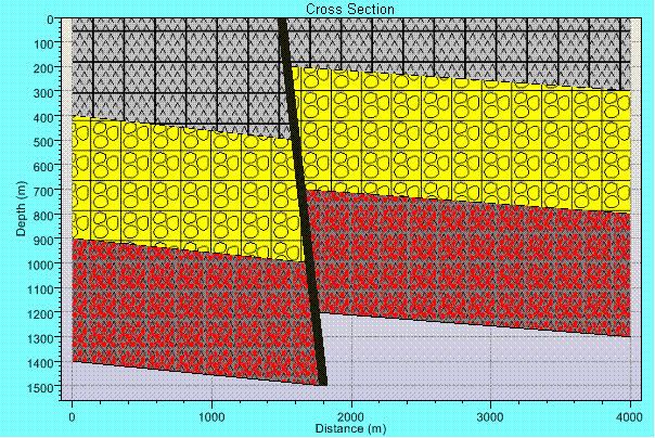
Example 23 Cross Section Display with fault for geological modeling
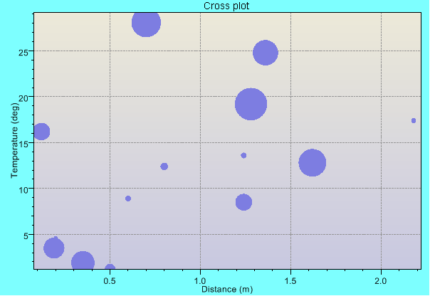
Example 24 Bubble Display
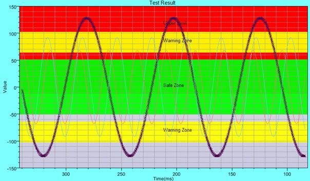
Example 25 Real time display with marked zones.
Reference Manual
The following figure shows all contents of the BYGraph's menu bar:

figure : BYGraph's menu bar
Open a BYGraph data file (.DAT), which contains the entire configuration and curve information about the graph display and its data curves.

figure2: new graph dialog
Start a new graph
Check/uncheck start a new graph, user can use the data file to create a new graph or impose on the current display to help users do graph's comparison.
Save a plot into a binary file (*.DAT), witch includes all of data information and display configuration.
Import an ASCII (*.CSV) file into BYGraph. When users open a CSV type file, a pop-up import configuration dialog box is showed on the screen (see the below figure).
Turn on off the check boxes New Graph, user can use the data file to create a new graph or impose on the current display.
Click on a column header to choose X Axis
Click on a column header while press Ctrl key down to choose Y Axis.
Select first data row by select the start row.
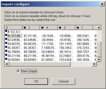
figure3: Import configure Dialog
Export all the data set data into an ASCII (*.csv) file. If the entire curve sets are sampled data. only, this export will only export first column as x and all other columns as y data. We export XY data with X and Y data into two columns side by side.
This function is to save the displaying graph. The saving file type is enhanced metafile (*.emf), so user can use it for further analysis or to generate report automatically.
Prints out to a standard printer.
After graph has been displayed, right click on the plot area, the property dialog box will be showed as follows:
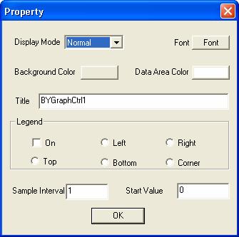
figure4: Graph Property Dialog
BYGraph supports multiple display formation: Normal Normalization, Crosse Section, Bar, Bar Stack, Trace, Different Panel, curve stack, distribution, function, and polar.
Users can change the graph's font, background color, and data area color at real-time.
Title
Set main title of plot, it supports multiple language.
Legend
Users can decide whether the graph needs legend by turning on or off the check boxes. If Legend is on, it can be displayed at the position as user need: left, right, top, bottom, or right corner.
Sample Interval
Click it to put the system into zoom in mode. With left mouse button holding down, move the mouse to target place and release the button. A rubber bound comes up to indicate the area to be zoomed in. There are maximum 9 levels of zoom in.
Zoom out one level.
After do zooming, if users want to go back to the original setting, they need to click the reset.
Add a gradient line by user input for plot.
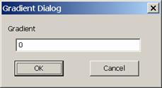
Figure5: gradient dialog
BYGraph supports single or multiple gradient lines, which support rotate and parallel dragging.
The cross in the middle of a gradient line is the pick point for users to snatch the line and move it. To rotate the gradient line, press the left mouse button on either end of the line and rotate to the appropriate position.
Click on it to let user select an annotation to put on the graph as a background or add a marker on the curve (when use click on the curve).
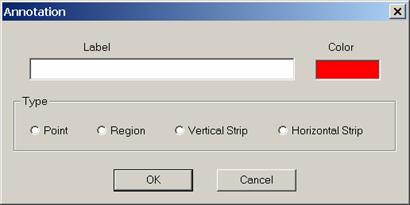
Figure6: Add Annotation Dialog
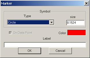
Figure7: Add Marker Dialog
Both of them can be deleted or configured after it created.
User define a custom fit by enter a formula which uses the calculator syntax.
If the current display mode is function, clicking on this item brings up a Computation Formula dialog enable users create a curve using their own formula. Users may key in one of the four formulas and leave the rest blank. Y=func(x, y, s, t.) are for Cartesian coordinate, while X=func(t) and Y=func(t) are for polar coordinate. Any current curve are available as input, so user just need to add the input curve as variable, such as to input Pressure as variable s and now user can type in the formula to calculate a new curve based on x, s.
This is only work for sampled data.
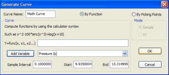
Figure8: Computation formula dialog
User could choose to use picking to generate a new curve by just click on the points he/she want in the display area.
First user need to click left mouse button on the curve to set it to be current curve, and modify the selected curve by enter a formula in the function dialog, for example: f(y) = 10*y + sinc(x).
First user need to click left mouse button on the curve to set it to be current curve, and click on the Add Noise item in the menu. The selected curve is shown as the simulation of curve data with noise of Gaussian distribution.
First user need
This item enables to user move curve dynamically to target position. First, click on this item in the main menu to set the current mode to be MOVE, then, left click on the curve to be moved, with the Ctrl key being hold, move the curve to the desired position and release the keys. Keep doing this for another movement. To return to the normal mode, double click on the screen.

Figure 10: Before the movement of black color curve
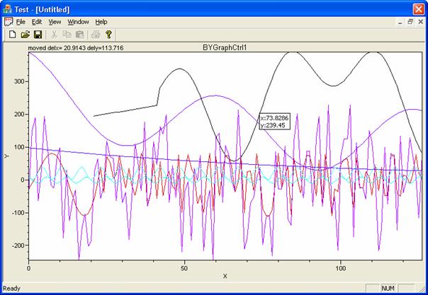
Figure 11: After the movement of black color curve
There are two deferent type picking are: irregular and interval region
Push left button down and drag mouse on the graph to pick some points, after released the button, there is a region displayed on the graph. Within the region user created, click right button, from pop-up menu user can create a fitting line delete points, smooth, or just remove region.
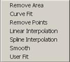
Figure 12: region pop-up menu
Remove region manually. If user create another region, the first region will be removed automatically.
Use pre-define fit helps depict trends in selected data.
Delete the points within the selected area.
User define a custom fit by enter a formula which uses the calculator syntax.
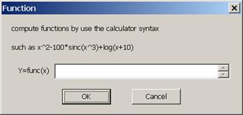
Figure 13: user defined curve fit
This item provides a function of modifying curve shape. First, click on this item in the main menu to set the current mode to be MODIFY, then, left click on the curve to be modified, with the Ctrl key being hold, move the curve to the target position and release the keys. Keep doing this for another modification. To return to the normal mode, double click on the screen.
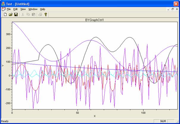
Figure 14: Before the modification of black color curve
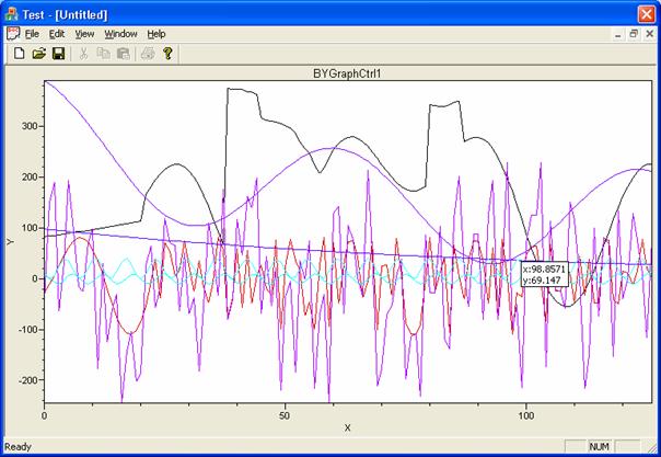
Figure 15: After the modification of black color curve
Axis Property Dialog
This property dialog box is used for editing the axis property.
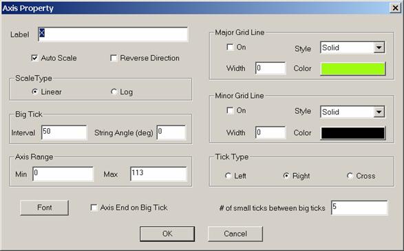
Figure : Axis Properties Dialog
Label
Users can change the axis' sub title by typing the sub title name into the label text box.
Auto Scale
If Auto Scale is on, user can not change the
3. Users can decide whether the graph needs the reverse direction .
4. Scale Type
Supports log and linear scale. Default is linear scale.
5. Big Tick
Users can modify number of the minor tickers between the major ticker, and the tickers string angle.
6.
User can decide the minimum value and maximum value of axis for graph by type in the value in the min and max text box.
7. Axis label font
8. Axis End on Big Tick
9. Tick Type
There are three types for user to choose, they cover all of the positions for ticks:
Left: for vertical axis ticks are on the left side, for horizontal axis ticks are on the top of axis
Right: for vertical axis ticks are on the right side, for horizontal axis ticks are under axis
10. # of small ticks between big ticks
11. Major grid line and Minor grid line
Users can decide whether the axis needs the major gird, minor grid or both by turning on or off the check boxes. If major/minor grid is on, it can be displayed on the graph plot area. Also, as curve, user can modify grid's line style, color and width.

Figure : Horizontal Axis
This property dialog box is used for users to modify properties for each curve. Move mouse on the curve which users want to edit, and double click to bring up curve property dialog.
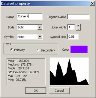
Figure 18: data set property
1. Name
Set curve name. The default name is Curve ** (** is the index of curve). BYGraph doesn't accept same curve names.
2. Legend Name
Legend Name and curve name can be different or same.
3. Style
There are ten styles for users to select: solid line, dash line, dot line, dash-dot line, dash-dot-dot line, null line, Area fill to Horizontal axis, Area fill to Zero, Bar to Horizontal axis, and Bar To Zero.
4. Users can change the curve width by typing a number into the text box.
5. Symbol
There are eleven curve symbols for users to choose: circle, filled circle, square, filled square, triangle, filled triangle, +, x, diamond, filled diamond, and null.
6. Symbol size
7. Color
Users can modify the curve's color by clicking the color button, and select a color from the color dialog box.
8. Axis
Set curve to use primary axis or secondary axis.
9. Statistic information
This statistic information is very useful for user, it includes: Mean, Median, Mode, Standard Deviation, Max value and Min. value.
10. Histogram.
CSV file is most popular file format since it could be used by most software packages. Most time user could just load any csv files without header information through the import file dialog to specify what each column data will be used for. But sometimes we want to load the data directly without any interaction. In this case, we need some formal header layout.
Any line begin with // will be treated as comments. There must have 2 lines header information start with symbol #. These two lines are optional but if they exist, they must come together with both column name and column type specification. The first header line specifies each column's name (curve name) and second line specify column data type.
Column data type could be any one of the following:
0:= x axis (index channel), this is for cross (xy) plot
1:= y value of a curve. If there is no index channel defined. This defines one sampled curve, otherwise this defines a xy curve.
2:= color. This channel must associate with a curve defined already to define each point's color
3:= size. This is for bubble plot,
any other value define that column is not used.
The follow is an example of the import csv file here we defined two x, y plot (curves), one is made of column 0 (x) and column 1 (pressure), the other curve is made of distance-voltage.
// this is a example import CSV file format
// line begin with // are comment lines
// line begin with # are column name specification lines
// first # line is column names
// second # line specify column type, 0: x-axis, 1: y-axis, 2: color axis, 3: size axis, others are not used columns
# Distance, Pressure, Temperature, Flow, Voltage, Current
# 0, 1, 5, 5, 1, 5
|