|
Using the ActiveX Controls 2 |
The topics in this chapter provide introductions to ActiveX controls provided with Visual Basic (also see "Using the ActiveX Controls 1). For many of these, you will also find scenarios along with code featuring the controls in sample applications.
Using the Slider Control
Using the StatusBar Control
Using the TabStrip Control
Using the ToolBar Control
Using the TreeView Control
A Slider control consists of a scale, defined by the Min and Max properties, and a "thumb," which the end user can manipulate using the mouse or arrow keys. At run time, the Min and Max properties can be dynamically reset to reflect a new range of values. The Value property returns the current position of the thumb. Using events such as the MouseDown and MouseUp events, the Slider control can be used to graphically select a range of values.
To set the value of a point on a graph.
To select a range of numbers to be passed into an array.
To resize a form, field, or other graphic object.
The Slider control consists of two parts: the thumb and the ticks, as shown below:
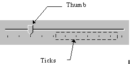
The appearance of the control depends on the TickStyle property. In brief, the ticks can appear along the bottom of the control, as sh 949g63j own above (the default style), along the top, along both top and bottom, or not at all.
In addition to the placement of the ticks, you can also program how many ticks appear on the control by setting the TickFrequency property. This property, in combination with the Min and Max properties, determines how many ticks will appear on the control. For example, if the Min property is set to 0, the Max to 100, and the TickFrequency to 5, there will be one tick for every five increments, for a total of 21. If you reset the Min and Max properties at run time, the number of ticks can be determined by using the GetNumTicks method, which returns the number of ticks on the control.
The Min and Max properties determine the upper and lower limits of a Slider control, and you can set these properties at either design time or run time. At design time, right-click on the control and click Properties to display the Property Pages dialog box, as shown below:
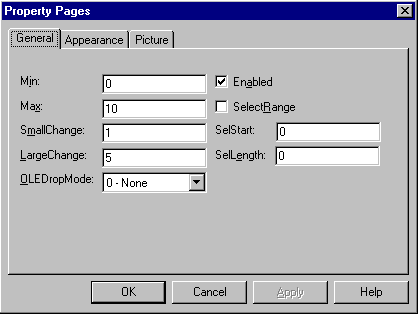
At run time, you can reset the Min and Max settings to accommodate different ranges. For example, if you are using the Slider to change values in a database, you can use the same control and bind it to different fields depending on what table the user is editing.
The SmallChange and LargeChange properties determine how the Slider control will increment or decrement when the user clicks it. The SmallChange property specifies how many ticks the thumb will move when the user presses the left or right arrow keys. The LargeChange property specifies how many ticks the thumb will move when the user clicks the control or when the user presses the PAGEUP or PAGEDOWN keys.
If the SelectRange property is set to True, the Slider control changes its appearance, as shown below:
![]()
To select a range of values, you must use the SelStart and SelLength properties. For a detailed example of this, see "Slider Scenario 2: Select a Range of Values with the Slider" in this chapter.
One possible use of the Slider is to resize a PictureBox control on a form while keeping its proportions.
The code below uses the following objects:
Form named "frmPictureBox"
Slider control named "sldResize"
PictureBox control named "picPhoto"
To resize a PictureBox control with a Slider control
Create two global variables for the Height and Width properties.
Use the Forms Load event to set global variables and the Max property.
Resize the height and width of the PictrureBox through the Scroll event.
One simple formula for retaining proportions would be:
picPhoto.Height = sldResize.Value * _
OriginalHeight / 100
picPhoto.Width = sldResize.Value * OriginalWidth / 100
This formula depends on two constant values: the original height and width of the PictureBox control. These values should be set when the form is loaded, and should be available as global variables, as shown below:
Option Explicit
Private gHeight As Long
Private gWidth As Long
To set the values for the global variables, use the Form object's Load event. It's also more efficient to calculate the values of OriginalHeight/100 and OriginalWidth/100 once, and store those values in global variables, as shown below:
gHeight = picPhoto.Height / 100
gWidth = picPhoto.Width / 100
The Load event can also be used to set the Max property of the Slider control. The Max property specifies the maximum value the Slider will accommodate. To keep the math simple, set the value of the Max property to 100:
sldResize.Max = 100
The complete code below, then, sets the global variables and the Max property in the Form object's Load event:
Private Sub Form_Load()
gHeight = picPhoto.Height/100
gWidth = picPhoto.Width/100
sldResize.Max = 100
End Sub
The Slider control has a Scroll event that occurs whenever the Slider's thumb is moved by the user. Use this event when you wish to continually process the Value property of the Slider control. In the present scenario, this means the size of the PictureBox will be dynamically changed as the thumb is moved. (If you don't want the user to be distracted by the dynamically changing control, you should use the Click event. The Click event updates the size of the control after the thumb has been released.) The code below shows the formula within the Scroll event:
Private Sub sldResize_Scroll()
picPhoto.Height = sldResize.Value * gHeight
picPhoto.Width = sldResize.Value * gWidth
End Sub
The complete code is shown below:
Private gHeight As Long
Private gWidth As Long
Private Sub Form_Load()
gHeight = picPhoto.Height / 100
gWidth = picPhoto.Width / 100
sldResize.Max = 100
End Sub
Private Sub sldResize_Scroll()
picPhoto.Height = sldResize.Value * gHeight
picPhoto.Width = sldResize.Value * gWidth
End Sub
Another feature of the Slider control is the ability to select a range of values. In this implementation, when the user presses the Shift key while clicking on the Slider control, the MouseDown event occurs. Code in that event sets the SelectRange and SelStart properties. When the user releases the mouse button, the MouseUp event occurs, and in that code the SelLength property is set, from which a range of values can be extracted.
The code below uses the following objects:
Form named "frmSlider"
Slider control named "sldSelect"
To select a range of values with the Slider control
Set the Slider control's SelectRange property to True.
In the MouseDown event, test to see if the SHIFT key is down.
In the MouseUp event, set the SelLength property to Value - SelStart.
To enable the selection of a range of values, the SelectRange property must be set to True. One place to do this is the Form object's Load event, as shown below:
Private Sub Form_Load()
sldSelect.SelectRange = True
End Sub
Alternatively, you can set the property to True at design time by right-clicking on the control, and clicking on Properties to display the Property Pages dialog box.
In order to select a range, the user must hold down the Shift key while moving the slider's thumb. The MouseDown event has a Shift argument, which allows you to determine if the Shift key is being held down. The If statement can be used to test for this possibility, as shown below:
Private Sub sldSelect_MouseDown _
(Button As Integer, Shift As Integer, _
x As Single, y As Single)
If Shift = 1 Then
' If the user has the Shift key down,
' handle it here.
End If
End Sub
If the Shift key is being held down by the user, the code then sets the SelStart and SelLength properties to appropriate values. The SelStart property specifies where a selection of values will begin. In the present context, the SelStart property would be set to where the thumb is placed the Slider control's Value property.
The SelLength property specifies a range of values to select; this property begins at the SelStart value. In the MouseDown event, a new range is being selected, so any previous range must be deselected by setting the SelLength property to 0. This is shown in the code below:
sldSelect.SelStart = SldResize.Value
' Set previous SelLength (if any) to 0.
sldSelect.SelLength = 0
To select a range, the user must hold the Shift key down while dragging the mouse. The code to set the new range is therefore found in the MouseUp event, which occurs when the end user releases the slider thumb. The code below sets the SelLength property with a simple formula, the value of the thumb minus the SelStart property:
sldSelect.Value - sldSelect.SelStart
However, it is possible for the user to release the Shift key while selecting a range. In that case no selection should occur. Therefore the above code will only execute if the Shift key is still down. As with the MouseDown event, an If statement can test for this possibility:
Private Sub sldSelect_MouseUp _
(Button As Integer, Shift As Integer, _
x As Single, y As Single)
If Shift = 1 Then
' If user selects backwards from a point,
' an error will occur.
On Error Resume Next
' Else set SelLength using SelStart and
' current value.
sldSelect.SelLength = _
sldSelect.Value - sldSelect.SelStart
Else
'If user lifts SHIFT key, set SelLength
' to 0 (to deselect the SelRange) and exit.
sldSelect.SelLength = 0
End If
End Sub
The complete code is shown below:
Private Sub Form_Load()
sldSelect.SelectRange = True
End Sub
Private Sub sldSelect_MouseDown _
(Button As Integer, Shift As Integer, _
x As Single, y As Single)
If Shift = 1 Then
sldSelect.SelStart = sldSelect.Value
' Set previous SelLength (if any) to 0.
sldSelect.SelLength = 0
End If
End Sub
Private Sub sldSelect_MouseUp _
(Button As Integer, Shift As Integer, _
x As Single, y As Single)
If Shift = 1 Then
' If user selects backwards from a point,
' an error will occur.
On Error Resume Next
' Else set SelLength using SelStart and
' current value.
sldSelect.SelLength = _
sldSelect.Value - sldSelect.SelStart
Else
'If user lifts SHIFT key, set SelLength
' to 0 (to deselect the SelRange) and exit.
sldSelect.SelLength = 0
End If
End Sub
A StatusBar control is a frame that can consist of several panels which inform the user of the status of an application. The control can hold up to sixteen frames. Additionally, the control has a "simple" style (set with the Style property), which switches from multi-panels to a single panel for special messages.
The StatusBar control can be placed at the top, bottom, or sides of an application. Optionally, the control can "float" within the application's client area.
To inform the user of a database table's metrics, such as number of records, and the present position in the database.
To give the user information about a RichTextBox control's text and font status.
To give status about key states (such as the Caps Lock or the Number Lock)
The StatusBar control is built around the Panels collection. Up to sixteen Panel objects can be contained in the collection. Each object can display an image and text, as shown below:
![]()
At run time, you can dynamically change the text, images, or widths of any Panel object, using the Text, Picture and Width properties. To add Panel objects at design time, right-click on the control, and click on Properties to display the Property Pages dialog box, as shown in Figure 2.26 below:
Figure 2.26 StatusBar panels page
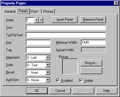
Using this dialog box, you can add individual Panel objects, and set the various properties for each panel.
To add Panel objects at run time, use the Set statement with the Add method. First declare an object variable of type Panel, then set the object variable to a Panel created with the Add method, as shown in the code below:
' The StatusBar control is named "sbrDB."
Dim pnlX As Panel
Set pnlX = sbrDB.Panels.Add()
Once you have created a Panel object and set the object variable to reference the new object, you can set the various properties of the Panel:
pnlX.Text = Drive1.Drive
pnlX.Picture = LoadPicture("mapnet.bmp")
pnlX.Key = "drive"
If you plan to have the control respond when the user clicks on a particular Panel object, be sure to set the Key property. Because the Key property must be unique, you can use it to identify particular panels.
To program the StatusBar control to respond to user clicks, use the Select Case statement within the PanelClick event. The event contains an argument (the panel argument) which passes a reference to the clicked Panel object. Using this reference, you can determine the Key property of the clicked panel, and program accordingly, as shown in the code below:
Private Sub sbrDB_PanelClick(ByVal Panel As Panel)
Select Case Panel.Key
Case "drive"
Panel.Text = Drive1.Drive
Case "openDB"
Panel.Text = rsOpenDB.Name
Case Else
' Handle other cases.
End Select
End Sub
One feature of the StatusBar control is its ability to display key states, time, and date with a minimum of code. By simply setting the Style property, any Panel object can display one of the following:
|
Constant |
Value |
Description |
|
|
||
|
sbrText |
0 |
(Default). Text and/or a bitmap. Set text with the Text property. |
|
sbrCaps |
1 |
Caps Lock key. Displays the letters CAPS in bold when Caps Lock is enabled, and dimmed when disabled. |
|
sbrNum |
2 |
Number Lock. Displays the letters NUM in bold when the number lock key is enabled, and dimmed when disabled. |
|
sbrIns |
3 |
Insert key. Displays the letters INS in bold when the insert key is enabled, and dimmed when disabled. |
|
sbrScrl |
4 |
Scroll Lock key. Displays the letters SCRL in bold when scroll lock is enabled, and dimmed when disabled. |
|
sbrTime |
5 |
Time. Displays the current time in the system format. |
|
sbrDate |
6 |
Date. Displays the current date in the system format. |
|
sbrKana |
7 |
Kana. displays the letters KANA in bold when kana lock is enabled, and dimmed when disabled. (enabled on Japanese operating systems only) |
The code below creates eight Panel objects, and assigns one of the eight styles to each:
Private Sub MakeEight()
' Delete the first Panel object, which is
' created automatically.
StatusBar1.Panels.Remove 1
Dim i As Integer
' The fourth argument of the Add method
' sets the Style property.
For i = 0 To 7
StatusBar1.Panels.Add , , , i
Next i
' Put some text into the first panel.
StatusBar1.Panels(1).Text = "Text Style"
End Sub
Using the Bevel, AutoSize, and Alignment properties, you can precisely control the appearance of each Panel object. The Bevel property specifies whether the Panel object will have an inset bevel (the default), raised, or none at all. All three bevels are shown in the figure below:
![]()
Settings for the Bevel property are:
|
Constant |
Value |
Description |
|
|
||
|
sbrNoBevel |
0 |
The Panel displays no bevel, and text looks like it is displayed right on the status bar |
|
sbrInset |
1 |
The Panel appears to be sunk into the status bar. |
|
sbrRaised |
2 |
The Panel appears to be raised above the status bar. |
The AutoSize property determines how a Panel object will size itself when the parent container (either a Form or a container control) is resized by the user. The figure below shows a StatusBar control before being resized:
![]()
When the container (the Form on which the StatusBar control is placed) of the control is resized, notice that the first panel retains its width, the second "springs" to fill the extra space, and the third sizes according to its contents (and therefore retains its width):
![]()
Settings for the AutoSize property are:
|
Constant |
Value |
Description |
|
|
||
|
sbrNoAutoSize |
0 |
None. No autosizing occurs. The width of the panel is always and exactly that specified by the Width property. |
|
sbrSpring |
1 |
Spring. When the parent form resizes and there is extra space available, all panels with this setting divide the space and grow accordingly. However, the panels' width never falls below that specified by the MinWidth property. |
|
sbrContents |
2 |
Content. The panel is resized to fit its contents. |
Tip Set the AutoSize property to Content (2) when you want to assure that the contents of a particular panel are always visible.
The Alignment property specifies how the text in a panel will align relative to the panel itself as well as any image in the panel. As with a word processor, the text can be aligned left, center, or right, as shown below:
![]()
Settings for the Alignment property are:
|
Constant |
Value |
Description |
|
|
||
|
sbrLeft |
0 |
Text appears left-justified and to right of bitmap. |
|
sbrCenter |
1 |
Text appears centered and to right of bitmap. |
|
sbrRight |
2 |
Text appears right-justified but to the left of any bitmap. |
The StatusBar control features a secondary mode in which the multiple panels are replaced by a single panel that spans the width of the control. This single panel has one property, the SimpleText property which specifies what text is displayed on the panel. To display this single panel, set the Style property of the StatusBar to sbrSimple (1).
One reason for switching to the Simple style and displaying a single panel is to notify the user that a lengthy transaction is occurring. For example, if you are performing a database operation, the Simple style may be used to notify the user of the current state of the transaction, as seen in the code below:
Private Sub GetRecords(State)
' The query finds all records which match
' the parameter State. While the query
' is creating the recordset, show the
' SimpleText on the StatusBar control.
sbrDB.SimpleText = "Getting records "
sbrDB.Style = sbrSimple ' Simple style.
sbrDB.Refresh ' You must refresh to see the
' Simple text.
Set rsNames = mDbBiblio.OpenRecordset _
("select * from Names Where State= " & _
State)
End Sub
A TabStrip acts like the dividers in a notebook or the labels on a group of file folders. By using a TabStrip control, you can define multiple pages for the same area of a window or dialog box in your application.

To create a tabbed dialog that sets various text attributes for a RichTextBox control.
To create a tabbed dialog that sets preferences for an application.
The control consists of one or more Tab objects in a Tabs collection. At both design time and run time, you can affect the Tab object's appearance by setting properties, and at run time, by invoking methods to add and remove Tab objects.
To identify a tab's function, you can assign an image from the ImageList control to the Tab object. You must first associate an ImageList control with the TabStrip control, and this can be accomplished at either design time or run time.
To associate an ImageList control with a TabStrip control at design time:
Populate the ImageList control with images for the tabs.
Right-click on the TabStrip control and click Properties to open the TabStrip Property Page dialog box.
On the General tab, click the ImageList box and select the ImageList control you have populated.
To associate an ImageList control with the control at run time, simply set the ImageList property to the name of the ImageList control, as shown in the example below:
Private Sub Form_Load()
' The TabStrip control is named "tabRTF," and the
' ImageList control is named "imlRTF."
tabRTF.ImageList = imlRTF
End Sub
You can create Tab objects at both design and run time. To create Tab objects at design time, use the Property Pages dialog box.
To create Tab objects at design time
Right-click the TabStrip control and click Properties to display the Property Pages dialog box.
Click Tabs to display the Tabs page, as shown in Figure 2.36, below:
Figure 2.36 TabStrip Property Pages
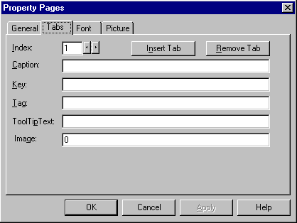
To create Tab objects at run time, use the Add method for Tab objects.
Note One Tab object is created for you by default.
To create a collection of Tab objects at run time
Declare a variable as type Tab. As you add each Tab object, the variable will contain the reference to the newly created object. Use this reference to set various properties of the new Tab object.
Using the Set statement with the Add method, set the object variable to the new Tab object.
Using the object variable, set the properties of the new Tab object.
The code below uses the Form object's Load event to create two Tab objects, then sets the Caption, Image, and Key properties of the new Tab object.
Private Sub Form_Load()
' The TabStrip control is named "tabData"
' Declare a variable, then use the Set
' statement with the Add method to create a new
' Tab object, while setting the object variable to
' the new Tab. Use the reference to set properties.
Dim tabX As Tab
' Tab 1: Find text.
Set tabX = tabData.Tabs.Add()
tabX.Key = "find"
tabX.Caption = "Find"
tabX.Image = "Find" ' Assuming this image exists.
' Tab 2: Draw objects.
Set tabX= tabData.Panels.Add()
tabX.Key = "draw"
tabX.Caption = "Draw"
tabX.Image = "draw" ' Assuming this image exists.
End Sub
Tip Using the Add method without setting the object variable is more efficient than setting the properties with the object variable. In this case, the code above could be rewritten as:
tabData.Tabs.Add , "find",
"Find", "find"
tabData.Tabs.Add , "draw", "Draw", "draw"
The TabStrip control is commonly used to create tabbed dialog boxes. Each page in the dialog box consists of a tab and a client area, as seen in the figure below:
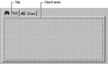
At run time, when the user clicks on a tab, you must program the client area to be reconfigured with a different set of container controls (discussed below in "Managing Tabs and Container Controls").
At design time, draw a container control, such as the PictureBox or Frame control, on the form. If you use a Frame control, you can set its BorderStyle property to be invisible at run time. Copy and paste the same control to create an array of controls; create one control for each Tab object you have created.
On each container control, draw the controls that should appear on a tab. Your form may appear something like Figure 2.37, below:
Figure 2.37 TabStrip at design time with two PictureBox controls
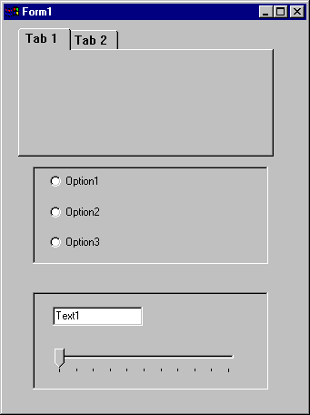
After you have created the container controls, there is one additional technique required to position them over the TabStrip control's client area: use the Move method with the ClientLeft, ClientTop, ClientWidth, and ClientHeight properties of the Tabstrip control, as shown in the code below:
Private Sub Form_Load()
' The name of the TabStrip is "tabRTF."
' The Frame control is named "fraTab."
For i = 0 To fraTab.Count - 1
With fraTab(i)
.Move tabRTF.ClientLeft, _
tabRTF.ClientTop, _
tabRTF.ClientWidth, _
tabRTF.ClientHeight
End With
Next i
End Sub
A tabbed dialog box contains more than one Tab object. As seen above, a Frame control (or other container control) should be associated with each Tab object. To efficiently manage the numerous Tab objects and container controls, the following strategy can be used:
At design time, create all the Tab objects you need.
Create a control array of container controls, one member for each Tab object.
On each container control, draw the controls that you want to have on a tab page.
At run time, use the control's SelectedItem property to determine the Index of the clicked Tab object.
Use the ZOrder method to bring the appropriate container control to the front.
The code to bring the proper container control to the front would then resemble the code below:
Private Sub tabRTF_Click()
picRTF(tabRTF.SelectedItem.Index - 1).ZOrder 0
End Sub
Tip At design time, you can set the Index property of the control array to become a 1-based array. Because the Tabs collection is also a 1-based collection, the above code would then be rewritten:
picRTF(TabRTF.SelectedItem.Index).ZOrder 0
For More Information For an example of code implementing the strategy outlined above, see "TabStrip Scenario: Create a Tabbed Dialog Box."
The Style property determines whether the TabStrip control looks like
notebook tabs (Tabs),
![]()
or push buttons (Buttons).
![]()
The advantages of each are outlined below:
|
Style |
Possible Use |
|
|
|
|
Tabs |
Use the Tabs style to create Tabbed dialog boxes. With this style, the complete tabbed dialog, including the client area, is drawn for you. Your code must manage what appears in the client area. |
|
Buttons |
The Buttons style can be used to create a toolbar or task bar in other words, when you do not need the client area, but prefer to have only the buttons as an interface element. Alternatively, you may wish to use the Buttons style when you do not need a well-defined client area drawn for you. |
Multi-Row Tabs
Another feature of the TabStrip control is the MultiRow property. When this property is set to True, a large number of Tab objects appear in rows, as seen in the figure below:

If the MultiRow property is set to False, the same set of tabs appears in a single row, with a pair of scroll buttons at the rightmost end:
![]()
The TabWidthStyle property determines the appearance of each row, and, if TabWidthStyle is set to Fixed, you can use the TabFixedHeight and TabFixedWidth properties to set the same height and width for all tabs in the TabStrip control.
A Toolbar control contains a collection of Button objects used to create a toolbar you can associate with an application.
![]()
Typically, a toolbar contains buttons that correspond to items in an application's menu, providing a graphic interface for the user to access an application's most frequently used functions and commands. The Toolbar control can also contain other controls, such as ComboBox or TextBox controls.
To create a toolbar, you must add Button objects to a Buttons collection; each Button object can have optional text and/or an image, supplied by an associated ImageList control. Set text with the Caption property, and an image with the Image property for each Button object. At design time, you can add Button objects to the control with the Toolbar Property Pages dialog box. At run time, you can add or remove buttons from the Buttons collection using Add and Remove methods.
To add other controls at design time, simply draw the desired controls on the toolbar. Alternatively, you can create a Button object with a Placeholder style and position the desired control over the button in a Resize event.
Double-clicking a toolbar at run time invokes the Customize Toolbar dialog box, which allows the user to hide, display, or rearrange toolbar buttons. To enable or disable the dialog box, set the AllowCustomize property. You can also invoke the Customize Toolbar dialog box by invoking the Customize method. If you wish to save and restore the state of a toolbar, or allow the end user to do so, use the SaveToolbar and RestoreToolbar methods.
Provide a consistent interface between applications with matching toolbars.
Place commonly used functions, such as File operations, in an easy to access place.
Provide a graphical, intuitive interface for your application.
The Toolbar control consists of one or more Button objects in a Buttons collection. At both design time and run time, you create Button objects. Each button can have an image, a caption, a Tooltip, or all three, as shown below:

Each button object also has a Style property (discussed below) that determines how the button will behave.
Toolbars usually feature icons that represent a function of the application. For example, an icon of a floppy disk is generally understood to represent a "Save File" function. To get your toolbar to display such images, you must first associate an ImageList control with the Toolbar control, and this can be accomplished at either design time or run time.
To associate an ImageList control with a Toolbar control at design time
Populate the ImageList control with images for the Toolbar.
Right-click on the Toolbar control and click Properties to open the Property Pages dialog box.
On the General tab, click the ImageList box and select the ImageList control you have populated.
To associate an ImageList control with the Toolbar control at run time, simply set the ImageList property to the name of the ImageList control, as shown in the example below:
Private Sub Form_Load()
' The Toolbar control is named "tlbTools," and the
' ImageList control is named "imlTools."
tlbTools.ImageList = imlTools
End Sub
To create Button objects at design time
Right-click on the Toolbar control and click Properties to display the Toolbar Property Pages.
Click the Buttons tab to display the dialog box shown in Figure 2.38, below:
Figure 2.38 Toolbar control property pages
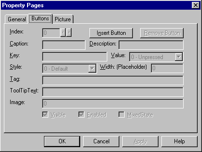
Click Insert Button to insert a new Button object.
Set appropriate properties, such as Key, Caption, Image, and ToolTipText.
Set the Button object's Style property by clicking the Style box and selecting a style.
To create a collection of Button objects at run time
Declare an object variable of type Button. As you add each Button object, the variable will contain the reference to the newly created object. Use this reference to set various properties of the new Button object.
Using the Set statement with the Add method, set the object variable to the new Button object.
Using the object variable, set the properties of the new Button object.
The code below uses the Form object's Load event to create one Button object, then sets the Key, Caption, TooltipText, and Style properties of the new Button object.
Private Sub Form_Load()
' Declare a variable, then set using the Set
' statement with the Add method, create a new
' Button object, and set the object variable to
' the new Button. Use the reference to set
' properties.
Dim myButton As Button
Set myButton = tlbTools.Add()
myButton.Key = "left"
myButton.Caption = "Align Left"
myButton.ToolTipText = "Align Left"
myButton.Style = tbrSeparator
End Sub
Tip Using the arguments of the Button collection's Add method is more efficient than setting the properties with the object variable. In this case, the code above could be rewritten as:
tlbTools.Buttons.Add , "left", "Align Left", _
tbrSeparator
An important property of the Button object is the Style property. The Style property determines how a button behaves and the function assigned to the button can have a bearing on which style is applied to it. The five button styles are listed below, with their possible uses:
|
Constant |
Value |
Possible Use |
|
|
||
|
tbrDefault |
0 |
Use the Default button style when the function it represents has no dependence on other functions. For example, a Save File operation can be performed at any time. Further, when the button is depressed, it springs back again when the function is finished. |
|
tbrCheck |
1 |
The Check style should be used when the function it represents is a toggle of some kind. For example, when using a RichTextBox control, selected text can be either bold or not. Thus, when the button is depressed, it stays depressed until it is pressed again. |
|
tbrButtonGroup |
2 |
Use the ButtonGroup style when a group of functions are mutually exclusive. That is, only one of the functions represented by the group of buttons can be on at a time. For example, text in a RichTextBox control can only be left-aligned, center-aligned, or right-alignedit cannot be more than one style at a time. Note: although only one button at a time can be depressed, all buttons in the group can be unpressed |
|
tbrSeparator |
3 |
The separator style has no function except to create a button that is eight pixels wide. Use the separator style to create a button that separates one button from another. Or use it to enclose the group of buttons with the ButtonGroup style. |
|
tbrPlaceholder |
4 |
The placeholder style functions as a "dummy" button: use this button to create a space on the Toolbar control where you want to have another control (such as a ComboBox or ListBox control) appear. |
You can easily place other controls, such as the ComboBox, TextBox, or OptionButton control, on the Toolbar control at design time.
To place other controls on the Toolbar control at design time
Create Button objects and assign appropriate properties.
Create a space on the toolbar where you want the other control to appear, then add a button with the Placeholder style, and set the Width property to an appropriate value.
Draw the other control in the space occupied by the placeholder button.
If the Wrappable property is set to True, the Toolbar control wraps automatically when the end user resizes the form. While Button objects wrap automatically, controls placed on them do not. To enable controls to wrap, first create a Button object with the Placeholder style, and draw the control in the space created by the button (as shown in the above topic). Then reposition the control over the button using the Move method in the Form object's Resize event, as shown below:
Private Sub Form_Resize()
' The Toolbar is named "tlbRTF"
' The Button object's Key is "btnFonts"
' The Combobox is named "cmbFonts"
' The ComboBox is placed over the position of the
' Button object using the Move method.
With tlbRTF.Buttons("btnFonts")
cmbFonts.Move .Left, .Top, .Width
cmbFonts.ZOrder 0
End With
End Sub
The ButtonClick event occurs whenever a button (except buttons with the placeholder or separator style) is clicked. You can identify the button that was clicked by its Index property or its Key property. Using either of these properties, use the Select Case statement to program the button's function, as shown in the example code below:
Private Sub tlbRTF_Click(ByVal Button As Button)
Select Case Button.Key
Case "OpenFile"
' Call a user-defined function to open a file.
OpenFile
Case "Bold"
' Call a user-defined function to bold text.
BoldText
Case Else
' Handle other cases.
End Select
End Sub
In some cases, a function of your application may return an indeterminate state a state that is a combination of two or more states. For example, if the user selects text in a RichTextBox, and some of the text is italicized, the button that represents italicized text cannot be either checked or unchecked; the text in the selection is both. To signify this indeterminate state, set the MixedState property to True. This dithers the image on the button to create a third state of the button's image.
A ToolTip is the text that appears above a button whenever the cursor hovers (without clicking) over a Button object.

You can add a ToolTip to any button at design time by typing the text you want to appear in the ToolTipText box of the Toolbar control's Property Pages.
At run time, you can dynamically change the ToolTip by setting the ToolTipText property for the Button object. The following code occurs in a CommandButton control that changes the Key and ToolTipText property of one button:
Private Sub cmdChangeButton_Click()
' The name of the toolbar is "tlbFunctions"
' Reset the Key and ToolTipText properties of
' a button with Key property value "1 funct"
tlbfuncts.Buttons("1 funct"). _
ToolTipText = "Function 7"
tlbfuncts.Buttons("1 funct").Key = "7 funct"
End Sub
If you set the AllowCustomize property to True, the end user can customize the toolbar by double-clicking it. Double-clicking the toolbar displays the Customize Toolbar dialog box, shown in figure 2.39 below:
Figure 2.39 Customize Toolbar dialog box
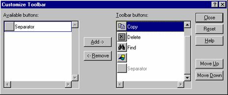
Alternatively, you can display the dialog box by invoking the Customize method.
If you allow your end user to reconfigure the Toolbar control, you can save and restore the toolbar by using the SaveToolbar and RestoreToolbar methods. For example, if several users use the same application but have different toolbar preferences, use the SaveToolbar method to allow each person to create a customized toolbar. Then create a login procedure that identifies each user, and uses that information to restore the user's personalized toolbar with the RestoreToolbar method.
The SaveToolbar method saves the current state of the Toolbar control to the system registry. The method requires three arguments. The first argument, key, must be an integer. The second and third argments, subkey and value, must be strings. To store different versions of the same toolbar in the same subkey, set the value argument to a different string.
The code below uses two constants to define the first two arguments. In the Form object's Load event, the code invokes a procedure named "Login" that returns the password of the user. The code then uses that value to restore a previously stored toolbar. The command button named "cmdSaveToolbar" saves the current state using the same three values.
' Declarations: SaveToolbar method constants.
Const SaveKey = 1
Const SaveSubKey = "MyToolbar"
Dim mSaveVal As String ' Module variable that
' identifies user.
Private Sub Form_Load()
' Run a login procedure that identifies the
' user. Use the user's password to identifiy the
' user's toolbar.
mSaveVal = LogIn()
' Restore state of Toolbar1 using Constants.
Toolbar1.RestoreToolbar SaveKey, SaveSubKey, _
mSaveVal
End Sub
Public Function LogIn()
' Ask the user for a password.
LogIn = InputBox("Password")
End Function
Private Sub cmdSaveToolbar_Click()
' Save the toolbar using the same constants.
Toolbar1.SaveToolbar SaveKey, SaveSubKey, mSaveVal
End Sub
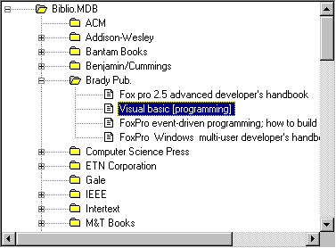
The TreeView control is designed to display data that is hierarchical in nature, such as organization trees, the entries in an index, the files and directories on a disk.
Figure Typical TreeView
To create an organization tree that can be manipulated by the user.
To create a tree that shows at least two or more levels of a database.
A "tree" is comprised of cascading branches of "nodes," and each node typically consists of an image (set with the Image property) and a label (set with the Text property). Images for the nodes are supplied by an ImageList control associated with the TreeView control. For more information on using the ImageList control with other controls, see "Using the ImageList control."
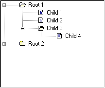
A node can be expanded or collapsed, depending on whether or not the node has child nodes nodes which descend from it. While a tree can have any number of child nodes, there can only be only one "root" node from which all nodes descend. The number of nodes is not limited (except by machine constraints). Figure 3.2 shows a tree with two root nodes; "Root 1" has three child nodes, and "Child 3" has a child node itself. "Root 2" has child nodes, as indicated by the "+" sign, but is unexpanded.
Figure 2.41 Root and child nodes
Each node in a tree is actually a programmable Node object, which belongs to the Nodes collection. As in other collections, each member of the collection has a unique Index and Key property which allows you to access the properties of the node. For example, the code below uses the Index of a particular node ("7") to set the Image and Text properties:
tvwMyTree.Nodes(7).Image = "closed"
tvwMyTree.Nodes(7).Text = "IEEE"
However, if a unique key, for example "7 ID" had been assigned to the node, the same code could be written as follows:
tvwMyTree.Nodes("7 ID").Image = "closed"
tvwMyTree.Nodes("7 ID").Text = "IEEE"
Each node can be either a child or a parent, depending on its relationship to other nodes. The Node object features several properties which return various kinds of information about children or parent nodes. For example, the following code uses the Children property to return the number of children if any a node has:
MsgBox tvwMyTree.Nodes(10).Children
However, some of the properties do not return information, as the Children property does, but instead return a reference to another node object. For example, the Parent property returns a reference to the parent of any particular node (as long as the node is not a root node). With this reference, you can manipulate the parent node by invoking any methods, or setting properties, that apply to Node objects. For example, the code below returns the Text and Index properties of a parent node:
MsgBox tvwMyTree.Nodes(10).Parent.Text
MsgBox tvwMyTree.Nodes(10).Parent.Index
Tip Use the Set statement with an object variable of type Node to manipulate references to other Node objects. For example, the code below sets a Node object variable to the reference returned by the Parent property. The code then uses the object variable to return properties of the relative node:
Dim tempNode As Node ' Declare object variable.
' Set object variable to returned reference.
Set tempNode = tvwMyTree.Nodes(10).Parent
MsgBox tempNode.Text ' Returns parent's Text.
MsgBox tempNode.Index ' Returns parent's Index.
To add a Node to the tree, use the Add method (Nodes collection). This method includes two arguments, relative and relationship, which can determine where the node will be added. The first argument relative names a node; the second argument relationship specifies the relationship between the new node and the node named in relative.
For example, the following code adds a node named "11 node" as a child of another node named "7 node." The intrinsic constant tvwChild specifies that the new node is a child of the node named in the previous argument. The third argument assigns the Key property to the new node.
tvwMyTree.Nodes.Add "7 node", tvwChild, "11 node"
Other possible relationships include:
|
Constant |
Value |
Description |
|
|
||
|
tvwLast |
1 |
The Node is placed after all other nodes at the same level of the node named in relative. |
|
tvwNext |
2 |
The Node is placed after the node named in relative. |
|
tvwPrevious |
3 |
The Node is placed before the node named in relative. |
|
tvwChild |
4 |
The Node becomes a child node of the node named in relative. |
For example, suppose there were three existing nodes, and you wished to place a fourth node between the second and the third nodes, the code would be:
' Assuming the second node's Key value is "2 node".
tvwMyTree.Nodes.Add "2 node", tvwNext
Other arguments of the Add method are key, text, and image. Using these arguments, you can assign the Key, Text, and Image properties as the Node object is created.
For More Information For more information about the Nodes collection's Add method See Add Method in the Language Reference by typing "Add Method" and clicking "Add Method (Nodes Collection)."
A second way of adding nodes is to declare an object variable of type Node, and then use the Set statement with the Add method. The Set statement sets the object variable to the new node. You can then use the object variable to set the node's properties, as shown below:
Dim nodX As Node
Set nodX = tvwMyTree.Nodes.Add("10 node", tvwChild)
nodX.Key = "11 node"
nodX.Text = "IEEE"
nodX.Image = "closed"
Tip Using the Set statement with the Add method makes reading and debugging your code easier. However, using the Add method and its arguments to add nodes creates faster code.
|