ALTE DOCUMENTE
|
|||||||||
To create a chart or graph, you need to open the worksheet and enter the data.
To open the worksheet:
Click the Chart tool in the Xtra Tools palette.
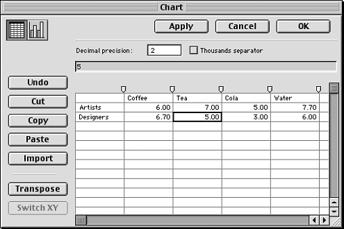
Drag the + sign cursor to create a rectangle on your work page. (The size of the rectangle determines the size of the chart.) The Chart worksheet appears

To enter data:
Type the data in the data entry area. This inserts the data into the currently active cell.
Press Return or Enter to apply the data to the cell and move to the cell below. Type the data for that cell.
Press Tab to apply the data to the cell and jump to the cell to the right.
Use the up, down, left, or right arrow keys to move to different cells.
Use the Import button to bring tabdelimited text directly into the worksheet.
Once you have entered the data, you need to choose the type of graph or chart you will create.
To style a graph or chart:
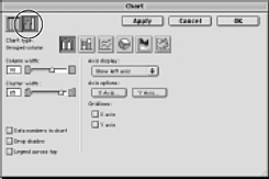
Click the chart style icon at the top of the Chart window. The worksheet disappears and the styling selections appears

Click one of the six chart type icons: grouped column, stacked column, line, pie, area, and scatter.
TIP
To see the effects of changing the style and features of your graph, click Apply at the top of the Chart window.
TIP
Use the Subselect tool to select an individual element in a chart.
Use a grouped column graph to compare data . Each bar represents one data cell.
![]()
Use a stacked column graph to compare the progress of data . Each stacked bar represents one row of data.
![]()
Use a line graph to compare the trend of data over time . Each line represents a column.
![]()
Use a Pie chart to display data as percentages of the total . Each wedge represents one data cell. Each row creates a separate chart.
![]()
Use an area graph to compare the trend of data over a period of time . Each area represents a column of data. Each column's value is added to the previous column's total.
![]()
Use a scatter graph to plot data as paired sets of coordinates. Each coordinate represents a row of data containing two cells.
![]()
To modify an existing chart:
Double-click the Chart tool in the Xtra toolbar.
or
Choose Xtras > Chart > Edit. The Chart worksheet opens.
TIP
Don't ungroup a chart or graph, or you will lose the link to the worksheet information.
|