Once you have entered data in the worksheet and picked the style of the graph, you can still modify various elements of the graph. These controls change depending on the type of graph selected.
To change the column width:
Click the icon for grouped column or stacked c 20320m127u olumn graphs.
To change the width that each column takes up within its cluster, drag the slider or enter the amount in the Column width field
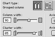
Click Apply to see the effects on the graph
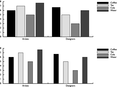
To change the cluster width:
Click the icon for a grouped column or stacked c 20320m127u olumn graph.
To change the width of the cluster of the columns, drag the slider or enter the amount in the Cluster width field.
Click Apply to see the effects on the chart

All the graphs except area graphs let you display the data values in the graph itself.
To show the data values:
Click the Data numbers in chart checkbox to see those values.
Charts are always created using shades of black. However, you can change the colors applied to the charts.
To color a chart:
Drag colors onto individual elements.
or
Subselect objects and change them through the color list.
TIP
you can also use the Find and Replace Graphics dialog box to change each color globally.
All the graphs except line and scatter graphs let you add a drop shadow behind the graph.
To add a drop shadow:
Click the Drop shadow checkbox to see the effect.
To move the legend:
Click the Legend across top checkbox.
All the graphs except the pie chart allow you to control whether or not gridlines are displayed along the x or y axis
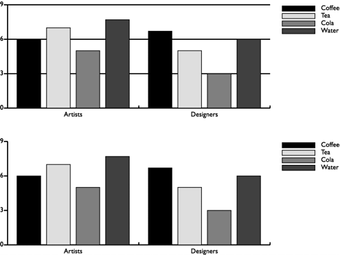
To create gridlines:
Check the x axis box to display horizontal gridlines.
Check the y axis box to display vertical gridlines
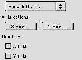
The most powerful part of modifying a column graph is in working with the x (horizontal) axis and the y (vertical) axis. You can modify how numerical values are displayed along an axis; if the axis has no numerical values, the options are grayed out.
To modify the axis values:
With a chart selected and the Chart dialog box open, click either the X axis or Y axis buttons under Axis options. The Options dialog box appears
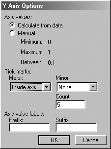
Under Axis values, click Calculate from data if you want the numbers along the axis to be calculated from the data entered in the worksheet.
or
Under Axis values, click Manual to enter your own values for the axis.
Choose the following from the Major Tick marks pop-up menu

o Across axis positions the tick marks so they straddle the axis.
o Inside axis positions the marks inside the axis line.
o Outside axis positions the marks outside the axis line.
Choose the following from the Minor Tick marks pop-up menu:
o Across axis positions the tick marks so they straddle the axis.
o Inside axis positions the marks inside the axis line.
o Outside axis positions the marks outside the axis line.
TIP
Many designers like to position the major tick marks across the axis, and the minor tick marks inside the axis.
Enter the number of minor tick marks in the Count field.
Use the Prefix and Suffix Axis value labels to add a prefix (such as $) in front of the data or a suffix (such as /hour) after the data in the axis.
|