In the early days of the Web, the people behind Netscape put together a set of 216 colors that were able to be seen on both Macintosh and Windows monitors that could display 256 colors. These are now called the Web-safe colors.
Although most people today can view more than just 256 colors, some people still insist on using only the Web-safe colors in their Web pages. FreeHand gives you two ways to pick colors from the Web-safe set.
To choose Web-safe colors:
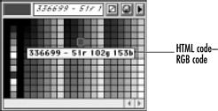
Click the Fill or Stroke color box in the Tools panel. The default listing shows the Web-safe colors

To import Web-safe colors:
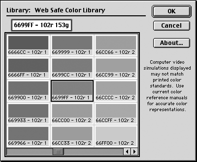
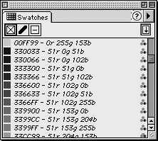
Use the Swatches panel menu to choose the Web Safe Color Library. The library appears containing the 216 Web colors

Select the colors you want in your document (see page 169).
TIP
Web pages take less time to display if you design with a small number of colors.
Click OK. The colors you have selected appear in the Colors List

TIP
The Web-safe colors are identified with both their hexadecimal codes and their RGB values. The hexadecimal codes are the tags used by the HyperText Markup Language (HTML) to designate Web colors.
Blending Web-safe ColorsIf you insist on using only Web-safe colors, your best best is not to use any blends or gradients. Both blends and gradients will create colors outside the range of the Web-safe colors. When you convert a gradient or blend to a GIF, you need to decide how the colors in the intermediate steps are handled . One way is to dither the intermediate colors. Dithering is the process that makes a few colors look like more. For instance, a dither between red and yellow means that dots of red are next to dots of yellow. An even mix between the red and yellow dots appears orange. More red than yellow appears red-orange. More yellow than red appears yellow-orange. Figure 4. A blend between Web-safe colors creates non-Web-safe colors between the original colors.
Dithering is the best way to preserve the look of blends in Web graphics . Dithering is usually not acceptable for solid colors and should be turned off when exporting those graphics. Figure 5. With Dither turned on, the area between the original Web colors has a speckled look as the colors mix many Web-safe colors together.
When colors are not dithered, they are converted to the closest Web-safe color. This may mean that a deep red turns brown or a light green turns dark. When you are working with flat colors, this is acceptable unless the color shift causes two colors you intend to be distinct to resemble each other too closely. When blends or gradients are not dithered, there are abrupt changes in each step of the blend . This usually looks unacceptable; turn dithering on when exporting graphics with gradients or blends. Figure 6. When a blend is converted with Dither turned off, the intermediate steps abruptly change from one Web-safe color to another.
My own personal feeling is that since so many people have monitors that can display millions of colors, it is no longer sucha a big deal to limit yourself to the Web-safe colors. |
|