|
Using Visual Basic's Standard Controls |
You use controls to get user input and to display output. Some of the controls you can use in your applications include text boxes, command buttons, and list boxes. Other controls let you access other applications and process data as if the remote application was part of your code. Each control has its own set of properties, methods, and events. This chapter introduces you to the standard controls in Visual Basic.
Note If you are using the Control Creation Edition of Visual Basic, some of the material covered in this document may not be applicable. With the full editions of Visual Basic you have the ability to create applications, ActiveX documents, and other types of components. Although some of the terminology may relate to application specific objects such as forms, in most cases the underlying concepts also apply to ActiveX control creation.
Introduction to Visual Basic Controls
Working with Control Arrays
Using the Check Box Control
Using the Combo Box Control
Using the Command Button Control
Using the Common Dialog Control
Using the Data Control
Using the Data-Bound Controls (DBCombo, DBList, and DBGrid)
Using the File-System Controls (Directory List Box, Drive List Box, and File List Box)
Using the Frame Control
Using the Horizontal and Vertical Scroll Bar Controls
Using the Image Control
Using the Label Control
Using the Line Control
Using the List Box Control
Using the Microsoft FlexGrid Control
Using the OLE Container Control
Using the Option Button Control
Using the Picture Box Control
Using the Shape Control
Using the Text Box Control
Using the Timer Control
Many of the code examples in this chapter are taken from the Alarm.vbp, Calc.vbp, Controls.vbp, Flex.vbp, and Winseek.vbp sample applications. If you installed the sample applications, you will find these applications in the \Alarm, \Calc, \Controls, and \MSFlexGd subdirectories of the Visual Basic samples directory (VB\Samples\Pguide); and Winseek.vbp in the \FileCtls subdirectory of (VB\Samples\Misc) of the samples directory.
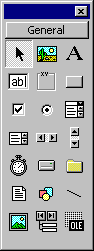
The Visual Basic toolbox contains the tools you use to draw controls on your forms.
Figure 7.1 The Visual Basic toolbox
There are three broad categories of controls in Visual Basic:
Intrinsic controls, such as the command button and frame controls. These controls are contained inside the Visual Basic .exe file. Intrinsic controls are always included in the toolbox, unlike ActiveX controls and insertable objects, which can be removed from or added to the toolbox.
ActiveX controls which exist as separate files with a .ocx file name extension. These include controls that are available in all editions of Visual Basic (data-bound grid, combo box, list controls, and so on) and those that are available only in the Professional and Enterprise editions (such as Listview, Toolbar, Animation, and tabbed dialog). Many third-party ActiveX controls are also available.
Note ActiveX controls with the .vbx file name extension use older technology and are found in applications written in earlier versions of Visual Basic. When Visual Basic opens a project containing a .vbx control, the default behavior is to replace the .vbx control with an .ocx control, but only if an .ocx version of the control is available. See "Updating Older Versions of Visual Basic Controls" later in this chapter for information on updating controls to the .ocx format.
Insertable Objects, such as a Microsoft Excel Worksheet object containing a list of all your company's employees, or a Microsoft Project Calendar object containing the scheduling information for a project. Since these can be added to the toolbox, they can be considered controls. Some of these objects also support Automation (formerly called OLE Automation), which allows you to program another application's objects from within a Visual Basic application.
For More Information See "Using the ActiveX Controls" for more information about the ActiveX controls available in the Professional and Enterprise versions of Visual Basic.
The following table summarizes the intrinsic controls found in the Visual Basic toolbox.
|
Icon |
Control name |
Class name |
Description |
|
|
|||
|
|
Check box |
CheckBox |
Displays a True/False or Yes/No option. You can check any number of check boxes on a form at one time. |
|
|
Combo box |
ComboBox |
Combines a text box with a list box. Allows a user to type in a selection or select an item from a drop-down list. |
|
|
Command button |
CommandButton |
Carries out a command or action when a user chooses it. |
|
|
Data |
Data |
Enables you to connect to an existing database and display information from it on your forms. |
|
|
Directory list box |
DirListBox |
Displays and allows a user to select directories and paths. |
|
|
Drive list box |
DriveListBox |
Displays and allows a user to select valid disk drives. |
|
|
File list box |
FileListBox |
Displays and allows a user to select from a list of files. |
|
|
Frame |
Frame |
Provides a visual and functional container for controls. |
|
|
Horizontal and vertical scroll bars |
HScrollBar and VScrollBar |
Allow a user to add scroll bars to controls that do not automatically provide them. (These are not the same as the built-in scroll bars found with many controls.) |
|
|
Image |
Image |
Displays bitmaps, icons, or Windows metafiles, JPEG, or GIF files; acts like a command button when clicked. |
|
|
Label |
Label |
Displays text a user cannot interact with or modify. |
|
|
Line |
Line |
Adds a straight-line segment to a form. |
|
|
List box |
ListBox |
Displays a list of items that a user can choose from. |
|
|
OLE container |
OLE |
Embeds data into a Visual Basic application. |
|
|
Option button |
OptionButton |
The Option Button control, as part of an option group with other option buttons, displays multiple choices, from which a user can choose only one. |
|
|
Picture box |
PictureBox |
Displays bitmaps, icons, or Windows metafiles, JPEG, or GIF files. It also displays text or acts as a visual container for other controls. |
|
|
Shape |
Shape |
Adds a rectangle, square, ellipse, or circle to a form, frame, or picture box. |
|
|
Text box |
TextBox |
Provides an area to enter or display text. |
|
|
Timer |
Timer |
Executes timer events at specified time intervals. |
Note The pointer tool (the first tool in the toolbox) provides a way to move and resize forms and controls. It is not a control.
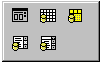
The Learning edition of Visual Basic contains a number of ActiveX controls (referred to as standard ActiveX controls) that allow you to add advanced features to your applications. ActiveX controls have the file name extension .ocx and can be used in your project by manually adding them to the toolbox.
Figure 7.2 Standard ActiveX controls added to the toolbox
The following table summarizes the standard ActiveX controls available in the Learning edition of Visual Basic.
|
Icon |
Control name |
Class name |
Description |
|
|
|||
|
|
Common dialog |
CommonDialog |
Provides a standard set of dialog boxes for operations such as opening and saving files, setting print options, and selecting colors and fonts. |
|
|
Data-bound combo box |
DBCombo |
Provides most of the features of the standard combo box control, plus increased data access capabilities. |
|
|
Apex data-bound grid |
DBGrid |
A spreadsheet-like bound control that displays a series of rows and columns representing records and fields from a Recordset object. |
|
|
Data-bound list box |
DBList |
Provides most of the features of the standard list box control, plus increased data access capabilities. |
|
|
Microsoft FlexGrid |
MSFlexGrid |
Similar to the DBGrid control, but has additional forma 323b11d tting, grouping, and binding features, as well as customization options. |
For More Information See "Using the ActiveX Controls" for more information about the ActiveX controls available in the Professional and Enterprise versions of Visual Basic.
You move ActiveX controls to and from the toolbox using the following procedures.
To add an ActiveX control to the toolbox
From the Project menu, choose Components.
Select the check box next to the name of the .ocx control, and then choose OK. Once a control is placed in the toolbox, you can add it to a form just as you would an intrinsic control.
To remove an ActiveX control
Remove all instances of the control from the forms in your project. Delete any references to the control in the project's code. If references to a deleted control are left in your code, an error message will display when you compile the application.
From the Project menu, choose Components.
Clear the check box next to the name of the .ocx control, and then choose OK. An error message will display if there are remaining instances of the control in your project.
For More Information See "Adding Controls to a Project" in "Managing Projects" for more information about adding and removing controls and insertable objects to and from the Toolbox.
Older 16-bit versions of Visual Basic controls with the file extension .vbx are incompatible with this version of Visual Basic. If you attempt to load an older project containing .vbx controls, Visual Basic will warn you that the controls are unavailable or incompatible. You have the option of continuing to load the project without the .vbx controls but, of course, the application will not function properly.
If you have older Visual Basic projects that contain third-party .vbx controls, contact the control's manufacturer to inquire about .ocx replacements.
When you first create an object (form or control), Visual Basic sets its Name property to a default value. For example, all command buttons have their Name property initially set to Commandn, where n is 1, 2, 3, and so on. Visual Basic names the first command button drawn on a form Command1, the second Command2, and the third Command3.
You may choose to keep the default name; however, when you have several controls of the same type, it makes sense to change their Name properties to something more descriptive. Because it may be difficult to distinguish the Command1 button on MyForm from the Command1 button on YourForm, a naming convention can help. This is especially true when an application consists of several form, standard, and class modules.
You can use a prefix to describe the class, followed by a descriptive name for the control. Using this naming convention makes the code more self-descriptive and alphabetically groups similar objects in the Object list box. For example, you might name a Check Box control like this:
chkReadOnly
The names you give to forms and controls:
must begin with a letter.
must contain only letters, numbers, and the underscore character (_); punctuation characters and spaces are not allowed.
must be no longer than 40 characters.
All controls have a property that you can use to store or retrieve values just by referring to the control, without using the property name. This is called the value of the control and is usually the most important or most commonly used property of the control. The following table lists the property that is considered to be the value for each control.
|
Control |
Property |
|
|
|
|
Check box |
Value |
|
Combo box |
Text |
|
Command button |
Value |
|
Common dialog |
Action |
|
Data |
Caption |
|
Data-bound combo box |
Text |
|
Data-bound grid |
Text |
|
Data-bound list box |
Text |
|
Directory list box |
Path |
|
Drive list box |
Drive |
|
File list box |
FileName |
|
Frame |
Caption |
|
Horizontal scroll bar |
Value |
|
Image |
Picture |
|
Label |
Caption |
|
Line |
Visible |
|
List box |
Text |
|
Option button |
Value |
|
Picture box |
Picture |
|
Shape |
Shape |
|
Text box |
Text |
|
Timer |
Enabled |
|
Vertical scroll bar |
Value |
Whenever you want to refer to a property on a control that happens to be the value of that control, you can do so without specifying the property name in your code. For example, this line sets the value of the Text property of a text box control:
Text1 = "This text is assigned to the Text property _
of Text1"
In this example, the Caption property of Label1 is set to the FileName property of File1 whenever the user clicks a file in the file list box:
Private Sub File1_Click ()
Label1 = File1
End Sub
Note Because using the value of a control makes your code somewhat less readable, the examples in this guide do not use it but instead refer explicitly to the properties on all controls. You may want to try writing your code both ways, and decide to use the value of controls in your code if you have no trouble reading it.
A control array is a group of controls that share the same name and type. They also share the same event procedures. A control array has at least one element and can grow to as many elements as your system resources and memory permit; its size also depends on how much memory and Windows resources each control requires. The maximum index you can use in a control array is 32767. Elements of the same control array have their own property settings. Common uses for control arrays include menu controls and option button groupings.
Adding controls with control arrays uses less resources than simply adding multiple controls of the same type to a form at design time. Control arrays are also useful if you want several controls to share code. For example, if three option buttons are created as a control array, the same code is executed regardless of which button was clicked.
If you want to create a new control at run time, that control must be a member of a control array. With a control array, each new element inherits the common event procedures of the array.
Without the control array mechanism, creating new controls at run time is not possible, because a completely new control would not have any event procedures. Control arrays solve this problem, because each new control inherits the common event procedures already written for the array. For example, if your form has several text boxes that each receive a date value, a control array can be set up so that all of the text boxes share the same validation code.
The Calculator sample application shown in Figure 7.3 contains two control arrays the number buttons and the operator buttons. If you installed the sample applications, you will find this application in the \Calc subdirectory of the main Visual Basic directory (VB\Samples\Pguide).
Figure 7.3 Control array example
The Name and Index property values for the control arrays in the Calculator example are listed in the following table.
|
Number(n) |
Operator(n) |
|
|
|
|
0 = Number(0) |
+ = Operator(1) |
|
1 = Number(1) |
= Operator(2) |
|
2 = Number(2) |
X = Operator(3) |
|
3 = Number(3) |
/ = Operator(4) |
|
4 = Number(4) |
= = Operator(5) |
|
5 = Number(5) | |
|
6 = Number(6) | |
|
7 = Number(7) | |
|
8 = Number(8) | |
|
9 = Number(9) | |
Notice how each control is referred to with the syntax object(index). You specify the index of a control when you create it. In fact, specifying any index for a control at design time makes that control part of an array.
The Index property distinguishes one element of the control array from another. When one of the controls in the array recognizes an event, Visual Basic calls a common event procedure and passes an argument (the value of the Index property) to identify which control actually recognizes the event.
For example, the first line of the Number_Click event procedure is:
Private Sub Number_Click (Index As Integer)
If Number(0) recognizes the event, Visual Basic passes 0 as the index argument, and if Number(1) recognizes the event, Visual Basic passes 1 as the index argument. Other than the index value, the remainder of the Number_Click code that is executed is the same for both Number(0) through Number(9).
There are three ways to create a control array at design time:
Assign the same name to more than one control.
Copy an existing control and then paste it onto the form.
Set the control's Index property to a value that is not Null.
Note You must create menu control arrays in the Menu Editor.
To add a control array element by changing its name
Draw the controls you want to be in the control array. (The controls must all be of the same type.) Decide which control will become the first element in the array.
Select one of the controls and change its Name setting to the Name setting for the first element in the array.
When you type an existing name for a control in the array, Visual Basic displays a dialog box asking you to confirm that you want to create a control array. Choose Yes to confirm the action.
For example, if the name of the first element in a control array is cmdCtlArr, you would choose a command button to add to the array and then set its name to cmdCtlArr. The message "You already have a control named 'cmdCtlArr.' Do you want to create a control array?" is displayed. Choose Yes to confirm the operation.
Controls added this way share only their Name property and control type; all other properties remain the same as when the control was originally drawn.
To add a control array element by copying an existing control
Draw a control in the control array.
While the control has the focus, choose Copy from the Edit menu.
From the Edit menu, choose Paste. Visual Basic displays a dialog box asking you to confirm that you want to create a control array. Choose Yes to confirm the action.
This control is assigned an index value of 1. The first control you drew has a value of 0.
The index value of each new array element corresponds to the order in which the element was added to the control array. When controls are added this way, most of the visual properties, such as height, width, and color, are copied from the first control in the control array to the new controls.
You can add and remove controls in a control array at run time using the Load and Unload statements. However, the control to be added must be an element of an existing control array. You must have created a control at design time with the Index property set, in most cases, to 0. Then, at run time, use this syntax:
Load object index%
Unload object index%
|
Argument |
Description |
|
|
|
|
object |
Name of the control to add to or delete from the control array. |
|
index% |
The control's index value in the array. |
When you load a new element of a control array, most of the property settings are copied from the lowest existing element in the array in this example, the element with the 0 index value. The Visible, Index, and TabIndex property settings are not automatically copied to new elements of a control array, so to make the newly added control visible, you must set its Visible property to True.
Note Visual Basic generates an error if you attempt to use the Load statement with an index number already in use in the array.
Important You can use the Unload statement to remove any control created with Load. However, you cannot use Unload to remove controls created at design time, regardless of whether or not they are part of a control array.
The control array example demonstrates how controls in this case, option buttons are added and deleted at run time. The example allows the user to add option buttons that change the background color of a picture box.
Start with a form, and then draw a picture box, a label, two option buttons, and three command buttons, as shown in Figure 7.4.
Figure 7.4 Adding controls at run time
The following table lists the property settings for the objects in the application.
|
Object |
Property |
Setting |
|
|
||
|
Form |
Caption |
Control Array Example |
|
Picture box |
Name |
picDisplay |
|
Label |
Caption |
Select an option button to display a new color |
|
Option1 |
Name |
optButton |
|
Option2 |
Name |
optButton |
|
First command button |
Name |
cmdAdd |
|
Second command button |
Name |
cmdDelete |
|
Third command button |
Name |
cmdClose |
Next, you need to add the event procedures for the option buttons and command buttons. Start by adding the form declaration:
Dim MaxId As Integer
The Click event procedure is shared by all the option buttons:
Private Sub optButton_Click (Index As Integer)
picDisplay.BackColor = QBColor(Index + 1)
End Sub
New option buttons are added by the Click event procedure for the Add command button. In this example, the code checks that no more than ten option buttons are loaded before the Load statement is executed. Once a control is loaded, its Visible property must be set to True.
Private Sub cmdAdd_Click ()
If MaxId = 0 Then MaxId = 1 ' Set total option
' buttons.
If MaxId > 8 Then Exit Sub ' Only ten buttons
' allowed.
MaxId = MaxId + 1 ' Increment button count.
Load optButton(MaxId) ' Create new button.
optButton(0).SetFocus ' Reset button selection.
' Set new button under previous button.
optButton(MaxId).Top = optButton(MaxId - 1)._
Top + 400
optButton(MaxId).Visible = True ' Display new
' button.
optButton(MaxId).Caption = "Option" & MaxId + 1
End Sub
Option buttons are removed by the Click event procedure for the Delete command button:
Private Sub cmdDelete_Click ()
If MaxId <= 1 Then Exit Sub ' Keep first two
' buttons.
Unload optButton(MaxId) ' Delete last button.
MaxId = MaxId - 1 ' Decrement button count.
optButton(0).SetFocus ' Reset button selection.
End Sub
The Close button Click event ends the application:
Private Sub cmdClose_Click ()
Unload Me
End Sub
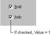
The check box control displays a check mark when it is selected. It is commonly used to present a Yes/No or True/False selection to the user. You can use check box controls in groups to display multiple choices from which the user can select one or more.
Figure 7.5 The check box control
The check box control is similar to the option button control in that each is used to indicate a selection that is made by the user. They differ in that only one option button in a group can be selected at a time. With the check box control, however, any number of check boxes may be selected.
For More Information See "Selecting Individual Options with Check Boxes" in "Forms, Controls, and Menus" for a simple demonstration of the check box control.
The Value property of the check box control indicates whether the check box is checked, unchecked, or unavailable (dimmed). When selected, the value is set to 1. For example:
The following table lists the values and equivalent Visual Basic constants that are used to set the Value property.
|
Setting |
Value |
Constant |
|
|
||
|
Unchecked |
vbUnchecked |
|
|
Checked |
vbChecked |
|
|
Unavailable |
vbGrayed |
|
The user clicks the check box control to indicate a checked or unchecked state. You can then test for the state of the control and program your application to perform some action based on this information.
By default, the check box control is set to vbUnchecked. If you want to preselect several check boxes in a series of check boxes, you can do so by setting the Value property to vbChecked in the Form_Load or Form_Initialize procedures.
You can also set the Value property to vbGrayed to disable the check box. For example, you may want to disable a check box until a certain condition is met.
Whenever the user clicks on the check box control, the Click event is triggered. You can then program your application to perform some action depending upon the state of the check box. In the following example, the check box control's Caption property changes each time the control is clicked, indicating a checked or unchecked state.
Private Sub Check1_Click()
If Check1.Value = vbChecked Then
Check1.Caption = "Checked"
ElseIf Check1.Value = vbUnchecked Then
Check1.Caption = "Unchecked"
End If
End Sub
Note If the user attempts to double-click the check box control, each click will be processed separately; that is, the check box control does not support the double-click event.
The Click event of the check box control is also triggered when the focus is shifted to the control with the keyboard by using the TAB key and then by pressing the SPACEBAR.
You can toggle selection of the check box control by adding an ampersand character before a letter in the Caption property to create a keyboard shortcut. For example:
In this example, pressing the ALT+C key combination toggles between the checked and unchecked states.
The check box control, like the command button and option button controls, may be visually enhanced by altering the setting of the Style property and then using the Picture, DownPicture and DisabledPicture properties. For example, you may want to add an icon or bitmap to a check box or display a different image when the control is clicked or disabled.
A combo box control combines the features of a text box and a list box. This control allows the user to select an item either by typing text into the combo box, or by selecting it from the list.
Figure 7.6 The combo box control
Combo boxes present a list of choices to the user. If the number of items exceeds what can be displayed in the combo box, scroll bars will automatically appear on the control. The user can then scroll up and down or left to right through the list.
Generally, a combo box is appropriate when there is a list of suggested choices, and a list box is appropriate when you want to limit input to what is on the list. A combo box contains an edit field, so choices not on the list can be typed in this field.
In addition, combo boxes save space on a form. Because the full list is not displayed until the user clicks the down arrow (except for Style 1, which is always dropped down), a combo box can easily fit in a small space where a list box would not fit.
For More Information See "Using Combo Boxes and List Boxes" in "Forms, Controls, and Menus" for a simple demonstration of these controls. Also see "Using the List Box Control" later in this chapter for more information about the list box control.
Visual Basic includes both standard and data-bound versions of the combo box control. While both versions allow you to display, edit, and update information from most standard types of databases, the data-bound combo box provides more advanced data access features. The Data-Bound combo box control also supports a different set of properties and methods than the standard combo box control.
There are three combo box styles. Each style can be set at either design or run time and uses values, or equivalent Visual Basic constants, to set the style of the combo box.
|
Style |
Value |
Constant |
|
|
||
|
Drop-down combo box |
vbComboDropDown |
|
|
Simple combo box |
vbComboSimple |
|
|
Drop-down list box |
vbComboDropDownList |
|
Figure 7.7 Combo box styles
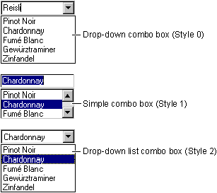
With the default setting (Style = 0 Dropdown Combo), a combo box is a drop-down combo box. The user can either enter text directly (as in a text box) or click the detached arrow at the right of the combo box to open a list of choices. Selecting one of the choices inserts it into the text portion at the top of the combo box. The user also can open the list by pressing ALT+ DOWN ARROW when the control has the focus.
Setting the Style property of a combo box to 1 Simple Combo specifies a simple combo box in which the list is displayed at all times. To display all entries in the list, you must draw the list box large enough to display the entries. A vertical scroll bar is automatically inserted when there are more entries than can be displayed. The user can still enter text directly or select from the list. As with a drop-down combo box, a simple combo box also allows users to enter choices not on the list.
A drop-down list box (Style = 2 Dropdown List) is like a regular list box it displays a list of items from which a user must choose. Unlike list boxes, however, the list is not displayed until you click the arrow to the right of the box. The key difference between this and a drop-down combo box is that the user can't type into the box, he can only select an item from the list. Use this type of list box when space is at a premium.
To add items to a combo box, use the AddItem method, which has the following syntax:
box.AddItem item[, index]
|
Argument |
Description |
|
|
|
|
box |
Name of the list or combo box. |
|
item |
String expression to add to the list. If item is a literal constant, enclose it in quotation marks. |
|
index |
Specifies where the new item is to be inserted in the list. An index of 0 represents the first position. If index is omitted, the item is inserted at the end (or in the proper sorted order). |
While list items are commonly added in the Form_Load event procedure, you can use the AddItem method at any time. This gives you the ability to add items to the list dynamically (in response to user actions).
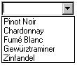
The following code places "Chardonnay," "Fumé Blanc," "Gewürztraminer," and "Zinfandel" into a combo box named Combo1 with its Style property set to 0 (vbComboDropDown):
Private Sub Form_Load ()
Combo1.AddItem "Chardonnay"
Combo1.AddItem "Fumé Blanc"
Combo1.AddItem "Gewürztraminer"
Combo1.AddItem "Zinfandel"
End Sub
Whenever the form is loaded at run time and the user clicks the down arrow, the list appears as shown in Figure 7.8.
Figure 7.8 "Wine list" combo box
You can also enter items into the list at design time by setting the List property in the Properties window of the combo box control. When you select the List property option and then click the down arrow, you can type list items and then press the CTRL+ENTER key combination to start a new line.
You can only add items to the end of the list. So, if you want to alphabetize the list, set the Sorted property to True. See "Sorting a List" below for more information.
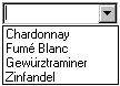
To add an item to a list at a specific position, specify an index value after the new item. For example, the next line of code inserts "Pinot Noir" into the first position, adjusting the position of the other items downward:
Combo1.AddItem "Pinot Noir", 0
Notice that it is 0, not 1, that specifies the first item in a list (see Figure 7.9).
Figure 7.9 Adding an item to a list
You can specify that items be added to a list in alphabetical order by setting the Sorted property to True and omitting the index. The sort is not case-sensitive; thus, the words "chardonnay" and "Chardonnay" are treated the same.
When the Sorted property is set to True, using the AddItem method with the index argument can lead to unpredictable, unsorted results.
You can use the RemoveItem method to delete items from a combo box. RemoveItem has one argument, index, which specifies the item to remove:
box.RemoveItem index
The box and index arguments are the same as for AddItem
For example, to remove the first entry in a list, you would add the following line of code:
Combo1.RemoveItem 0
To remove all list entries in a combo box, use the Clear method:
Combo1.Clear
Usually, the easiest way to get the value of the currently selected item is to use the Text property. The Text property corresponds to whatever is entered in the text box portion of the control at run time. This can be either a selected list item or a string that a user types in the text box.
For example, the following code displays information about Chardonnay if a user selects "Chardonnay" from a list box:
Private Sub Combo1_Click ()
If Combo1.Text = "Chardonnay" Then
Text1.Text = "Chardonnay is a medium-bodied _
white wine."
End If
End Sub
The Text property contains the currently selected item in the Combo1 list box. The code checks to see if "Chardonnay" has been selected and, if so, displays the information in the text box.
The List property provides access to all items in the list. This property contains an array in which each item in the list is an element of the array. Each item is represented in string form. To refer to an item in the list, use this syntax:
box.List(index)
The box argument is a reference to a combo box, and index is the position of the item. The top item has an index of 0, the next has an index of 1, and so on. For example, the following statement displays the third item (index = 2) in a list in a text box:
Text1.Text = Combo1.List(2)
If you want to know the position of the selected item in a list in a combo box, use the ListIndex property. This property sets or returns the index of the currently selected item in the control and is available only at run time. Setting the ListIndex property for a combo box also generates a Click event for the control.
The value of this property is 0 if the first (top) item is selected, 1 if the next item down is selected, and so on. ListIndex is 1 if no item is selected or if a user enters a choice in a combo box (Style 0 or 1) instead of selecting an existing item in the list.
Note The NewIndex property allows you to keep track of the index of the last item added to the list. This can be useful when inserting an item into a sorted list.
To return the number of items in a combo box, use the ListCount property. For example, the following statement uses the ListCount property to determine the number of entries in a combo box:
Text1.Text = "You have " & Combo1.ListCount & " _
entries listed"
The command button control is used to begin, interrupt, or end a process. When clicked, it invokes a command that has been written into its Click event procedure.
Figure 7.10 The command button control
Most Visual Basic applications have command buttons that allow the user to simply click them to perform actions. When the user chooses the button, it not only carries out the appropriate action, it also looks as if it's being pushed in and released and is therefore sometimes referred to as a push button.
For More Information See "Clicking Buttons to Perform Actions" in "Forms, Controls, and Menus" for a simple demonstration of the Command Button control.
You will likely use one or more command buttons in your application. To add command buttons to a form, draw them on as you would any other control. Command buttons can be sized with the mouse or by setting their Height and Width properties.
To change the text displayed on the command button, use the Caption property. At design time, you can set this property by selecting it from the control's Properties window. When you set the Caption property at design time, the button text will be updated dynamically.
You can set the Caption property up to 255 total characters. If your caption exceeds the width of the command button, it will wrap to the next line. However, it will be clipped if the control cannot accommodate its overall height.
You can change the font displayed on the command button by setting its Font property.
You can use the Caption property to create access key shortcuts for your command buttons by adding an ampersand (&) before the letter you want to use as the access key. For example, to create an access key for the caption "Print" you add an ampersand before the letter "P": "&Print". At run time, the letter "P" will be underlined and the user can select the command button by simultaneously pressing ALT+P.
Note To include an ampersand in a caption without creating an access key, include two ampersands (&&). A single ampersand is displayed in the caption and no characters are underlined.
On each form, you can select a command button to be the default command button that is, whenever the user presses the ENTER key the command button is clicked regardless of which other control on the form has the focus. To specify a command button as default set the Default property to True.
You can also specify a default cancel button. When the Cancel property of a command button is set to True, it will be clicked whenever the user presses the ESC key, regardless of which other control on the form has the focus.
A command button can be selected at run time by using the mouse or keyboard in the following ways:
Use a mouse to click the button.
Move the focus to the button by pressing the TAB key, and then choose the button by pressing the SPACEBAR or ENTER.
Press an access key (ALT+ the underlined letter) for a command button.
If the command button is the default command button for the form, pressing ENTER chooses the button, even if you change the focus to a different control.
If the command button is the default Cancel button for the form, then pressing ESC chooses the button, even if you change the focus to another control.
Whenever the command button is selected, its Value property is set to True and the Click event is triggered. False (default) indicates the button isn't chosen. You can use the Value property in code to trigger the command button's Click event. For example:
cmdClose.Value = True
When clicked, the command button's Click event is triggered and the code you've written in the Click event procedure is invoked.
Clicking a command button control also generates the MouseDown and MouseUp events. If you intend to attach event procedures for these related events, be sure that their actions don't conflict. The order in which these three events occur varies from control to control. In the command button control, these events occur in this order: MouseDown, Click, MouseUp.
For More Information See "Responding to Mouse and Keyboard Events" for more information on the MouseDown and MouseUp events.
Note If the user attempts to double-click the command button control, each click will be processed separately; that is, the command button control does not support the double-click event.
The command button control, like the check box and option button controls, may be visually enhanced by altering the setting of the Style property and then using the Picture, DownPicture and DisabledPicture properties. For example, you may want to add an icon or bitmap to a command button or display a different image when the button is clicked or disabled.
The common dialog control provides a standard set of dialog boxes for operations such as opening and saving files, setting print options, and selecting colors and fonts. The control also has the ability to display Help by running the Windows Help engine.
Figure 7.11 The common dialog control
The common dialog control provides an interface between Visual Basic and the routines in the Microsoft Windows dynamic-link library Commdlg.dll. To create a dialog box using this control, Commdlg.dll must be in your Microsoft Windows \System directory.
You use the common dialog control in your application by adding it to a form and setting its properties. The dialog displayed by the control is determined by the methods of the control. At run time, a dialog box is displayed or the Help engine is executed when the appropriate method is invoked; at design time, the common dialog control is displayed as an icon on a form. This icon can't be sized.
The common dialog control allows you to display these commonly used dialog boxes:
Open
Save As
Color
Font
To use the common dialog control
If you haven't already done so, add the common dialog control to the toolbox by selecting Components from the Project menu. Locate and select the control in the Controls tabbed dialog, then click the OK button.
On the toolbox, click the CommonDialog control and draw it on a form.
When you draw a common dialog control on a form, it automatically resizes itself. Like the timer control, the common dialog control is invisible at run time.
At run time, use the appropriate method, as listed in the following table, to display the desired dialog.
|
Method |
Dialog displayed |
|
|
|
|
ShowOpen |
Open |
|
ShowSave |
Save As |
|
ShowColor |
Color |
|
ShowFont |
Font |
|
ShowPrinter |
|
|
ShowHelp |
Invokes Windows Help |
The Open dialog box allows the user to specify a drive, a directory, a file name extension, and a file name.
The Save As dialog box is identical to the Open dialog in appearance, except for the dialog's caption, and file names appearing dimmed out. At run time, when the user chooses a file and closes the dialog box, the FileName property is used to get the selected file name.
Figure 7.12 An Open dialog box
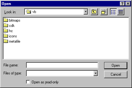
To display the Open dialog box
Specify the list of file filters that are displayed in the Files of type list box.
You can do this by setting the Filter property using the following format:
description1 | filter1 | description2 | filter2...
Description is the string displayed in the list box for
example, "Text Files (*.txt)." Filter
is the actual file filter for example, "*.txt." Each
description | filter
set must be separated by a pipe symbol (|).
Use the ShowOpen method to display the dialog box.
After the user chooses a file, use the FileName property to get the name of the selected file.
With all the common dialog boxes, when the CancelError property is True, an error is generated when the user clicks the dialog box's Cancel button. You detect that the Cancel button was pressed by trapping the error when the dialog box is displayed.
The following code displays an Open dialog box and uses the selected file name as an argument to a procedure that opens a file:
Private Sub mnuFileOpen_Click ()
' CancelError is True.
On Error GoTo ErrHandler
' Set filters.
CommonDialog1.Filter = "All Files (*.*)|*.*|Text _
Files (*.txt)|*.txt|Batch Files (*.bat)|*.bat"
' Specify default filter.
CommonDialog1.FilterIndex = 2
' Display the Open dialog box.
CommonDialog1.ShowOpen
' Call the open file procedure.
OpenFile (CommonDialog1.FileName)
Exit Sub
ErrHandler:
' User pressed Cancel button.
Exit Sub
End Sub
The Color dialog box allows the user to select a color from a palette or to create and select a custom color. At run time, when the user chooses a color and closes the dialog box, you use the Color property to get the selected color.
Figure 7.13 The Color dialog box
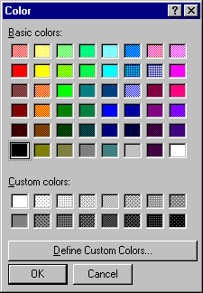
To display the Color dialog box
Set the Flags property for the common dialog control to the Visual Basic constant cdlCCRGBInit.
Use the ShowColor method to display the dialog box.
Use the Color property to get the RGB value of the color the user selects. The following code displays the Color dialog box when a user clicks the Command1 command button:
Private Sub Command1_Click ()
' Set Cancel to True.
CommonDialog1.CancelError = True
On Error GoTo ErrHandler
' Set the Flags property.
CommonDialog1.Flags = cdlCCRGBInit
' Display the Color dialog box.
CommonDialog1.ShowColor
' Set the form's background color to the selected
' color.
Form1.BackColor = CommonDialog1.Color
Exit Sub
ErrHandler:
' User pressed Cancel button.
Exit Sub
End Sub
The Font dialog box allows the user to select a font by its size, color, and style. Once the user makes selections in the Font dialog box, the following properties contain information about the user's selection.
|
Property |
Determines |
|
|
|
|
Color |
The selected color. To use this property, you must first set the Flags property to cdlCFEffects. |
|
FontBold |
Whether bold was selected. |
|
FontItalic |
Whether italic was selected. |
|
FontStrikethru |
Whether |
|
FontUnderline |
Whether underline was selected. |
|
FontName |
The selected font name. |
|
FontSize |
The selected font size. |
Figure 7.14 The Font dialog box
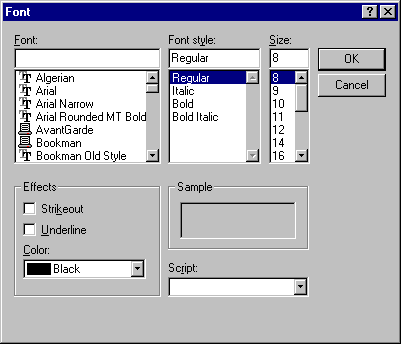
To display the Font dialog box
Set the Flags property to one of the following Visual Basic constant values:
cdlCFScreenFonts (screen fonts)
cdlCFPrinterFonts (printer fonts)
cdlCFBoth (for both screen and printer fonts)
Caution You must set the Flags property to one of these values before displaying the Font dialog box. Otherwise, the error No fonts exist occurs.
Use the ShowFont method to display the dialog box.
The following code sets the font properties for a text box based on a user's selections in the Font dialog box:
Private Sub Command1_Click ()
' Set Cancel to True.
CommonDialog1.CancelError = True
On Error GoTo ErrHandler
' Set the Flags property.
CommonDialog1.Flags = cdlCFBoth Or cdlCFEffects
' Display the Font dialog box.
CommonDialog1.ShowFont
' Set text properties according to user's
' selections.
Text1.Font.Name = CommonDialog1.FontName
Text1.Font.Size = CommonDialog1.FontSize
Text1.Font.Bold = CommonDialog1.FontBold
Text1.Font.Italic = CommonDialog1.FontItalic
Text1.Font.Underline = CommonDialog1.FontUnderline
Text1.FontStrikethru = CommonDialog1.FontStrikethru
Text1.ForeColor = CommonDialog1.Color
Exit Sub
ErrHandler:
' User pressed Cancel button.
Exit Sub
End Sub
The Print dialog box allows the user to specify how output should be printed. The user can specify a range of pages to be printed, a print quality, a number of copies, and so on. This dialog box also displays information about the currently installed printer and allows the user to configure or reinstall a new default printer.
Note This dialog box does not actually send data to a printer. It allows users to specify how they want data printed. You must write code to print the data in the format they select.
For More Information See "Working with Text and Graphics" for information on printing data.
At run time, when the user makes selections in the Print dialog box, the following properties contain information about the user's selection.
|
Property |
Determines |
|
|
|
|
Copies |
The number of copies to print. |
|
FromPage |
The page to start printing. |
|
ToPage |
The page to stop printing. |
|
hDC |
The device context for the selected printer. |
Figure 7.15 The Print dialog box
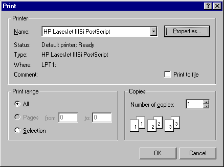
To display the Print dialog box
Set any desired default settings for the dialog by setting the appropriate Print dialog properties.
For example, to display 2 in the Copies box when the dialog is displayed, set the Copies property to 2:
CommonDialog1.Copies = 2
Use the ShowPrinter method to display the Print dialog box.
The following code displays the Print dialog box when the user clicks the Command1 command button:
Private Sub Command1_Click ()
Dim BeginPage, EndPage, NumCopies, i
' Set Cancel to True.
CommonDialog1.CancelError = True
On Error GoTo ErrHandler
' Display the Print dialog box.
CommonDialog1.ShowPrinter
' Get user-selected values from the dialog box.
BeginPage = CommonDialog1.FromPage
EndPage = CommonDialog1.ToPage
NumCopies = CommonDialog1.Copies
For i = 1 to NumCopies
' Put code here to send data to your printer.
Next
Exit Sub
ErrHandler:
' User pressed Cancel button.
Exit Sub
End Sub
Note If the PrinterDefault property is set to True, you can print to the Visual Basic Printer object. In addition, when the PrinterDefault property is True, any changes the user makes in the Setup portion of the Print dialog box are used to change the printer settings in the user's Printer setup.
The ShowHelp method of the common dialog control allows you to display a Help file.
To display a Help file using the ShowHelp method
Set the HelpCommand and HelpFile properties.
Use the ShowHelp method to display the specified Help file.
The following code displays the specified Help file when the user clicks the Command1 command button:
Private Sub Command1_Click()
' Set Cancel to True.
CommonDialog1.CancelError = True
On Error GoTo ErrHandler
' Set the HelpCommand Property
CommonDialog1.HelpCommand = cdlHelpForceFile
' Specify the Help file.
CommonDialog1.HelpFile = "c:\Windows\Cardfile.hlp"
' Display the Windows Help engine.
CommonDialog1.ShowHelp
Exit Sub
ErrHandler:
' User pressed Cancel button.
Exit Sub
End Sub
The data control is used to create simple database applications without writing any code. It can also be used to create more full-featured applications that give you a high degree of control over your data.
Figure 7.16 The data control
The data-bound list, data-bound combo, data-bound grid, and Microsoft FlexGrid controls are all capable of managing sets of records when bound to a data control. All of these controls permit several records to be displayed or manipulated at once.
The intrinsic picture, label, text box, check box, image, OLE container, list box and combo box controls are also data-aware and can be bound to a single field of a Recordset managed by the data control. Additional data-aware controls like the masked edit and rich text box controls are available in the Professional and Enterprise editions and from third-party vendors.
The data-bound list box, combo box, and grid controls are used with the data control to display information from a database.
The data-bound list box and combo box are different from the standard list box and combo box controls in that they are automatically filled from a recordset instead of through use of the AddItem method. In addition, both controls support an automated search mode that can quickly locate items in the list without additional code.
Figure 7.17 The data-bound list box and combo box controls
The data-bound grid control is a spreadsheet-like bound control that displays a series of rows and columns representing records and fields from a Recordset object.
Figure 7.18 The data-bound grid control
The data-bound grid control is functionally similar to the Microsoft FlexGrid control. The Microsoft FlexGrid control, however, provides read-only data binding, additional formatting, grouping, and binding features, as well as customization options.
For More Information See "Using the Microsoft FlexGrid Control" later in this chapter for more information on the Microsoft FlexGrid control.
Many applications must present information about disk drives, directories, and files. To allow users of your applications to explore the file system, Visual Basic provides two alternatives. You can use the standard dialog boxes provided by the common dialog control, or you can build custom dialogs using your own combinations of three specialized controls: the drive list box, the directory list box, and the file list box.
You can use the file-system controls to allow users to investigate and choose among available disk files in your applications. Consider using the common dialog control if you just need a standard File Open or Save dialog box.
For More Information See "Using the Common Dialog Control" earlier in this chapter for more information.
Many of the code examples are taken from the WinSeek sample application (Winseek.vbp). If you installed the sample applications, you will find this application in the \Filectls subdirectory of the main Visual Basic directory (\VB\Samples\Misc).
Each of the file-system controls has been carefully designed to combine flexible and sophisticated file-system inspection capabilities with easy programming. Each control performs its file-data retrieval tasks automatically, but you can write code both to customize their appearance and to specify which information they display.
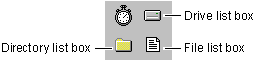
Figure 7.19 The file-system controls
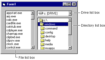
You can use file-system controls singly or in combination. With combinations, you can write code in each control's event procedures to determine how they interact. Or you can let them act independently. Figure 7.20 shows the three controls used together.
Figure 7.20 The file-system controls used together
File-system controls obtain all their information from the operating system automatically; you can access this information or determine what is displayed by each control through its properties. For example, the contents of the current working directory is displayed by default (that is, the directory from which the application was launched, or what became the current directory as the result of a ChDir statement).
Your application can also display a list of the files with names matching a pattern, such as *.frm. Simply draw a file list box on the form and set its Pattern property to *.frm. You can specify the Pattern property at run time with the following code:
File1.Pattern = "*.FRM"
The file-system controls give you the flexibility that is not available with the common dialog control. You can mix and match them in a variety of ways, and you control their appearance and how they interact.
If your goal is simply to allow users to open and save files, a common dialog control provides a ready-to-run set of dialog boxes for these and other operations. These are the same dialog boxes used by many other Microsoft Windows based applications, so they provide a standardized look-and-feel. They also recognize network drives when they're available.
For More Information See "Using the Common Dialog Control" earlier in this chapter for more information.
The drive list box is a drop-down list box. By default, the current drive is displayed on the user's system. When this control has the focus, the user can type in any valid drive designation or click the arrow at the right of the drive list box. When the user clicks the arrow, the list box drops down to list all valid drives. If the user selects a new drive from the list, that drive appears at the top of the list box.
You can use code to examine the Drive property of the drive list box to determine which drive is currently selected. Your application can also specify which drive appears at the top of the list box with this simple assignment:
Drive1.Drive = "c:\"
The drive list box displays valid available drives. Choosing a drive from the list box doesn't automatically change the current working drive; however, you can use the Drive property to change drives at the operating system level by specifying it as an argument to the ChDrive statement:
ChDrive Drive1.Drive
The directory list box displays the directory structure of the current drive on the user's system, beginning with the top-level directory. Initially, the name of the current directory appears highlighted and indented from directories above it in the hierarchy, back to the root. Subdirectories are indented beneath the current directory in the directory list box. As a user moves up or down the list, each of the items is highlighted in turn.
Each directory in the box has an integer identifier associated with it that allows you to identify individual directories. This capability is not provided by the common dialog control. The directory specified by the Path property (Dir1.Path) always has the ListIndex value of 1. The directory immediately above it has the ListIndex value of 2, the one above that of 3, and so on up to the root. The first subdirectory of Dir1.Path has the ListIndex 0. If there are multiple directories at the first subdirectory level, the next has the ListIndex value of 1, then 2, and so on, as shown in Figure 7.21.
Figure 7.21 A directory structure displayed in the directory list box
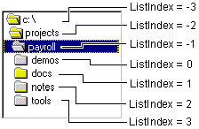
Use the Path property of the directory list box to set or return the current directory in the box (ListIndex = 1). For example, if you assign "c:\payroll" to Drive1.Path in Figure 7.21, the \Payroll directory becomes selected as the current working directory.
Similarly, you can assign the Drive property of the drive list box to the Path property of the directory list box:
Dir1.Path = Drive1.Drive
When this assignment is executed, the directory list box displays all the available directories and subdirectories on that drive. By default, the directory list box also displays all directories above, and any subdirectories immediately below, the current directory of a drive assigned to the Dir1.Path property. The directory list box doesn't set the current directory at the operating system level; it merely highlights the directory and gives it the ListIndex value of 1.
To set the current working directory, use the ChDir statement. For example, the following statement changes the current directory to the one displayed in the directory list box:
ChDir Dir1.Path
In an application that uses file controls, you can set the current directory to the directory where the application's executable (.exe) file is located with the Application object:
ChDrive App.Path ' Set the drive.
ChDir App.Path ' Set the directory.
Note The Path property is available only at run time, not at design time.
When a user clicks an item in a directory list box, that item is highlighted. When an item is double-clicked, it is assigned to the Path property, its ListIndex property gets the value 1, and the directory list box is redrawn to show its immediate subdirectories.
The ListCount property returns the number of directories below the currently expanded directory, not the total number of items in the directory list box. Because the ListIndex value of the currently expanded directory is always , you can write code to determine how far down from the root the currently expanded directory is in the hierarchy. For example:
' Initialize for currently expanded directory.
GoHigher = 0
' Dir1.List(x) returns empty string if the directory
' doesn't exist.
Do Until Dir1.List(GoHigher) = ""
GoHigher = GoHigher - 1
Loop
' Convert to positive number, if desired.
LevelsAbove = Abs(GoHigher)
The file list box displays files contained in the directory specified by the Path property at run time. You can display all the files in the current directory on the current drive using the following statement:
File1.Path = Dir1.Path
You can then display a subset of these files by setting the Pattern property for example, *.frm displays only files with that extension. The Pattern property can also accept a list delimited by semicolons. For example, a line with the following code displays all files with the extensions .frm and .bas:
File1.Pattern = "*.frm; *.bas"
Visual Basic supports the ? wildcard character. For instance, ???.txt displays files that have base names of only three characters with the extension .txt.
The attributes of the currently selected file (Archive, Normal, System, Hidden, and ReadOnly) are also available through file list box properties. You use these properties to specify which kinds of files to display in a file list box. The default value for the System and Hidden attributes is False. The default value for the Normal, Archive, and ReadOnly attributes is True.
To display only read-only files in the list box, for example, simply set the ReadOnly property to True and the other attribute properties to False:
File1.ReadOnly = True
File1.Archive = False
File1.Normal = False
File1.System = False
File1.Hidden = False
When Normal = True, those files without the System or Hidden attribute are displayed. When Normal = False, you can still display files with ReadOnly and/or Archive attributes by setting these attributes to True.
Note You cannot use the attribute properties to set file attributes. To set file attributes, use the SetAttr statement.
By default, you can highlight only a single selection in a file list box. To select multiple files, use the MultiSelect property.
If you use a combination of file-system controls, you can synchronize the information they display. For example, if you have a drive list box, a directory list box, and a file list box with the default names Drive1, Dir1, and File1, the sequence of events might work like this:
The user selects a drive in the Drive1 list box.
A Drive1_Change event is generated, and the display in Drive1 is updated to reflect the new drive.
Code in the Drive1_Change event procedure assigns the new selection (the Drive1.Drive property) to the Path property of the Dir1 list box with the following statements:
Private Sub Drive1_Change ()
Dir1.Path = Drive1.Drive
End Sub
The assignment to the Path property generates a Dir1_Change event and updates the display in Dir1 to reflect the current directory of the new drive.
Code in the Dir1_Change event procedure assigns the new path (the Dir1.Path property) to the File1.Path property of the File1 list box:
Private Sub Dir1_Change ()
File1.Path = Dir1.Path
End Sub
The assignment to the File1.Path property causes the display in the File1 list box to reflect the Dir1 path specification.
The event procedures you use and the properties you change depend on the way your application uses the combination of file-system controls. The code in "File-System Controls Scenario: A File Seeker Application" illustrates the synchronization of controls described here.
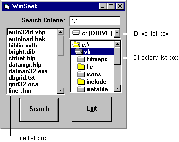
Because users often want to find a file or group of files available to an application quickly, many applications provide capabilities for investigating the file system. The Winseek.vbp sample application helps the user browse drives and directories, and displays any category of files.
Figure 7.22 File-system controls in the WinSeek application
The following table summarizes the controls in Seek.frm from the WinSeek application.
|
Control |
Property |
Setting |
|
|
||
|
Drive list box |
Name |
drvList |
|
Directory list box |
Name |
dirList |
|
File list box |
Name
|
filList |
|
First command button |
Name
|
cmdSearch |
|
Second command button |
Name
|
cmdExit |
|
List box |
Name |
lstFoundFiles |
Note The file-system controls do not have caption properties, although you can label them and give them access keys. For more information on using labels this way, see "Using the Label Control" later in this chapter.
In the drive list box, a Change event is triggered by a single mouse click on an item. A Change event also occurs when the user selects an item and then changes the focus on the form. In the directory list box, a DblClick event is necessary to generate a Change event.
When users want to change directories without using a mouse, they typically use the arrow keys to select the desired directory and then press the ENTER key.
Because ENTER is commonly associated with the default command button control, WinSeek must recognize when the user simply wants to change directories rather than conduct a search for files.
The WinSeek application resolves this ambiguity by determining if the path of the dirList box differs from the currently highlighted directory. This situation can occur when the user single-clicks an item in the directory list box or navigates the directory list box using the arrow keys. The following code determines whether the dirList.Path is different from the path of the highlighted directory. If the paths are different, the dirList.Path is updated. If the paths are the same, the search is performed.
Private Sub cmdSearch_Click()
.
.
.
' If the dirList.Path is different from the currently
' selected directory, update it; otherwise perform the
' search.
If dirList.Path <> dirList.List(dirList.ListIndex) Then
dirList.Path = dirList.List(dirList.ListIndex)
Exit Sub
End If
' Continue with search.
.
.
.
End Sub
The WinSeek application uses the following procedures to handle significant events:
The drvList_Change procedure
The dirList_Change procedure
The cmdSearch_Click procedure
When the user clicks an item in the drive list box, its Change event is generated. The drvList_Change event procedure is invoked, and the following code is run:
Private Sub drvList_Change ()
On Error GoTo DriveHandler
' If new drive was selected, the Dir1 box
' updates its display.
dirList.Path = drvList.Drive
Exit Sub
' If there is an error, reset drvList.Drive with the
' drive from dirList.Path.
DriveHandler:
drvList.Drive = dirList.Path
Exit Sub
End Sub
Notice that the Change event in a drive list box occurs when a new drive is selected, either with a single mouse click or when the user moves the selection (for example, with an arrow key). The error handler is triggered by actions such as attempting to access a floppy disk drive while the drive door is open or selecting a network drive that has been inadvertently disconnected. Because the error prevents the original assignment, dirList.Path still contains the previous valid drive. Reassigning dirList.Path to drvList.Drive corrects this error.
For More Information See "Debugging Your Code and Handling Errors" for more information.
If the user double-clicks an item in the directory list box, or if the Path property of dirList is changed in code (as in the drvList_Change procedure), the dirList_Change event is initiated. The following code responds to that event:
Private Sub dirList_Change ()
' Update file list box to synchronize with the
' directory list box.
filList.Path = dirList.Path
End Sub
This event procedure assigns the Path property of the dirList box to the Path property of the filList box. This causes a PathChange event in the filList list box, which is redrawn; you don't need to add code to the filList_PathChange procedure, because in this application, the event chain ends in the filList list box.
This event procedure determines whether the highlighted item in the dirList list box is the same as the dirList.Path. If the items are different, then dirList.Path is updated. If the items are the same, then the search is performed.
Private Sub cmdSearch_Click ()
.
.
.
' If the dirList.Path is different from the
' currently selected directory, update it;
' otherwise perform the search.
If dirList.Path <> dirList.List _
(dirList.ListIndex) Then
dirList.Path = dirList.List(dirList.ListIndex)
Exit Sub
End If
' Continue with search.
.
.
.
End Sub
Note You can enhance the WinSeek application with additional features. For example, you might want to use a file control's attribute properties. You could use check boxes to allow the user to set different combinations of file attributes so that the file list box displays files that are Hidden, System, and so on. This would restrict a search to conforming files.
The Microsoft FlexGrid control provides advanced features for displaying data in a grid. It is similar to the data-bound grid control; however, it does not allow the user to edit data bound to or contained in the control. This enables you to display data to the user while ensuring that the original data is secure and unchanged. You can add cell-editing features to the Microsoft FlexGird control by combining it with a text box. (See "Microsoft FlexGrid Control Scenario 2: SpreadSheet With Cell Editing" for more information.)
Figure 7.23 The Microsoft FlexGrid control
The Microsoft FlexGrid control supports the following features:
Read-only data binding.
Ability to pivot data between columns and rows.
Automatic regrouping of data during column adjustment.
Adaptation to existing Visual Basic code for the data-bound grid (DBGrid).
Ability of each cell to contain text, a picture, or both.
Changing of current cell text in code or at run time.
Ability to read data automatically when assigned to a data control.
Word-wrap capability for text within cells.
Find and replace functionality for complex strings.
The Microsoft FlexGrid control can be used in the following scenarios:
To implement a "sorting and merging" data display that groups information by category, allowing the user to modify the order in which information is presented.
To create a spreadsheet with in-cell editing using standard Visual Basic controls.
To implement an outline-style display, with heading items that can be collapsed or expanded with the mouse.
The Microsoft FlexGrid sample application (Flex.vbp) demonstrates many features of this control. If you installed the sample applications, you will find this application in the \MSFlexGd subdirectory of the main Visual Basic directory (\VB\Samples\Pguide).
This scenario demonstrates how you can sort and merge data in the Microsoft FlexGrid control.
In most cases, you will load data into the control from a database. In this example, however, sample data will be used to populate the columns and rows of the control. The steps to creating this data display are as follows:
Set the properties of the Microsoft FlexGrid.
Create data.
Define routines to calculate an index and to do a sort.
Define routine to enter the data (from step 2) into the control.
Allow the control to switch views in terms of data organization.
The following controls are used in the scenario:
Microsoft FlexGrid control
In this example, the following properties are used to set the number of columns and rows, the font and font size, and to create headings for the columns:
|
Object |
Property |
Setting |
|
|
||
|
Microsoft FlexGrid control |
Name |
Fg1 |
Use this routine in the Form_Load event to create an array to store the sample data:
Sub Form_Load ()
Dim I As Integer
Create array.
For i = Fg1.FixedRows To Fg1.Rows - 1
' Region.
Fg1.TextArray(fgi(i, 0)) = RandomString(0)
' Product.
Fg1.TextArray(fgi(i, 1)) = RandomString(1)
' Employee.
Fg1.TextArray(fgi(i, 2)) = RandomString(2)
Fg1.TextArray(fgi(i, 3)) = _
Format(Rnd * 10000, "#.00")
Next
Set up merging.
Fg1.MergeCol(0) = True
Fg1.MergeCol(1) = True
Fg1.MergeCol(2) = True
Sort to see the effects.
DoSort
End Sub
The following two routines are needed to calculate an index to be used with the TextArray property and to sort the data:
Function Fgi (r As Integer, c As Integer) As Integer
Fgi = c + Fg1.Cols * r
End Function
Sub DoSort ()
Fg1.Col = 0
Fg1.ColSel = Fg1.Cols - 1
Fg1.Sort = 1 ' Generic ascending.
End Sub
Next, define a routine that populates the Microsoft FlexGrid control with sample data:
Function RandomString (kind As Integer)
Dim s As String
Select Case kind
Case 0 ' Region.
Select Case (Rnd * 1000) Mod 5
Case 0: s = "1. Northwest"
Case 1: s = "2. Southwest"
Case 2: s = "3. Midwest"
Case 3: s = "4. East"
Case Else: s = "5. Overseas"
End Select
Case 1 ' Product.
Select Case (Rnd * 1000) Mod 5
Case 0: s = "1. Wahoos"
Case 1: s = "2. Trinkets"
Case 2: s = "3. Foobars"
Case Else: s = "4. Applets"
End Select
Case 2 ' Employee.
Select Case (Rnd * 1000) Mod 4
Case 0: s = "Mary"
Case 1: s = "Sarah"
Case 2: s = "Donna"
Case Else: s = "Paula"
End Select
End Select
RandomString = s
End Function
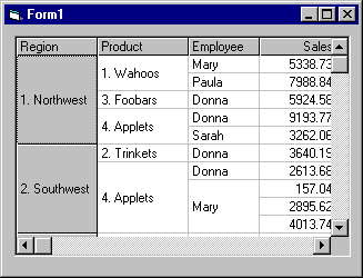
If you run the project at this point, it should look something like this:
To allow the user to reorganize the data by dragging columns to a new position, add the following two routines.
This routine uses the Tag property to save the column number when the user presses the mouse button, triggering the MouseDown event:
Sub Fg1_MouseDown (Button As Integer, _
Shift As Integer, X As Single, Y As Single)
Fg1.Tag = ""
If Fg1.MouseRow <> 0 Then Exit Sub
Fg1.Tag = Str(Fg1.MouseCol)
MousePointer = vbSizeWE
End Sub
This routine readjusts the columns and sorts the data when the user releases the mouse button, triggering the MouseUp event:
Sub Fg1_MouseUp (Button As Integer, Shift As _
Integer, X As Single, Y As Single)
MousePointer = vbDefault
If Fg1.Tag = "" Then Exit Sub
Fg1.Redraw = False
Fg1.ColPosition(Val(Fg1.Tag)) = Fg1.MouseCol
DoSort
Fg1.Redraw = True
End Sub
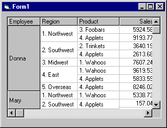
At run time, the data is automatically reorganized when the user drags a column to a new position. For example, if the Employee column were dragged to the left, it would then look like this:
This sample project illustrates some of the Microsoft FlexGrid control's events and container capabilities. It shows how this control can be used to implement a spreadsheet with in-cell editing using standard Visual Basic controls. The steps to creating this Microsoft FlexGrid data display are as follows:
Create controls.
Set properties.
Add row and column headings.
Add in-cell editing.
Add functionality to text box (the "edit" box) for updating the data.
Copy the data from the text box to Microsoft FlexGrid.
The following controls are used in the scenario:
Microsoft FlexGrid control
Text box control
For this example, add a Microsoft FlexGrid control and then a text box control inside it to create a parent-child relationship. As in this example:
Set the following properties for the Microsoft FlexGrid and text box controls:
|
Object |
Property |
Setting |
|
|
||
|
Microsoft FlexGrid control |
Name |
Fg2 |
|
Text box |
Name |
txtEdit |
To modify the Microsoft FlexGrid control so that it resembles a spreadsheet, add the following code to the form's Form_Load procedure:
Sub Form_Load ()
Dim i As Integer
' Make first column narrow.
Fg2.ColWidth(0) = Fg2.ColWidth(0) / 2
Fg2.ColAlignment(0) = 1 ' Center center.
' Label rows and columns.
For i = Fg2.FixedRows To Fg2.Rows - 1
Fg2.TextArray(fgi(i, 0)) = i
Next
For i = Fg2.FixedCols To Fg2.Cols - 1
Fg2.TextArray(fgi(0, i)) = i
Next
' Initialize edit box (so it loads now).
txtEdit = ""
End Sub
Then, create a function to calculate an index for the TextArray property:
Function Fgi (r As Integer, c As Integer) As Integer
Fgi = c + Fg2.Cols * r
End Function
The sample application (Flex.vbp) demonstrates the functionality necessary for navigating around and selecting ranges of cells . To add in-cell editing, the following code needs to be added to the Microsoft FlexGrid control's KeyPress and DblClick events:
Sub Fg2_KeyPress (KeyAscii As Integer)
MSFlexGridEdit Fg2, txtEdit, KeyAscii
End Sub
Sub Fg2_DblClick ()
MSFlexGridEdit Fg2, txtEdit, 32 ' Simulate a space.
End Sub
To initialize the text box and to pass the focus from the Microsoft FlexGrid control to the text box, add the following routine:
Sub MSFlexGridEdit (MSFlexGrid As Control, _
Edt As Control, KeyAscii As Integer)
' Use the character that was typed.
Select Case keyascii
' A space means edit the current text.
Case 0 To 32
Edt = MSFlexGrid
Edt.SelStart = 1000
' Anything else means replace the current text.
Case Else
Edt = Chr(keyascii)
Edt.SelStart = 1
End Select
' Show Edt at the right place.
Edt.Move MSFlexGrid.CellLeft, MSFlexGrid.CellTop, _
MSFlexGrid.CellWidth, MSFlexGrid.CellHeight
Edt.Visible = True
' And let it work.
Edt.SetFocus
End Sub
Add the following routines to the KeyPress and DblClick events of the text box to allow data to be updated:
Sub txtEdit_KeyPress (KeyAscii As Integer)
' Delete returns to get rid of beep.
If KeyAscii = vbCr Then KeyAscii = 0
End Sub
Sub txtEdit_KeyDown (KeyCode As Integer, _
Shift As Integer)
EditKeyCode Fg2, txtEdit, KeyCode, Shift
End Sub
Sub EditKeyCode (MSFlexGrid As Control, Edt As _
Control, KeyCode As Integer, Shift As Integer)
' Standard edit control processing.
Select Case KeyCode
Case 27 ' ESC: hide, return focus to MSFlexGrid.
Edt.Visible = False
MSFlexGrid.SetFocus
Case 13 ' ENTER return focus to MSFlexGrid.
MSFlexGrid.SetFocus
Case 38 ' Up.
MSFlexGrid.SetFocus
DoEvents
If MSFlexGrid.Row > MSFlexGrid.FixedRows Then
MSFlexGrid.Row = MSFlexGrid.Row - 1
End If
Case 40 ' Down.
MSFlexGrid.SetFocus
DoEvents
If MSFlexGrid.Row < MSFlexGrid.Rows - 1 Then
MSFlexGrid.Row = MSFlexGrid.Row + 1
End If
End Select
End Sub
Finally, you need to tell the Microsoft FlexGrid control what to do with the data when it is entered into the text box. The focus is returned to the control when the user enters the data and presses the ENTER key or clicks on a different cell in the Microsoft FlexGrid control with the mouse. The text from the text box is then copied into the active cell. Add the following code to the GotFocus and LeaveCell event procedures:
Sub Fg2_GotFocus ()
If txtEdit.Visible = False Then Exit Sub
Fg2 = txtEdit
txtEdit.Visible = False
End Sub
Sub Fg2_LeaveCell ()
If txtEdit.Visible = False Then Exit Sub
Fg2 = txtEdit
txtEdit.Visible = False
End Sub
At run time, data can be entered into individual cells as in this example:
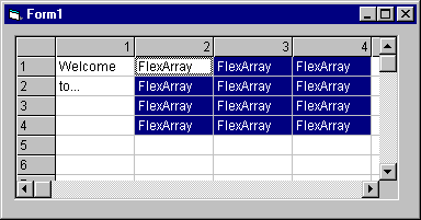
This sample project shows how Microsoft FlexGrid can be used to implement an outline-style display, with heading items that can be collapsed or expanded with the mouse. The steps to creating this data display are as follows:
Set properties of Microsoft FlexGrid control.
Create data.
Add collapsing and expanding functionality.
The following controls are used in the scenario:
Microsoft FlexGrid control
For this application, set four column headings with the FormatString property with the first column narrow and empty (like a spreadsheet) and the other three for the data (include the spacing between each heading). Set the following properties for the Microsoft FlexGrid control:
|
Object |
Property |
Setting |
|
|
||
|
Microsoft FlexGrid control |
Name |
Fg3 |
The Form_Load event procedure is used to create sample data, to set up and calculate the headings at the top of the control, and to set the Col and the Row properties to select the first cell at run time.
Sub Form_Load ()
Dim i As Integer, tot As Integer
Dim t As String, s As String
' Create sample data.
t = Chr(9)
Fg3.Rows = 1
Fg3.AddItem "*" + t + "Air Fare"
s = "" +t+ "SFO-JFK" +t+ "9-Apr-95" +t+ "750.00"
For i = 0 to 5
Fg3.AddItem s
Next
Fg3.AddItem "*" + t + "Meals"
s = "" +t+ "Flint's BBQ" +t+ "25-Apr-95" _
+t+ "35.00"
For i = 0 to 5
Fg3.AddItem s
Next
Fg3.AddItem "*" +t+ "Hotel"
s = "" +t+ "Center Plaza" +t+ "25-Apr-95" _
+t+ "817.00"
For i = 0 to 5
Fg3.AddItem s
Next
' Add up totals and format heading entries.
For i = Fg3.Rows - 1 To 0 Step -1
If Fg3.TextArray(i * Fg3.Cols) = "" Then
tot = tot + Val(Fg3.TextArray_
(i * Fg3.Cols + 3))
Else
Fg3.Row = i
Fg3.Col = 0
Fg3.ColSel = Fg3.Cols - 1
Fg3.CellBackColor = &HC0C0C0
Fg3.CellFontBold = True
Fg3.CellFontWidth = 8
Fg3.TextArray(i * Fg3.Cols + 3) = _
Format(tot, "0")
tot = 0
End If
Next
' Select the first row.
Fg3.Col = 1
Fg3.Row = 1
Fg3.ColSel = Fg3.Cols - 1
End Sub
At run time, the rows are sorted into three divisions under their respective headings: Air Fare, Meals, and Hotels.
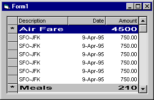
To add functionality which allows the row headings to be expanded or collapsed, add the following code to the control's DblClick event procedure:
Sub Fg3_DblClick ()
Dim i As Integer, r As Integer
' Ignore top row.
r = Fg3.MouseRow
If r < 1 Then Exit Sub
' Find field to collapse or expand.
While r > 0 And Fg3.TextArray(r * Fg3.Cols) = ""
r = r - 1
Wend
' Show collapsed/expanded symbol on first column.
If Fg3.TextArray(r * Fg3.Cols) = "*" Then
Fg3.TextArray(r * Fg3.Cols) = "+"
Else
Fg3.TextArray(r * Fg3.Cols) = "*"
End If
' Expand items under current heading.
r = r + 1
If Fg3.RowHeight(r) = 0 Then
Do While Fg3.TextArray(r * Fg3.Cols) = ""
Fg3.RowHeight(r) = -1' Default row height.
r = r + 1
If r >= Fg3.Rows Then Exit Do
Loop
' Collapse items under current heading.
Else
Do While Fg3.TextArray(r * Fg3.Cols) = ""
Fg3.RowHeight(r) = 0 ' Hide row.
r = r + 1
If r >= Fg3.Rows Then Exit Do
Loop
End If
End Sub
At run time, the user can expand and collapse the row headings by double-clicking on the "+" or "*" symbols in the first column, as in this example:
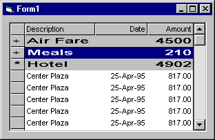
Note You could easily modify this example to show images instead of "+" and "*" characters, or to add additional levels to the outline.
Frame controls are used to provide an identifiable grouping for other controls. For example, you can use frame controls to subdivide a form functionally to separate groups of option button controls.
Figure 7.24 The frame control
In most cases, you will use the frame control passively to group other controls and will have no need to respond to its events. You will, however, most likely change its Name, Caption, or Font properties.
For More Information See "Grouping Options with Option Buttons" in "Forms, Controls, and Menus" for a simple demonstration of using the frame control to group option buttons.
When using the frame control to group other controls, first draw the frame control, and then draw the controls inside of it. This enables you to move the frame and the controls it contains together.
To add other controls to the frame, draw them inside the frame. If you draw a control outside the frame, or use the double-click method to add a control to a form, and then try to move it inside the frame control, the control will be on top of the frame and you'll have to move the frame and controls separately.
Figure 7.25 Controls inside a frame
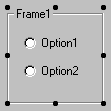
Note If you have existing controls that you want to group in a frame, you can select all the controls, cut them to the clipboard, select the frame control, and then paste them into the frame control.
To select multiple controls in a frame , hold down the CTRL key while using the mouse to draw a box around the controls. When you release the mouse, the controls inside the frame will be selected, as in Figure 7.26.
Figure 7.26 Selecting controls inside a frame
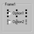
Scroll bars provide easy navigation through a long list of items or a large amount of information by scrolling either horizontally or vertically within an application or control. Scroll bars are a common element of the Windows 95 and Windows NT interface.
Figure 7.27 The horizontal and vertical scroll bar controls
The horizontal and vertical scroll bar controls are not the same as the built-in scroll bars found in Windows or those that are attached to text boxes, list boxes, combo boxes, or MDI forms within Visual Basic. Those scroll bars appear automatically whenever the given application or control contains more information than can be displayed in the current window size (or, in the case of text boxes and MDI forms, when the ScrollBars property is also set to True).
In previous versions of Visual Basic, scroll bars were most often used as input devices. Windows interface guidelines now suggest, however, that slider controls be used as input devices instead of scroll bar controls. A Windows 95 slider control is included in the Professional and Enterprise versions of Visual Basic.
Scroll bar controls are still of value in Visual Basic because they provide scrolling to applications or controls that do not provide them automatically. See "Scroll Bar Controls Scenario: Creating a Scrollable Graphics Viewport" for information on using scroll bars in this manner.
The scroll bar controls use the Scroll and Change events to monitor the movement of the scroll box (sometimes referred to as the thumb) along the scroll bar.
|
Event |
Description |
|
|
|
|
Change |
Occurs after the scroll box is moved. |
|
Scroll |
Occurs as the scroll box is moved. Does not occur if the scroll arrows or scroll bar is clicked. |
Using the Scroll event provides access to the scroll bar value as it is being dragged. The Change event occurs after the scroll box is released or when the scroll bar or scroll arrows are clicked.
The Value property (which, by default, is 0) is an integer value corresponding to the position of the scroll box in the scroll bar. When the scroll box position is at the minimum value, it moves to the leftmost position (for horizontal scroll bars) or the top position (for vertical scroll bars). When the scroll box is at the maximum value, the scroll box moves to the rightmost or bottom position. Similarly, a value halfway between the bottom and top of the range places the scroll box in the middle of the scroll bar.
In addition to using mouse clicks to change the scroll bar value, a user can also drag the scroll box to any point along the bar. The resulting value depends on the position of the scroll box, but it is always within the range of the Min to Max properties set by the user.
Note Min can be larger than Max if you want your scroll bar to display information changing from a larger to a smaller value.
To specify the amount of change to report in a scroll bar, use the LargeChange property for clicking in the scroll bar, and the SmallChange property for clicking the arrows at the ends of the scroll bar. The scroll bar's Value property increases or decreases by the values set for the LargeChange and SmallChange properties. You can position the scroll box at run time by setting Value between 0 and 32,767, inclusive.
The horizontal and vertical scroll bar controls can be used, in addition to the picture box control, to create a scrollable graphics viewport application. The picture box control alone will not allow you to scroll a graphic if it exceeds its boundaries the picture box control does not automatically add scroll bars.
This application uses two picture boxes. The first is referred to as the stationary parent picture box control. The second, which is contained within the parent, is referred to as the child picture box control. The child picture box contains the graphic image and is moved around within the parent picture box control when the scroll bar controls are used.
Figure 7.28 Adding scroll bar controls at design time
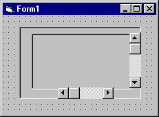
Start by creating a new project and then draw two picture boxes, a horizontal scroll bar, and a vertical scroll bar on the form, as shown in Figure 7.28.
The form's Form_Load event is used to set the scale mode, to size the child picture box within the parent picture box, to position and size the horizontal and vertical scroll bars, and then to load a bitmap graphic. Add the following code to the form's Form_Load event procedure:
Private Sub Form_Load()
' Set ScaleMode to pixels.
Form1.ScaleMode = vbPixels
Picture1.ScaleMode = vbPixels
' Autosize is set to True so that the boundaries of
' Picture2 are expanded to the size of the actual
' bitmap.
Picture2.AutoSize = True
' Set the BorderStyle of each picture box to None.
Picture1.BorderStyle = 0
Picture2.BorderStyle = 0
' Load the bitmap.
Picture2.Picture = _
LoadPicture("c:\Windows\Winlogo.bmp")
' Initialize location of both pictures.
Picture1.Move 0, 0, ScaleWidth - VScroll1.Width, _
ScaleHeight - HScroll1.Height
Picture2.Move 0, 0
' Position the horizontal scroll bar.
HScroll1.Top = Picture1.Height
HScroll1.Left = 0
HScroll1.Width = Picture1.Width
' Position the vertical scroll bar.
VScroll1.Top = 0
VScroll1.Left = Picture1.Width
VScroll1.Height = Picture1.Height
' Set the Max property for the scroll bars.
HScroll1.Max = Picture2.Width - Picture1.Width
VScroll1.Max = Picture2.Height - Picture1.Height
' Determine if the child picture will fill up the
' screen.
' If so, there is no need to use scroll bars.
VScroll1.Visible = (Picture1.Height < _
Picture2.Height)
HScroll1.Visible = (Picture1.Width < _
Picture2.Width)
End Sub
The horizontal and vertical scroll bars' Change event is used to move the child picture box up and down or left and right within the parent picture box. Add the following code to the Change event of both scroll bar controls:
Private Sub HScroll1_Change()
Picture2.Left = -HScroll1.Value
End Sub
Private Sub VScroll1_Change()
Picture2.Top = -VScroll1.Value
End Sub
The Left and Top properties of the child picture box are set to the negative value of the horizontal and vertical scroll bars so that as you scroll up or down or right or left, the display moves appropriately.
At run time, the graphic will be displayed as shown in Figure 7.29.
Figure 7.29 Scrolling the bitmap at run time
In the example described above, the viewable size of the graphic is limited by the original size of the form. To resize the graphic viewport application when the user adjusts the size of the form at run time, add the following code to the form's Form_Resize event procedure:
Private Sub Form_Resize()
' When the form is resized, change the Picture1
' dimensions.
Picture1.Height = Form1.Height
Picture1.Width = Form1.Width
' Reinitialize the picture and scroll bar
' positions.
Picture1.Move 0, 0, ScaleWidth - VScroll1.Width, _
ScaleHeight - HScroll1.Height
Picture2.Move 0, 0
HScroll1.Top = Picture1.Height
HScroll1.Left = 0
HScroll1.Width = Picture1.Width
VScroll1.Top = 0
VScroll1.Left = Picture1.Width
VScroll1.Height = Picture1.Height
HScroll1.Max = Picture2.Width - Picture1.Width
VScroll1.Max = Picture2.Height - Picture1.Width
' Check to see if scroll bars are needed.
VScroll1.Visible = (Picture1.Height < _
Picture2.Height)
HScroll1.Visible = (Picture1.Width < _
Picture2.Width)
End Sub
The image control is used to display graphics. Image controls can display graphics in the following formats: bitmap, icon, metafile, enhanced metafile, or as JPEG or GIF files.
Figure 7.30 The image control
In addition, image controls respond to the Click event and can be used as a substitute for command buttons, as items in a toolbar, or to create simple animations.
For More Information See "Lightweight Graphical Controls" in "Forms, Controls, and Menus" for a simple demonstration of using the image control like a command button. See "Creating Simple Animation" in "Working with Text and Graphics" for more information on using the image control to create simple animations.
The image control uses fewer system resources and repaints faster than a picture box control, but it supports only a subset of the picture box control's properties, events, and methods. Both controls support the same picture formats. However, you can stretch pictures in an image control to fit the control's size. You cannot do this with the picture box control.
The image control can display picture files in any of the following standard formats.
|
Picture format |
Description |
|
|
|
|
Bitmap |
A bitmap defines an image as a pattern of dots (pixels). A bitmap has the file name extensions .bmp or .dib. Bitmaps are also called "paint-type" graphics. You can use bitmaps of various color depths, including 2, 4, 8, 16, 24, and 32-bits, but a bitmap only displays correctly if the display device supports the color depth used by the bitmap. For example, an 8-bit-per-pixel (256 color) bitmap only displays in 16 colors when shown on a 4-bit-per-pixel (16 color) device. |
|
Icon |
An icon is a special kind of bitmap. Icons have a maximum size of 32 pixels by 32 pixels, but under Microsoft Windows 95, icons are also found in 16 by 16 pixel size. An icon has the file name extension .ico. |
|
Metafile |
A metafile defines an image as coded lines and shapes. Conventional metafiles have the file name extension .wmf. Enhanced metafiles have the file name extension .emf. Only files that are compatible with Microsoft Windows can be loaded. Metafiles are also called "draw-type" graphics. |
|
JPEG |
JPEG (Joint Photographic Experts Group) is a compressed bitmap format which supports 8- and 24-bit color. It is a popular file format on the Internet. |
|
GIF |
GIF (Graphic Interchange Format) is a compressed bitmap format originally developed by CompuServe. It supports up to 256 colors and is a popular file format on the Internet. |
Pictures can be loaded into the image control at design time by selecting the Picture property from the control's Properties window, or at run time by using the Picture property and the LoadPicture method.
Image1.Picture = LoadPicture("c:\Windows\Winlogo.bmp")
When a picture is loaded into the image control, the control automatically resizes to fit the picture regardless of how small or large the image control was drawn on the form.
To clear the graphic from the image control, use the LoadPicture method without specifying a file name. For example:
Image1.Picture = LoadPicture
This will clear the image control even if a graphic was loaded into the Picture property at design time.
You can also add a graphic to an image control at design time by pasting it from another application. For example, you may want to add a bitmap image that was created in Windows Paint. Simply copy the image to the Clipboard, select the image control, and either use the keyboard shortcut CTRL+V or the Paste command from the Edit menu.
The Stretch property determines whether the picture is stretched when the image control is resized at design time. If set to True, the picture loaded into the image control via the Picture property is stretched. Stretching a picture (especially a bitmap format) can produce a loss in image quality, as shown in Figure 7.31. Metafiles, which are "draw-type" graphics, are better suited for stretching.
Figure 7.31 Stretching a bitmap image
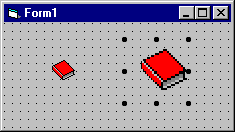
Label controls are used to display text and cannot be edited by the user. They are used to identify objects on a form provide a description of what a certain control will do if clicked, for example or at run time, they can display information in response to an event or process in your application.
Figure 7.32 The label control
Labels are used in many instances, for many different purposes. Most commonly, they are used to label controls that don't have their own Caption properties. For example, you can use the label control to add descriptive labels to text boxes, list boxes, combo boxes and so on. They can also be used to add descriptive text to a form, for example, to provide the user with Help information.
You can also write code that changes the text displayed by a label control in response to events at run time. For example, if your application takes a few minutes to process a change, you can display a processing-status message in a label.
Because the label control cannot receive the focus, it can also be used to create access keys for other controls.
To change the text displayed in the label control, use the Caption property. At design time, you can set this property by selecting it from the control's Properties window.
You can set the length of the Caption property up to a maximum of 1024 bytes.
The Alignment property allows you to set the alignment of the text within the label control to either Left Justify (0, the default) , Center (1), or Right Justify (2).
By default, when text entered into the Caption property exceeds the width of the control, the text wraps to the next line and is clipped if it exceeds the control's height.
To allow the control to automatically adjust to the size of its contents, set the AutoSize property to True. The control will expand horizontally to fit the entire contents of the Caption property. To allow the contents to wrap down and expand vertically, set the WordWrap property to True.
For More Information See "Using Labels to Display Text" in "Forms, Controls, and Menus" for a simple demonstration of the AutoSize and WordWrap properties.
Set the UseMnemonic property to True if you want to define a character in the Caption property of the label as an access key. When you define an access key in a label control, the user can press and hold down ALT+ the character you designate to move the focus to the next control in the tab order.
You can also create access keys for any other controls that have a Caption property by adding an ampersand (&) before the letter you want to use as the access key. To assign an access key to controls that don't have captions, use a label with the control. Because labels can't receive focus, focus automatically moves to the next control in the tab order. Use this technique to assign access keys to text boxes, picture boxes, combo boxes, list boxes, drive list boxes, directory list boxes, grids, and images.
To assign an access key to a control with a label
Draw the label first, and then draw the control.
or
Draw the controls in any order and set the TabIndex property of the label to one less than the control.
Use an ampersand in the label's Caption property to assign the access key for the label.
Note You may want to display ampersands in a label control, rather than using them to create access keys. This may occur if you bind a label control to a field in a recordset where the data includes ampersands. To display ampersands in a label control, set the UseMnemonic property to False.
The line control is used to create simple line segments on a form, a frame, or in a picture box.
Figure 7.33 The line control
You can control the position, length, color, and style of line controls to customize the look of applications. Figure 7.34 shows a line control used to graphically separate the label containing the text "Company Name" from the rest of the form.
Figure 7.34 A line control on a form
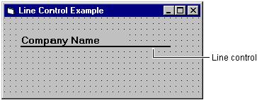
The line control has limited functionality and is intended for simple uses display and printing. Line segments cannot be joined to form other shapes, for instance. For more advanced uses you need to use the line method.
For More Information See "Using Graphics Methods" in "Working with Text and Graphics" for more information on drawing lines, rectangles, and filled-in boxes at run time using the line method or for more information on drawing circles, ellipses, and arcs at run time using the Circle method.
You set the color and style of a line segment by using the BorderStyle and BorderColor properties.
The BorderStyle property provides you with six line styles:
Transparent
Solid
Dash
Dot
Dash-Dot
Dash-Dot-Dot
Inside Solid
You can specify a line style at design time by choosing the BorderStyle property from the Properties window of the line control or, at run time, by specifying the style using its equivalent Visual Basic constant in code.
The BackColor property is used to specify the color of the line.
At design time, you can set the line color by choosing the BorderColor property from the Properties window of the line control and then selecting from the available palette or system colors.
To set colors at run time, use the Visual Basic color constants (vbGreen, for example) or the system color constants (vbWindowBackground, for example) or the RGB function to specify border colors.
Note When BorderStyle is set to 0 (Transparent), the BorderColor property is ignored.
For More Information Refer to "Working with Text and Graphics" for detailed information on creating graphics in Visual Basic.
You can move or resize the line control at run time by altering its X1, X2, Y1, and Y2 properties. The X1 and Y1 properties set the horizontal and vertical positions of the left end of the line segment. The X2 and Y2 properties set the horizontal and vertical positions of the right end of the line segment. You can't move a line segment using the Move method.
You can use the line control to draw simple lines on forms.
To draw a line on a form
In the toolbox, select the line control.
When the pointer moves onto the form, it changes to a cross hair.
Click the form where you want the line to begin and hold down the mouse button.
Drag the cross hair to where you want the line to end and release the mouse button.
From the Properties window, select the BorderStyle property if you want to change the appearance of the line.
In the Settings box, select the style you want.
A list box control displays a list of items from which the user can select one or more.
Figure 7.35 The list box control
List boxes present a list of choices to the user. By default, the choices are displayed vertically in a single column, although you can set up multiple columns as well. If the number of items exceeds what can be displayed in the list box, scroll bars automatically appear on the control. The user can then scroll up and down, or left to right through the list. Figure 7.36 shows a single-column list box.
Figure 7.36 Single-column list box
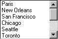
Visual Basic includes both standard and data-bound versions of the list box control. While both versions of the list box control allow you to display, edit, and update information from most standard types of databases, the data-bound list provides more advanced data access features. The data-bound list box control also supports a different set of properties and methods than the standard list box control.
A recommended practice for list box events, especially when the list box appears as part of a dialog box, is to add a command button to use with the list box. The Click event procedure for this button should make use of the list-box selection, carrying out whatever action is appropriate for your application.
Double-clicking an item in the list should have the same effect as selecting the item and then clicking the command button. To do this, have the DblClick procedure for the list box call the Click procedure for the command button:
Private Sub List1_DblClick ()
Command1_Click
End Sub
Or, set the value of the command button's Value property to True, which will automatically invoke the event procedure:
Private Sub List1_DblClick ()
Command1.Value = True
End Sub
This provides mouse users with a shortcut, yet does not prevent keyboard users from performing the same action. Note that there is no keyboard equivalent for the DblClick event.
To add items to a list box, use the AddItem method, which has the following syntax:
box.AddItem item[, index]
|
Argument |
Description |
|
|
|
|
box |
Name of the list box. |
|
item |
String expression to add to the list. If item is a literal constant, enclose it in quotation marks. |
|
index |
Specifies where the new item is to be inserted in the list. An index of 0 represents the first position. If index is omitted, the item is inserted at the end (or in the proper sorted order). |
While list items are commonly added in the Form_Load event procedure, you can use the AddItem method at any time. This gives you the ability to add items to the list dynamically (in response to user actions).
The following code places "Germany," "India," "France," and "USA" into a list box named List1:
Private Sub Form_Load ()
List1.AddItem "Germany"
List1.AddItem "India"
List1.AddItem "France"
List1.AddItem "USA"
End Sub
Whenever the form is loaded at run time, the list appears as shown in Figure 7.37.
Figure 7.37 "Countries" list box
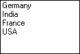
To add an item to a list at a specific position, specify an index value for the new item. For example, the next line of code inserts "Japan" into the first position, adjusting the position of the other items downward:
List1.AddItem "Japan", 0
Notice that it is 0, not 1, that specifies the first item in a list (see Figure 7.38).
Figure 7.38 Adding an item to a list
You can also enter items into the list at design time by setting the List property in the Properties window of the list box control. When you select the List property option and then click the down arrow, you can type list items and then press the CTRL+ENTER key combination to start a new line.
You can only add items to the end of the list. So, if you want to alphabetize the list, set the Sorted property to True. See "Sorting a List" below for more information.
You can specify that items be added to a list in alphabetical order by setting the Sorted property to True and omitting the index. The sort is not case-sensitive; thus, the words "japan" and "Japan" are treated the same.
When the Sorted property is set to True, using the AddItem method with the index argument can lead to unpredictable, unsorted results.
You can use the RemoveItem method to delete items from a list box. RemoveItem has one argument, index, which specifies the item to remove:
box.RemoveItem index
The box and index arguments are the same as for AddItem
For example, to remove the first entry in a list, you would add the following line of code:
List1.RemoveItem 0
To remove all list entries in bound or standard versions of the list and combo boxes, use the Clear method:
List1.Clear
Usually, the easiest way to get the value of the currently selected item is to use the Text property. The Text property always corresponds to a list item a user selects at run time.
For example, the following code displays information about the population of Canada if a user selects "Canada" from a list box:
Private Sub List1_Click ()
If List1.Text = "Canada" Then
Text1.Text = "Canada has 24 million people."
End If
End Sub
The Text property contains the currently selected item in the List1 list box. The code checks to see if "Canada" has been selected and, if so, displays the information in the Text box.
The List property provides access to all items in the list. This property contains an array in which each item in the list is an element of the array. Each item is represented in string form. To refer to an item in the list, use this syntax:
box.List(index)
The box argument is a reference to a list box, and index is the position of the item. The top item has an index of 0, the next has an index of 1, and so on. For example, the following statement displays the third item (index = 2) in a list in a text box:
Text1.Text = List1.List(2)
If you want to know the position of the selected item in a list, use the ListIndex property. This property sets or returns the index of the currently selected item in the control and is available only at run time. Setting the ListIndex property for a list box also generates a Click event for the control.
The value of this property is 0 if the first (top) item is selected, 1 if the next item down is selected, and so on. ListIndex is 1 if no item is selected.
Note The NewIndex property allows you to keep track of the index of the last item added to the list. This can be useful when inserting an item into a sorted list.
To return the number of items in a list box, use the ListCount property. For example, the following statement uses the ListCount property to determine the number of entries in a list box:
Text1.Text = "You have " & List1.ListCount & " _
entries listed"
The Columns property allows you to specify the number of columns in a list box. This property can have the following values:
|
Value |
Description |
|
|
|
|
Single-column list box with vertical scrolling. |
|
|
Single-column list box with horizontal scrolling. |
|
|
>1 |
Multiple-column list box with horizontal scrolling. |
Visual Basic takes care of wrapping list items to the next line and adding a horizontal scroll bar to the list if needed; if the list fills a single column, no scroll bar is added. Wrapping to the next column also occurs automatically as needed. Note that if a list box entry is wider than the width of a column, the text is truncated.
You can allow users to select multiple items from a list. Multiple selection in standard list boxes is handled by setting the MultiSelect property, which can have the following values.
|
Value |
Type of selection |
Description |
|
|
||
|
None |
Standard list box. |
|
|
Simple multiple selection |
A click or the SPACEBAR selects or deselects additional items in the list. |
|
|
Extended multiple |
The SHIFT+ click or SHIFT+ an arrow key extends the selection to include all the items between the current and previous selections. CTRL+ click selects or deselects an item in the list. |
|
For More Information See "List Box Control Scenario 2: Creating Multiple-Column List Boxes" later in this chapter for more information on the Columns and MultiSelect properties.
This example shows how you can use the AddItem, RemoveItem, and Clear methods with the ListIndex and ListCount properties to add and remove list entries at run time. The example in Figure 7.39 lets a user type a client's name in a text box, which can be added to the list box if the Add button is clicked. A user can remove a current list item by selecting the item and choosing the Remove button, or by choosing Clear to clear all list entries.
Figure 7.39 A list box using the AddItem, RemoveItem, and Clear methods
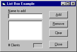
The number of clients in the list box is displayed in a label that looks like a text box (BorderStyle is set to 1-Fixed Single). This label is updated every time a client name is added or removed. Because the Sorted property for the list box is set to True, items are added to the list box in alphabetical order.
Create a form with a text box, a list box, three labels, and four command buttons. The following table lists the property settings for the objects in the application.
|
Object |
Property |
Setting |
|
|
||
|
Top text box |
Name |
txtName |
|
Top label |
Name |
lblName |
|
List box |
Name |
lstClient |
|
Bottom label |
Name |
lblClients |
|
Number of clients label |
Name |
lblDisplay |
|
First command button |
Name |
cmdAdd |
|
Second command button |
Name |
cmdRemove |
|
Third command button |
Name |
cmdClear |
|
Fourth command button |
Name |
cmdClose |
Add this code to the cmdAdd_Click event procedure:
Private Sub cmdAdd_Click ()
lstClient.AddItem txtName.Text ' Add to list.
txtName.Text = "" ' Clear text box.
txtName.SetFocus
' Display number.
lblDisplay.Caption = lstClient.ListCount
End Sub
Add this code to the cmdRemove_Click event procedure:
Private Sub cmdRemove_Click ()
Dim Ind As Integer
Ind = lstClient.ListIndex ' Get index.
' Make sure list item is selected.
If Ind >= 0 Then
' Remove it from list box.
lstClient.RemoveItem Ind
' Display number.
lblDisplay.Caption = lstClient.ListCount
Else
Beep
End If
' Disable button if no entries in list.
cmdRemove.Enabled = (lstClient.ListIndex <> -1)
End Sub
Add this code to the cmdClear_Click event procedure:
Private Sub cmdClear_Click ()
' Empty list box.
lstClient.Clear
' Disable Remove button.
cmdRemove.Enabled = False
' Display number.
lblDisplay.Caption = lstClient.ListCount
End Sub
Add this code to the cmdClose_Click event procedure:
Private Sub cmdClose_Click ()
Unload Me
End Sub
Add this code to the lstClient_Click event procedure:
Private Sub lstClient_Click ()
cmdRemove.Enabled = lstClient.ListIndex <> -1
End Sub
Add this code to the txtName_Change event procedure:
Private Sub txtName_Change ()
' Enable the Add button if at least one character
' in the name.
cmdAdd.Enabled = (Len(txtName.Text) > 0)
End Sub
To create a multiple-column, multiple-selection list box, you need to set both the Columns and the MultiSelect properties of a list box. In the following example, these properties are used to create such a list box.
You'll notice that when you run the application, the list box contains two columns, as shown in Figure 7.40.
Figure 7.40 Multiple-column list box
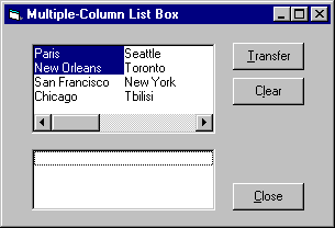
If you draw the list box large enough to hold all the items in one column, the second column will be empty; the other items will wrap, and horizontal scroll bars will appear automatically only if the list box is not long enough. Try resizing the top list box and adding additional list items to see how Visual Basic automatically handles multiple columns.
The example uses the Selected property a Boolean array containing the selection status of a list box to determine which items are selected. Each entry in the array corresponds to a list item and is set to True if the item is selected, or False if it is not selected. After the user selects items from the list, each array entry is checked to see if it is set (True). If so, the entry is added to the second list, a normal single-column list box, using the AddItem method.
Set the properties for the example as indicated in the following table.
|
Object |
Property |
Setting |
|
|
||
|
Form |
Caption |
Multiple-Column List Box |
|
Top list box |
Name |
lstTop |
|
Bottom list box |
Name |
lstBottom |
|
First command button |
Name |
cmdTransfer |
|
Second command button |
Name |
cmdClear |
|
Third command button |
Name |
cmdClose |
The MultiSelect property allows you to select a range of values in a list box. If you click the first list item, and then press SHIFT and click the last item in the range (or use the SHIFT+ DOWN ARROW keys), all the items in the range are selected.
Add code to the Form_Load procedure to initialize the top list, 1stTop:
Private Sub Form_Load ()
lstTop.AddItem "Paris"
lstTop.AddItem "New Orleans"
lstTop.AddItem "San Francisco"
lstTop.AddItem "Chicago"
lstTop.AddItem "Seattle"
lstTop.AddItem "Toronto"
lstTop.AddItem "New York"
lstTop.AddItem "Tbilisi"
lstTop.AddItem "Moscow"
lstTop.AddItem "Portland"
' Select a couple of items.
1stTop.Selected(0) = True
1stTop.Selected(1) = True
End Sub
Note You can add items to list boxes without repeatedly using the AddItem method by typing items in the List property of the Properties window. After entering each item, press CTRL+ENTER to go to the next line. This allows you to type multiple entries in a multiple-column list box.
Add the following code to the 1stTop_DblClick event procedure:
Private Sub 1stTop_DblClick ()
cmdTransfer.Value = True ' Press transfer button.
End Sub
Add the following code to the Click event procedure for the Transfer command button:
Private Sub cmdTransfer_Click ()
For n = 0 To (lstTop.ListCount - 1)
' If selected, add to list.
If lstTop.Selected(n) = True Then
lstBottom.AddItem lstTop.List(n)
End If
Next
cmdClear.Enabled = True
End Sub
Notice how the array index values start from 0 and go to ListCount -1
Add the following code to the Click event procedure for the Clear command button:
Private Sub cmdClear_Click ()
lstBottom.Clear
cmdClear.Enabled = False
End Sub
Add the following code to the Click event procedure for the Close command button.
Private Sub cmdClose_Click ()
Unload Me
End Sub
You can link or embed any object that supports Automation (formerly called OLE Automation) into the OLE container control. Using this control, your Visual Basic application can display and manipulate data from other Windowsbased applications, such as Microsoft Excel and Microsoft Word for Windows.
Figure 7.41 The OLE container control
The OLE container control is used to create a document-centered application. In such an application, the user combines data from different applications to create a single document. This type of application may be a word processor that allows the user to enter text and then embed a spreadsheet or chart.
The OLE container control allows you to add objects from other applications to your Visual Basic applications. With this control, you can:
Create a placeholder in your application for an object. You can create the object that appears within the OLE container control at run time, or you can change an object you have placed in the OLE container control at design time.
Create a linked object in your application.
Bind the OLE container control to a database.
Perform an action if the user moves, sizes, or updates the object in the OLE container control.
Create objects from data that was copied onto the Clipboard.
Display objects as icons.
Provide backward compatibility with an application that includes many OLE container controls (called OLE client controls in previous versions of Visual Basic).
Option button controls are used to display options, usually in option button groups, from which the user can choose one.
Figure 7.42 The option button control
While option button controls and check box controls may appear to function similarly, there is an important difference: when a user selects an option button, the other option button controls in the same group are automatically unavailable. In contrast, any number of check box controls can be selected.
For More Information See "Grouping Options with Option Buttons" in "Forms, Controls, and Menus" for a demonstration of the use of option buttons.
You group option button controls by drawing them inside a container such as a frame control, a picture box control, or a form. At run time, the user may select a single option button from each distinct group of option buttons. For example, if you add option buttons to a form and option buttons to a frame control on the form, you have created two distinct groups of option buttons.
Figure 7.43 Creating option button groups
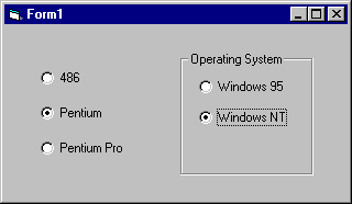
All option buttons that are added directly to the form become one group. To add additional groups, you need to place them inside frame or picture box controls.
To group option button controls in a frame or picture box, draw the frame or picture box first, and then draw the option button controls inside. At design time, option buttons contained within a frame or picture box control may be selected and moved as a single unit.
To select multiple controls contained inside a frame control, a picture box control, or a form, hold down the CTRL key while using the mouse to draw a box around the controls.
For More Information See "Using the Frame Control" earlier in this chapter for more information on drawing controls inside a frame.
An option button may be selected at run time in several ways: clicking it with the mouse, using the TAB key to shift the focus to the control, using the TAB key to select a group of option button controls and then using the arrow keys to select one within the group, creating a shortcut key in the option button's caption, or, by setting its Value property to True in code.
When an option button is selected, its Click event is triggered. Depending upon the functionality of your application, you may or may not need to respond to this event. Responding to this event is useful when you want to update a label control's caption to provide the user with information about the option that has been selected, for example.
The Value property of the option button control indicates whether the option button is selected. When selected, the value is changed to True. You can select an option button in code by setting its Value property. For example:
optPentium.Value = True
To make an option button the default within an option button group, set the Value property at design time using the Properties window or at run time in code, as shown above.
When you present the user with a dialog box containing option buttons, you are asking them to select options that will determine what your application will do next. You can use the Value property of each of the option button controls to determine which option or options were selected and then respond accordingly.
You can use the Caption property to create access key shortcuts for your option buttons by adding an ampersand (&) before the letter you want to use as the access key. For example, to create an access key for the option button caption "Pentium" you add an ampersand before the letter "P": "&Pentium". At run time, the letter "P" will be underlined and the user can select the command button by simultaneously pressing ALT+P.
Note To include an ampersand in a caption without creating an access key, include two ampersands (&&). A single ampersand is displayed in the caption and no characters are underlined.
To disable an option button, set its Enabled property to False. At run time, the option button will appear dimmed, meaning that it is unavailable.
The look of the option button control may be enhanced by altering the setting of the Style property and then using the Picture, DownPicture and DisabledPicture properties.
The picture box control is used to display graphics, to act as a container for other controls, and to display output from graphics methods or text using the Print method.
Figure 7.44 The picture box control
The picture box control is similar to the image control in that each can be used to display graphics in your application each supports the same graphic formats. The picture box control, however, contains functionality which the image control does not, for example: the ability to act as a container for other controls and support for graphics methods.
For More Information See "Working with Picture Boxes" "Forms, Controls, and Menus" for a demonstration of the use of picture boxes.
The picture box control can display picture files in any of the following formats: bitmap, icon, metafile, enhanced metafile, or as JPEG or GIF files.
For More Information See "Using the Image Control" earlier in this chapter for detailed descriptions of these graphic formats.
Pictures can be loaded into the picture box control at design time by selecting the Picture property from the control's Properties window, or at run time by using the Picture property and the LoadPicture method.
Picture1.Picture = _
LoadPicture("c:\Windows\Winlogo.bmp")
To clear the graphic from the picture box control, use the LoadPicture method without specifying a file name. For example:
Picture1.Picture = LoadPicture
This will clear the picture box control even if a graphic was loaded into the Picture property at design time.
You can also add a graphic to a picture box control at design time by pasting it from another application. For example, you may want to add a bitmap image that was created in Windows Paint. Simply copy the image to the clipboard, select the picture box control, and either use the keyboard shortcut CTRL+V or the Paste command from the Edit menu.
By default, graphics are loaded into a picture box at their original size, meaning that if the graphic is larger than the control, the image will be clipped the picture box control does not provide scroll bars. To make a picture box control automatically resize to display an entire graphic, set its AutoSize property to True. The control will then size to the graphic growing or shrinking.
Unlike the image control, the picture box control cannot stretch the image to fit the size of the control.
For More Information See "Scroll Bar Controls Scenario: Creating a Scrollable Graphics Viewport" earlier in this chapter for information on using picture boxes to create a scrollable graphics viewport.
You can use the picture box control as a container for other controls. For example, since the picture box can be placed inside the internal area of a MDI form, it is often used to manually create a toolbar or status bar.
Picture boxes, like forms, can be used to receive the output of graphics methods such as Circle, Line, and Point. For example, you can use the Circle method to draw a circle in a picture box by setting the control's AutoRedraw property to True.
Picture1.AutoRedraw = True
Picture1.Circle (1200, 1000), 750
Setting AutoRedraw to True allows the output from these methods to be drawn to the control and automatically redrawn when the picture box control is resized or redisplayed after being hidden by another object.
For More See "Using Graphics Methods" "Working with Text and Graphics" for more information about using the picture box control with the graphics methods.
You can use the picture box control to output text by using the Print method and setting the AutoRedraw property to True. For example:
Picture1.Print "A text string"
When using the Print method you can also modify the font style and size or use the CurrentX, CurrentY, Height, and Width properties to align text within a picture box.
For More Information See "Working with Text and Graphics for more information.
The shape control is used to create the following predefined shapes on forms, frames, or picture boxes: rectangle, square, oval, circle, rounded rectangle, or rounded square.
Figure 7.45 The shape control
You can set the shape style, color, fill style, border color, and border style of any of the shapes you draw on a form.
For simple uses, the shape control allows you to create a variety of shapes without writing any code. For more advanced functionality you need to use the Line and Circle methods.
For More Information See "Using Graphics Methods" in "Working with Text and Graphics" for more information on drawing lines, rectangles, and filled-in boxes at run time using the Line method or for more information on drawing circles, ellipses, and arcs at run time using the Circle method.
The Style property of the shape control provides you with six predefined shapes. The following table lists all the predefined shapes, their values and equivalent Visual Basic constants:
|
Shape |
Style |
Constant |
|
|
||
|
Rectangle |
vbShapeRectangle |
|
|
Square |
vbShapeSquare |
|
|
Oval |
vbShapeOval |
|
|
Circle |
vbShapeCircle |
|
|
Rounded Rectangle |
vbShapeRoundedRectangle |
|
|
Rounded Square |
vbShapeRoundedSquare |
|
Figure 7.46 Predefined shapes
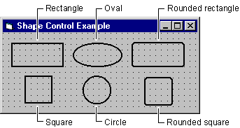
You can use the FillStyle and BorderStyle properties to set the fill style and border style of any of the shapes you draw on a form.
The FillStyle property, like the Style property, provides you with a number of predefined fill style patterns. These include: Solid, Transparent, Horizontal Line, Vertical Line, Upward Diagonal, Downward Diagonal, Cross, and Diagonal Cross.
The BorderStyle property provides you with a number of predefined border styles. These include: Transparent, Solid, Dash, Dot, Dash-Dot, Dash-Dot-Dot, and Inside Solid.
The BackColor and FillColor properties allow you to add color to the shape and its border.
At design time, you can set the fill or border colors by choosing either property from the Properties window of the shape control and then selecting from the available palette or system colors.
To set colors at run time, use the Visual Basic color constants (vbGreen, for example) or the system color constants (vbWindowBackground, for example) or the RGB function to specify fill colors.
Note When the FillStyle or BackStyle properties are set to 1 (Transparent), the FillColor and BackColor properties are ignored.
For More Information Refer to "Working with Text and Graphics" for detailed information on creating graphics in Visual Basic.
You can use the shape control to draw rectangles (regular or rounded corners), squares (regular or rounded corners), ovals, and circles on a form.
To draw a shape on a form
In the toolbox, select the Shape control.
When the pointer moves onto the form, it changes to a cross hair.
Click and drag the cross hair to make the item the size you want.
From the Properties window, select the Shape property.
In the Settings box, select the style you want.
Shapes can be sized like any other controls, by selecting and dragging the control to the desired size, or by setting the Height and Width properties.
The text box control is used to display information entered by the user at run time, or assigned to the Text property of the control at design or run time.
Figure 7.47 The text box control
In general, the text box control should be used for editable text, although you can make it read-only by setting its Locked property to True. Text boxes also allow you to display multiple lines, to wrap text to the size of the control, and to add basic formatting.
Text entered into the text box control is contained in the Text property. By default, you can enter up to 2048 characters in a text box. If you set the MultiLine property of the control to True, you can enter up to 32K of text.
When text exceeds the boundaries of the control, you can allow the control to automatically wrap text by setting the MultiLine property to True and add scroll bars by setting the ScrollBars property to add either a horizontal or vertical scroll bar, or both. Automatic text wrapping will be unavailable, however, if you add a horizontal scroll bar because the horizontal edit area is increased by the presence of the scroll bar.
When the MultiLine property is set to True, you can also adjust the alignment of the text to either Left Justify, Center, or Right Justify. The text is left-justified by default. If the MultiLine property is False, setting the Alignment property has no effect.
For More Information See "Working with Text Boxes" for a demonstration of the MultiLine, ScrollBar, and Alignment properties.
You can control the insertion point and selection behavior in a text box with the SelStart, SelLength and SelText properties.
For More Information See "Working with Text Boxes" in "Forms, Controls, and Menus" for a demonstration of the SelStart, SelText, and SelLength properties.
A password box is a text box that allows a user to type in his or her password while displaying placeholder characters, such as asterisks. Visual Basic provides two text box properties, PasswordChar and MaxLength, which make it easy to create a password text box.
PasswordChar specifies the character displayed in the text box. For example, if you want asterisks displayed in the password box, you specify * for the PasswordChar property in the Properties window. Regardless of what character a user types in the text box, an asterisk is displayed, as shown in Figure 7.48.
Figure 7.48 Password example
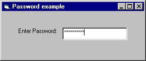
With MaxLength, you determine how many characters can be typed in the text box. After MaxLength is exceeded, the system emits a beep and the text box does not accept any further characters.
You can use the KeyPress event to restrict or transform characters as they are typed. The KeyPress event uses one argument, keyascii. This argument is an integer that represents the numeric (ASCII) equivalent of the character typed in the text box.
The next example demonstrates how to cancel keystrokes as they are typed. If the character typed is not within the specified range, the procedure cancels it by setting KeyAscii to 0. The text box for this example is named txtEnterNums, and the procedure prevents the text box from receiving any characters other than digits. Compare KeyAscii directly to the numeric (Asc) values of various characters.
Private Sub txtEnterNums_KeyPress (KeyAscii As Integer)
If KeyAscii < Asc("0") Or KeyAscii > Asc("9") Then
KeyAscii = 0 ' Cancel the character.
Beep ' Sound error signal.
End If
End Sub
For More Information See "Responding to Keyboard Events" in "Responding to Mouse and Keyboard Events" for more information about the KeyPress event.
You can use the Locked property to prevent users from editing text box contents. Set the Locked property to True to allow users to scroll and highlight text in a text box without allowing changes. With the Locked property set to True, a Copy command will work in a text box, but Cut and Paste commands will not. The Locked property only affects user interaction at run time. You can still change text box contents programmatically at run time by changing the Text property of the text box.
Sometimes quotation marks (" ") appear in a string of text.
She said, "You deserve a treat!"
Because strings assigned to a variable or property are surrounded by quotation marks (" "), you must insert an additional set of quotation marks for each set to display in a string. Visual Basic interprets two quotation marks in a row as an embedded quotation mark.
For example, to create the preceding string, use the following code:
Text1.Text = "She said, ""You deserve a treat!"" "
To achieve the same effect, you can use the ASCII character (34) for a quotation mark:
Text1.Text = "She said, " & Chr(34) + "You deserve a treat!" & Chr(34)
Timer controls respond to the passage of time. They are independent of the user, and you can program them to take actions at regular intervals. A typical response is checking the system clock to see if it is time to perform some task. Timers also are useful for other kinds of background processing.
Figure 7.49 The timer control
Each timer control has an Interval property that specifies the number of milliseconds that pass between one timer event to the next. Unless it is disabled, a timer continues to receive an event (appropriately named the Timer event) at roughly equal intervals of time.
The Interval property has a few limitations to consider when you're programming a timer control:
If your application or another application is making heavy demands on the system such as long loops, intensive calculations, or drive, network, or port access your application may not get timer events as often as the Interval property specifies.
The interval can be between 0 and 64,767, inclusive, which means that even the longest interval can't be much longer than one minute (about 64.8 seconds).
The interval is not guaranteed to elapse exactly on time. To ensure accuracy, the timer should check the system clock when it needs to, rather than try to keep track of accumulated time internally.
The system generates 18 clock ticks per second so even though the Interval property is measured in milliseconds, the true precision of an interval is no more than one-eighteenth of a second.
Every timer control must be associated with a form. Therefore, to create a timer application, you must create at least one form (though you don't have to make the form visible if you don't need it for any other purpose).
Note The word "timer" is used in several ways in Visual Basic, each closely related to the workings of the timer control. In addition to the control name and control type, "timer" is used in the Timer event and the Timer function.
Techniques for working with the timer control are included in the Alarm sample application (Alarm.vbp). If you installed the sample applications, you will find this application in the \Alarm subdirectory of the main Visual Basic directory (\VB\Samples\Pguide).
Placing a timer control on a form is like drawing any other control: Click the timer button in the toolbox and drag it onto a form.
The timer appears on the form at design time only so you can select it, view its properties, and write an event procedure for it. At run time, a timer is invisible and its position and size are irrelevant.
A timer control has two key properties.
|
Property |
Setting |
|
|
|
|
Enabled |
If you want the timer to start working as soon as the form loads, set it to True. Otherwise, leave this property set to False. You might choose to have an outside event (such as a click of a command button) start operation of the timer. |
|
Interval |
Number of milliseconds between timer events. |
Note that the Enabled property for the timer is different from the Enabled property for other objects. With most objects, the Enabled property determines whether the object can respond to an event caused by the user. With the Timer control, setting Enabled to False suspends timer operation.
Remember that the Timer event is periodic. The Interval property doesn't determine "how long" as much as it determines "how often." The length of the interval should depend on how much precision you want. Because there is some built-in potential for error, make the interval one-half the desired amount of precision.
Note The more often a timer event is generated, the more processor time is used in responding to the event. This can slow down overall performance. Don't set a particularly small interval unless you need it.
When a timer control's interval elapses, Visual Basic generates the Timer event. Typically, you respond to this event by checking some general condition, such as the system clock.
A digital clock is a very simple but very useful application involving a timer control. Once you understand how the application works, you can enhance it to work as an alarm clock, stopwatch, or other timing device.
The Digital Clock application includes a timer and a label with a border. At design time, the application looks like Figure 7.50.
Figure 7.50 The Digital Clock application
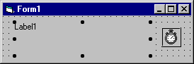
At run time, the timer is invisible. The following table lists the property settings for the Digital Clock application.
|
Control |
Property |
Setting |
|
|
||
|
Label1 |
BorderStyle |
Fixed Single |
|
Timer1 |
Interval |
500 (half a second) |
|
Timer1 |
Enabled |
True |
The only procedure in this application is an event procedure for the timer:
Private Sub Timer1_Timer ()
If lblTime.Caption <> CStr(Time) Then
lblTime.Caption = Time
End If
End Sub
The procedure displays the system time by calling the intrinsic Time function. This function returns a Variant containing the current time as a date/time value (VarType 7). When you assign it to a string variable or property, such as the Caption property in this case, Visual Basic converts it to a string using the time format specified in the Control Panel. If you want to display it using a different format, you can use the Format function.
The Interval property for the timer is set to 500, following the rule of setting the Interval to half of the shortest period you want to distinguish (one second in this case). This may cause the timer code to update the label with the same time twice in one second. This is wasteful and can cause some visible flicker, so the code tests to see if the time is different from what is displayed in the label before it changes the caption.
You can customize the look of the Digital Clock without having to write any additional statements. For example, you might want to select a different font for the label or change the BorderStyle property of the form.
|
